-

-
Chapter 1:
The Masters of Doom
-
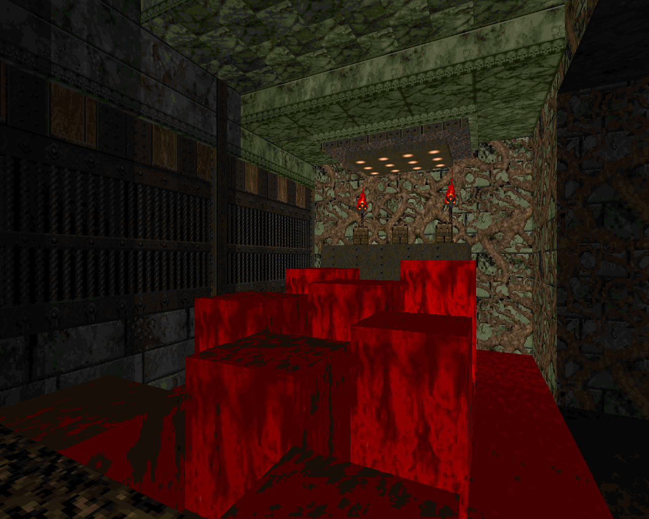
When the original Doom games came out, they were a revelation. There had been plenty of video games before Doom that were fun to play, and a decent handful that had made use of advancing technology to present gameplay mechanics in a polished way. It wasn’t even the first game to feel truly immersive—by my reckoning, that was Ultima Underworld. But nothing before Doom had felt so vivid and visceral at the same time. Nothing before it had felt almost like it could be real—or perhaps more to the point, nothing before Doom had made it seem like feeling real was something video games could do. It’s easy for newer gamers to miss that point, given how cartoony it is compared to the full-3D games that followed it. But if you were 8 years old in 1993, staring up in awe at Doom playing on demo loop on a row of a dozen store computers, you’d have known right away that nothing was ever going to be the same. Trust me. 8-year-old me was there. That’s the real reason that first-person shooter games were referred to as “Doom clones” for years afterward—the real reason that, even as late as 1996, games like Quake and Duke Nukem 3D were being marketed as the games that would finally kill Doom.
There's a reason that first-person shooter games were referred to as “Doom clones” for years
Games before Doom were usually pretty cheesy, because that was the easiest direction to go with the technology that was available. Video games were too simplistic to be taken very seriously; you had a cartoony art style because that was the best thing your engine could handle, and on top of that, you probably had a tiny development team where the programmers and level designers were also the visual artists. You couldn’t even have very many words on a screen at a time due to the low resolutions. Besides, ‘90s culture demanded that you be laid back, especially if you were young and male, which meant you were by far the primary target demographic for video games at the time. As a result, games tended to be really goofy, with over-the-top attitudes, stories that made little sense, and silly powerups and enemies.
Even in Doom, you can still see some of that. The story is gritty but mostly lighthearted, monsters like the Pinky and Cacodemon have exaggerated physical characteristics, and the powerups seem to have little reason to exist in the game world except that they’re fun. But the screwball tone of earlier games is largely gone, and the goofy elements feel pretty slight in comparison to the heavy, sinister mood that permeates Doom. Doom’s world feels far more palpable than those of its predecessors in the action game genres; the emotions it evokes come from deeper inside you. And although it doesn’t have the complexity or depth of story that contemporary role-playing games like Ultima Underworld had, its visceral environments have a lot to say in their own way.
Doom’s world feels far more palpable than those of its predecessors in the action game genres; the emotions it evokes come from deeper inside you
Needless to say, Doom mappers have taken a great deal of inspiration from the things that make Doom unique—both the design tropes of the original games and the odd hybrid nature of its engine. Doom was created at the cusp of a new era, which it ushered in. And so it’s dark and silly at the same time, realistic yet also arcadey, offering complex ways of creating spaces in 3D and yet in many ways limited to abstraction. This fascinating and utterly unique sphere is where the Doom mapping community dwells, as though we’re an alternate branch of history where Doom was so great that nobody even bothered to develop subsequent games and we’ve reimagined the whole evolution of game design via our wonderfully creaky old tech.
Of course, it helps that the level designers at Id Software knew what they were doing, and that their design gave us a lot of depth to mimic right from the start. The first two Doom games each have their own distinct tone, and each of them has influenced the mapping community in different ways.
-
 Doom - id Software (1993)
The Only Way Out Is ThroughOne of the most important things about Doom as a trailblazer (both for the gaming industry and for fan-made content) is the way that it combined action and horror. Horror already existed as a video game genre through Alone in the Dark and perhaps a few other games, but conveying the emotion of fear was practically an impossibility before the Doom engine. Part of this is simply that it’s both in real-time and first-person perspective, which means that you can’t see everything happening around you and the things you don’t see can actively harm you. In addition, its sound design was sufficiently good and its texturing and spriting were sufficiently realistic in their level of detail to carry the mood.
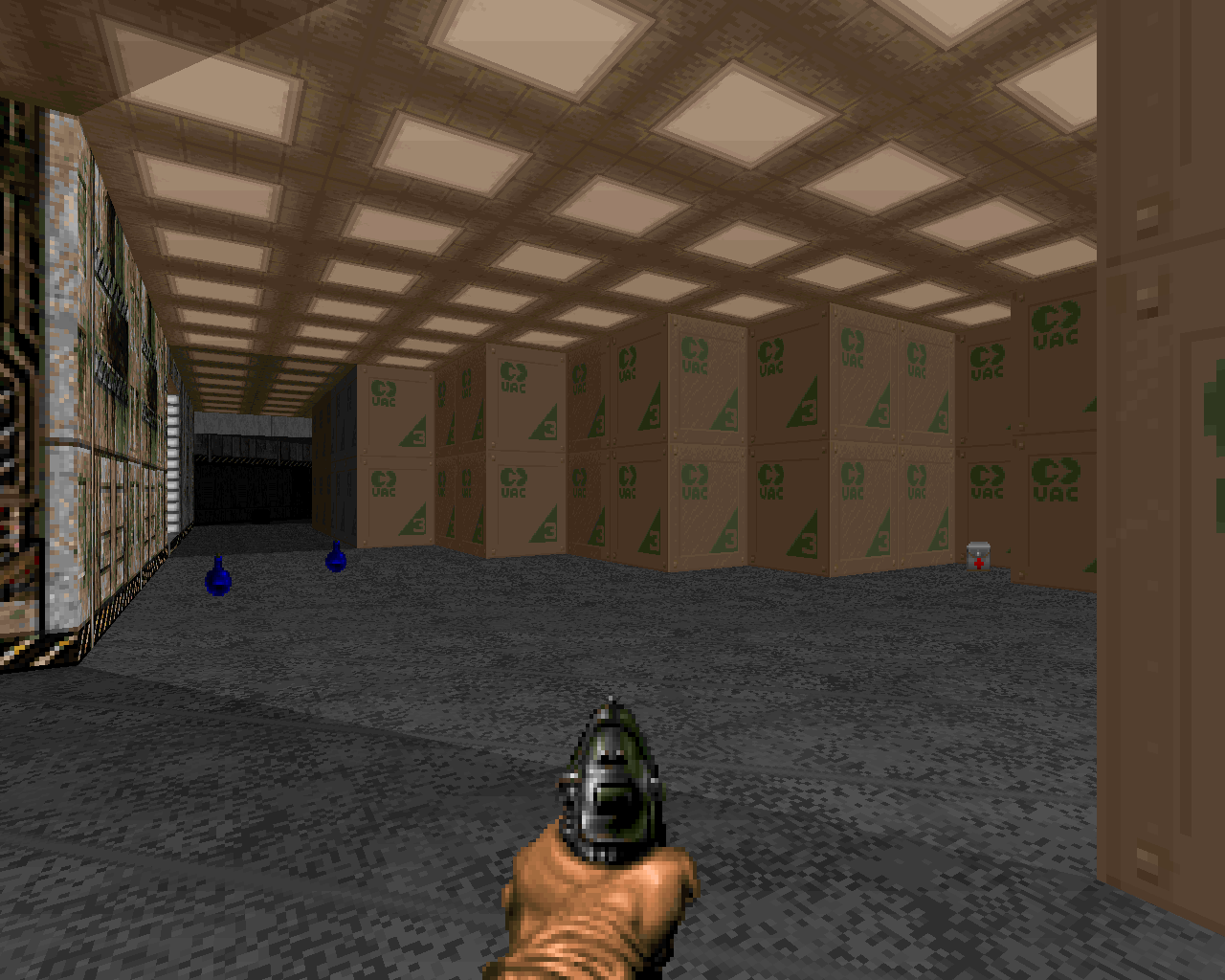
But perhaps most importantly, Doom was the first game that really allowed the level designers to take lighting seriously. Wolfenstein 3D had no lighting at all; Ultima Underworld had global light levels that you could affect by equipping torches and such. But Doom allows for a wide range of light levels within the same area, meaning that you can simulate cast light and shadow. Creepy, isolated interior areas can descend into darkness while outdoor areas remain bright; glowing tech-lights can cut swaths of bright light through darkness, and pillars can interrupt those swaths, cutting dark shadows through them. The engine also allowed for a handful of specialized lighting effects, which are used sparingly in the original game but can’t be underemphasized. Staring into the dark maw of the wooden maze in “Halls of the Damned” (E2M6), most of it almost pitch black but with patches of light blinking at multiple speeds so that they felt disturbingly desynced, and knowing that you had to go in there to get that last key to exit the map—that was a real thing in 1993. It was terrifying.
Doom was the first game that really allowed the level designers to take lighting seriously
Due to engine limitations, Doom doesn’t mess around with complex gradient lighting. That’s because you have to add linedefs to add lighting, and having too many linedefs in one spot will overload the game. So for the same reason that the architecture uses simple, clean lines, the lighting does as well. As a response to the limitations they were working with, Id’s level designers focused on high-contrast lighting, very bright next to very dark, which creates an appealing stylized look. Although many modern Doom mappers go wild with gradient lighting, often to excellent effect, this high-contrast style has remained very popular as well, particularly among retro mappers.
The gameplay itself contributes a fair amount to the horror tone as well, particularly in the way threats are presented. Nowhere is this more apparent than in the famous blue key trap in “Toxin Refinery” (E1M3), where everything suddenly goes dark when you pick up the key and Imps appear out of a previously unseen ambush closet. Another similar case occurs in “Command Control” (E1M4), where you open up one door of a small room at the center of a hub area and all its doors open at once, flooding enemies out into the hub. Ambushes (whether via monster closets or teleporters) and other combat surprises fit perfectly with the tone of the game, serving as alarming interruptions to the standard pacing and sudden adrenaline-pumping challenges, and they have been part and parcel of fan-made Doom mapping for as long as it has existed.
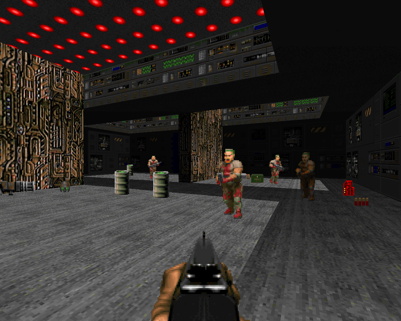
Romero’s E1 is usually a key point of discussion when people talk about Doom. Early Romero emphasized the flow of combat above all else, reserving the scariest elements of the game for a handful of specific moments. His E1 maps are mostly very open and nonlinear, gated only by occasional keycard use, allowing you to play the game as a sort of running exploration with branching paths and optional side areas. These maps are constructed to allow a great deal of freedom of movement, which feeds into the fast pace of the combat. This fast pacing is also well served by the E1 monsters, which all have low health and are easy to bring down quickly with the basic weapons that you have on hand throughout the episode.
Since Romero’s maps are the first thing most people remember about Doom, it’s easy to spin it in the modern era as a straight action game. And this is where it’s worth reiterating that a lot of Doom’s horror-like atmosphere comes from the engine itself and the impact that it had at the time. Things like lighting and monster jump scares are relatively minor “horror elements,” at least in comparison to the mechanics that modern horror games employ, but the gestalt of the Doom engine’s various features and graphical detail was so intensely atmospheric that the game was able to induce every emotion you could possibly associate with the horror genre—dread, repulsion, eerie unease, and of course full-on terror.
The combination and division of horror versus action elements was a huge part of what made Doom successful
The two later episodes, which were mostly created by Sandy Petersen, lean into the horror elements a lot more. In these maps, where you have more intimidating monsters lurking around and hunting for you in the dark, and seemingly anything can happen—ceilings suddenly sweeping down to crush you, pillars of flesh moving up and down with no apparent purpose, mazes of teleporters with no clear logic behind them—it’s a lot easier to feel overwhelmed and backed into a corner. The lighting gets darker in many of these maps, becoming an even more important part of the atmosphere. Petersen’s Doom maps place more emphasis on survival rather than being a badass, and they tend to take on a dungeon crawl aspect. As open as many of Romero’s maps are, it was also Petersen who introduced true exploration-focused sandbox gameplay through maps like “Containment Area” (E2M2) and “Mt. Erebus” (E3M6).
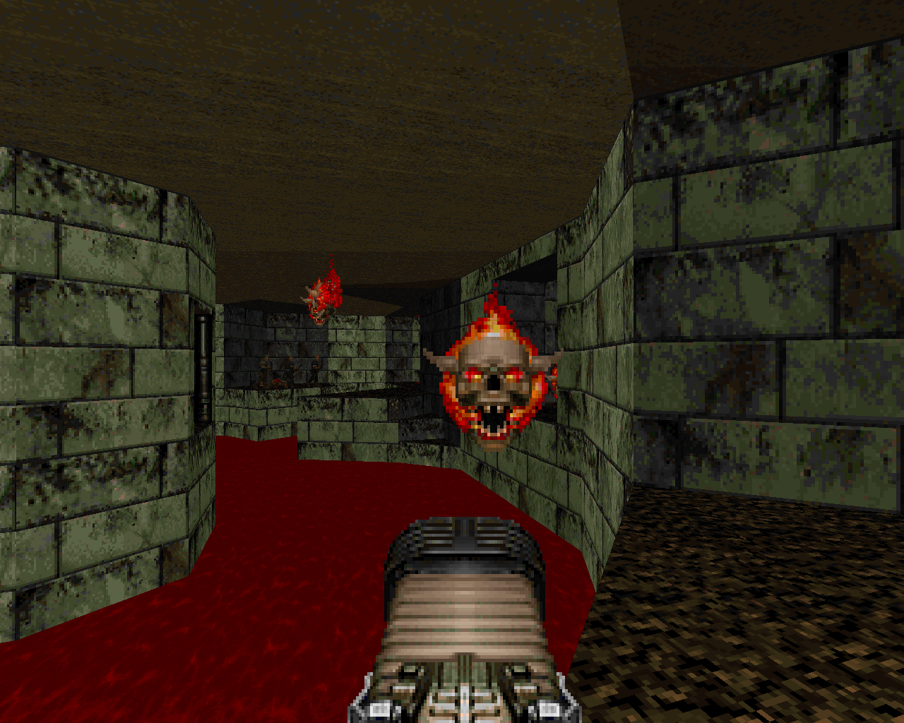
The combination and division of horror vs. action elements was a huge part of what made Doom successful, and it has been the mapping community’s main takeaway from the first game. I say “combination and division” because it’s just that: you can focus on the horror, you can focus on the action, or you can blend the two to varying degrees. Action-oriented mappers tend to take more inspiration from Romero’s gameplay flow, while atmosphere-oriented mappers tend to follow Petersen’s tropes more. Doom itself did well to combine the two, of course. The horror elements frighten and intimidate, but you have no choice except to grab a gun and push through; the creepy mood and surprises form a huge part of the new player’s initial experience, but a veteran player who already knows what’s going to happen can play more aggressively and appreciate the fast pace of the game.
Naturally, modern Doom players rarely find the game scary, but its horror-atmospheric elements are still treated as critical for establishing mood in fan-made maps, no matter what the mapper’s gameplay focus is. Ambush tactics tend to also be important from a combat and pacing perspective: you can enter a room that’s empty and then find it suddenly populated, blocking your escape route, as opposed to entering, seeing opposition, and quickly backing out to deal with combat through the safety of a doorway. No matter how jaded Doomers may get with the lurking terrors of the game, however, there are still occasional releases like Maskim Xul and Dark Universe that will scare the crap out of you, just like Doom did in the old days.
-
 Doom 2 - id Software (1994)
Their Own Reality
Doom 2, on the other hand, is barely about instilling fear at all. It’s something a lot more…experimental than that. If the first game provided the mapping community with a set of baseline gameplay archetypes and genre savvy, then the second one gave us our yearning to create the inexplicable and strange in all its myriad forms—which I believe is a big part of why we’re still here 25 years later.

Though it’s sometimes criticized, the Id team’s decision to stick with the exact same engine for the sequel allowed them to refine their formula quite a bit, rather than getting distracted by a lot of new features. On the most basic level, the many changes and additions from the first Doom are about making Doom 2 a more combat-oriented game. The first game was seen by many as a little too simple and too grindy, so the sequel adds an anti-grind weapon (the Super Shotgun) and a large number of monsters with more challenging attacks and higher damage outputs, in addition to making the first game’s boss monsters a more standard part of the lineup. As a result, both monsters and players become more threatening to each other, and the game’s various maps become dynamic playgrounds where movement and strategy are more important. Needless to say, this added strategic depth has given mappers a lot to work with. It allows for a much greater variety of gameplay than would be possible with the first Doom’s monster set, and mappers have taken advantage of this to develop numerous combat styles over the decades.
Sandy Petersen designed half of the levels for Doom 2, with the rest being mostly split between Romero and American McGee, and Petersen’s style is perhaps the one that people most associate with the game, whether they consider that to be for better or for worse. Petersen’s maps in the first Doom had begun to develop the idea that Hell was a place where reality unraveled; in Doom 2, he went all out with it. The unraveling of reality becomes a central focus of both the aesthetics and the gameplay throughout the entire game.
Doom 2 gave us our yearning to create the inexplicable and strange—which I believe is a big part of why we’re still here 25 years later
Petersen’s maps deal in abstraction. “The Factory” (map 12) and “Downtown” (map 13) are in roughly the shape of a factory complex or a downtown area with city blocks and tall buildings, but once you look past that outer shell, nothing makes sense. The interiors of buildings appear twisted beyond recognition, reconfigured with a character that may or may not be explicable in terms of gameplay logic but is absolutely never explicable from a real-world perspective. Compare the cities in Doom 2 to the ones in a game like Duke Nukem 3D, where the whole point is to replicate a realistic environment. Petersen was having none of that. What’s the point of a demonic apocalypse if things still make sense, if real-world logic still exists as a safety net to fall back on? And so you have maps like “Tricks and Traps” (map 08), where every room in an ostensibly human-made techbase is entirely designed around conveying some sort of strange combat puzzle or unusual style of ambush, and “The Pit” (map 09), which is constructed around odd movement puzzles that no military-industrial megacorp would have put there for its employees to traverse during their daily tasks. The whole concept behind these maps ties into a line from one of the intermission texts: “But something is wrong. The demons have brought their own reality with them.”
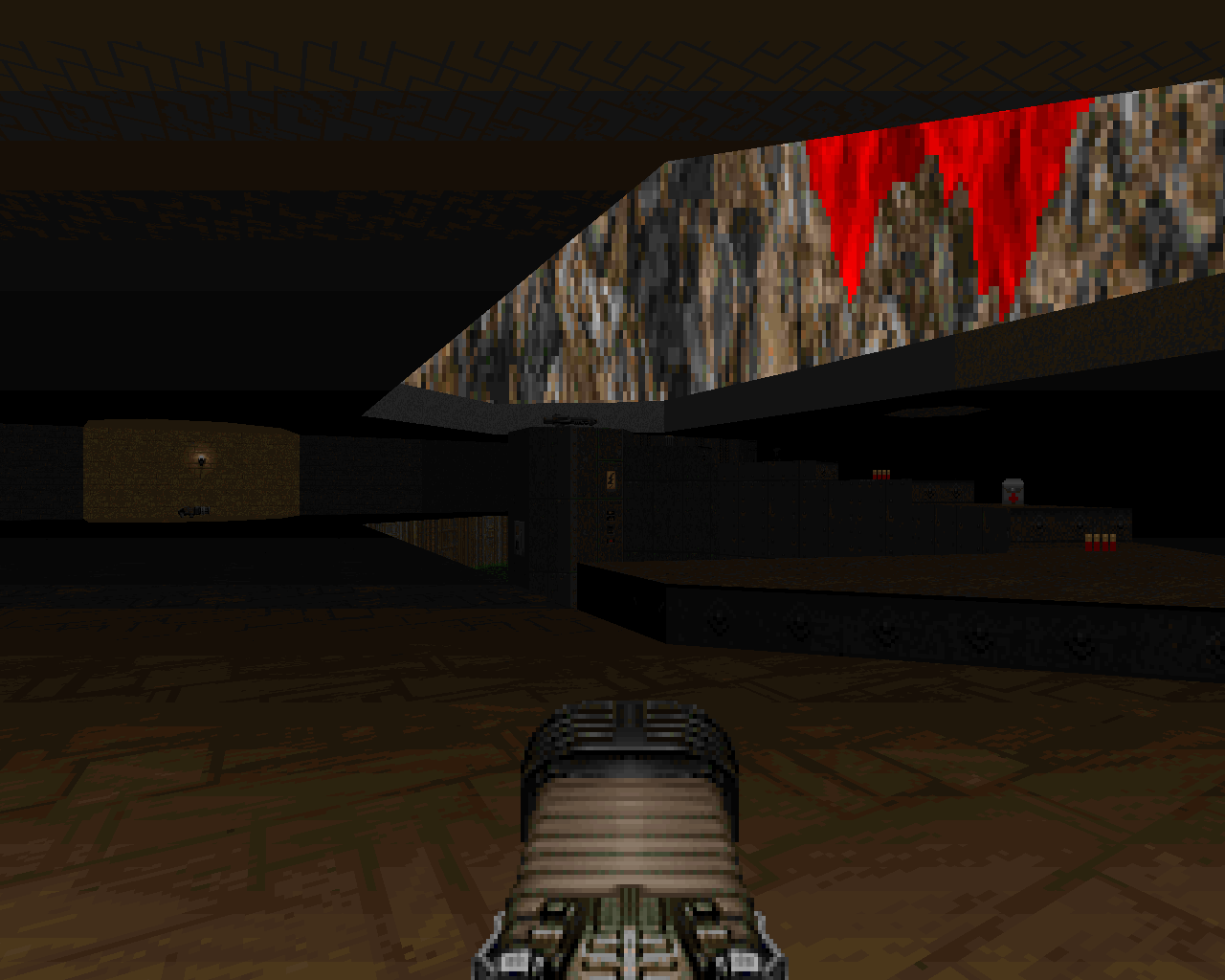
And perhaps the most interesting and unique thing about Doom 2 as a concept is that this disturbance in the fabric of reality goes both ways, and nowhere is it more apparent than in the Hell maps. The first Doom’s vision of Hell was awesome, but pretty traditional: rocky wastelands full of fire and brimstone, with the added twist of the organic elements, entire landscapes made out of flesh and guts. Doom 2’s Hell looks a whole lot like a twisted version of Earth, which is the entire point. Even as Earth’s reality bends to take on the eerie, hostile tone of Hell, Hell’s reality has begun to twist around earthly shapes and materials. “Barrels o’ Fun” (map 23) sees a hellish landscape wrought in abstract stucco and metal constructs and filled with barrels of human toxic waste; “Monster Condo” (map 27) is a haunted mansion filled with libraries and walled in the same brick and wood that make up the city maps. Clearly this wasn’t just Petersen; Romero and McGee both made Hell maps, and they both treated them the same way. The whole team was on board. It’s even present in the bestiary, as though the bosses from the first game were prototypes for the creation of new species of cybernetic monsters that blend human tech with demonic flesh, perhaps in demonic factories or perhaps by some supernatural shift, simply because Hell’s biological reality has gotten…confused. Personally, I think all evidence points to the latter.
The fundamental unbalancing and reconverging of reality, the disturbed surrealism that permeates most of the maps, is what makes Doom 2 the game it is
At the risk of repeating myself, almost the whole game is built on that same ideology. McGee’s “The Crusher” (map 06) structures a boss battle around the game’s first Spider Mastermind being little more than a fly trapped in a web, poised to be destroyed by conveniently placed technology; Romero’s “The Tenements” (map 17) seems normal at its heart but begins to unravel around the edges; Petersen’s “The Chasm” (map 24) splinters the safely traversable space into a web of tightrope walks over vast, deadly pits. It’s particularly interesting to see how Romero, the king of tight, logical flow in Knee-Deep in the Dead, changed as a mapper in Doom 2 after he had been working with Petersen for a while. His maps are still combat-focused, with large and freeform spaces that are designed around high-concept combat elements—the sniper zombies in “Industrial Zone” (map 15) or the steady rain of fire from distant Mancubi in “The Living End” (map 29), for instance—but his maps in Doom 2 tend to use Petersenesque abstraction as a canvas for those fights, both in the aesthetics and the overall layouts. McGee, by contrast, tends to be regarded as the least influential of the three because his maps are the most conventional—but that said, his early-game maps have served as the inspiration for the opening runs of most large fan-made mapsets, the simple, logical prelude that helps to emphasize the later descent into madness.
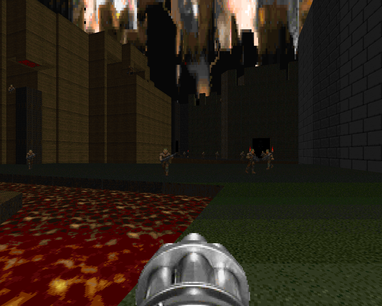
No matter how you slice it, Doom 2 is a weird game. Even if you look past the “unraveling of reality” aspect, it represents a totally open-ended design ethos; it isn’t at all concerned with what a “real place” should look like, which allowed the designers to build structures around what they wanted from their gameplay. But the fundamental unbalancing and reconverging of reality, the disturbed surrealism that permeates most of the maps, is really what makes it the game it is, and it would hardly be an exaggeration to say that almost every fan-made Doom 2 map ever made draws on that at least a little bit, and often extensively. Just look at your favorite megawad to see worlds coming apart at the seams—or better yet, check out the creations of the Russian Doom community, such as A.L.T. and Sacrament, for the idea that you don’t even need Hell’s influence in order for reality to make no sense anymore. There’s something about the whole concept that taps deep into human psychology—who hasn’t felt that the world was coming apart around them at some point or other? The weirdness of Doom 2 has had far less impact on the mainstream game industry than the first Doom’s more logical establishment of genre tropes—but it’s had every bit as much influence on the Doom community, and it’s hard to imagine that the Doom engine could have held such a grip on our collective psyche for so long with nothing but flowy techbases and fiery hellscapes.
