-

-
Chapter 9:
The Vanilla Resurgence
-
By the mid-2000s, Doom mapping had gotten pretty complex. ZDoom (and the then-new GZDoom) were becoming more advanced, and mapping projects became more ambitious as a result, with people trying to push more and more out of a game engine that was now over 10 years old. Scythe 2 and its immediate successors, despite their simpler source port choices, were no exception; they were huge in scale, highly detailed, and very challenging for the time, with gameplay that bore little resemblance to what people had enjoyed in the ‘90s. Then, as now, people would often complain that it was no fun to face down a mob of 30 Revenants appearing out of nowhere. Then, as now, many felt that advanced port features were nothing more than a distraction from what made Doom great: its original core gameplay. And so the question remained: What was even Doom anymore?
At the same time, people were becoming interested in limitations. Just as many community projects began to revolve around restrictions in order to get people’s creative juices flowing, the vanilla format itself became a limitation through which mappers sought to challenge themselves. Mapping without any bells and whistles, and with very little leeway for complex architectural detailing, forced people to home in on the most basic elements of design, which many would say made them better level designers. These mappers believed that the removal of Doom’s engine limitations had led to haphazard design and poor gameplay quality, and the focus on self-imposed limits was a direct reaction to that.
Just as many community projects began to revolve around restrictions, the vanilla format itself became a limitation through which mappers sought to challenge themselves
I don’t believe there was ever a gap in which no one was mapping for vanilla Doom anymore—Alien Vendetta and Kama Sutra are both vanilla, for instance, which is easy to forget given the size and beauty of their maps. However, there’s no doubt that the late 2000s and early to mid-2010s saw a huge revival of vanilla mapping, and specifically of people who wanted to return to the old school and create projects that felt like they could have come out of the ‘90s. The vanilla resurgence was about going back to the beginning: simplicity as a response to complexity, purity of design as a response to perceived excess. Mappers with this mindset aren’t exclusive to vanilla—there have been plenty of limit-removing and even occasional Boom releases that still adhere to simplicity as a core design tenet—but vanilla compatibility has certainly been the major figurehead for the whole movement.
-
 Suspended in Dusk - Espi (2005)
The Lovely Bones
Although Espi didn’t limit himself exclusively to the vanilla format over the course of his mapping career—arguably his most famous individual map requires ZDoom—he kept coming back to the idea that a little can go a long way, and that perfectly cultivated simplicity can accomplish the same amount as far more complex designs. Espi’s design sense is so exquisite that it’s often hard to wrap your head around just how little you’re actually looking at, and in Suspended in Dusk in particular, the overall layouts and individual scenes tend to give the impression of being more intricate than they actually are (indeed, more complex than it is physically possible for them to be, given the format). And that’s just because they’re so economical in the way they’re constructed.
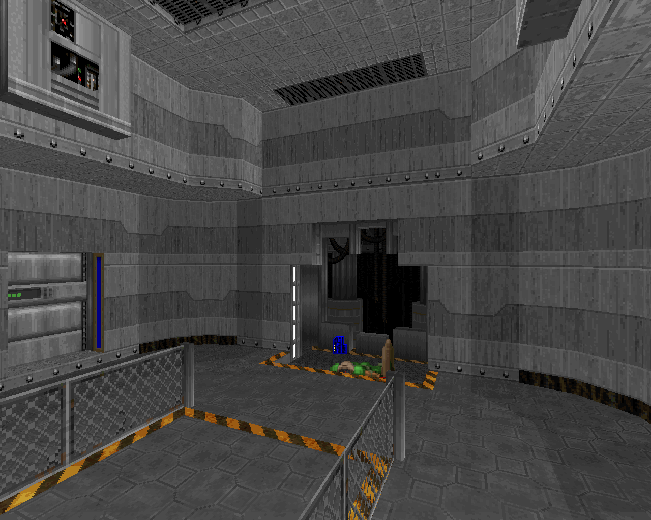
Vanilla Doom can’t handle nearly as much detailing or architectural complexity as other mapping formats, or even as much as “limit-removing” maps that use vanilla format but are intended for more advanced source ports. The key to Espi’s design is to rely on sector detailing as little as possible, instead conveying most of what reads as “detail” through good use of basic architectural shaping and texturing. Espi was a master of what esselfortium refers to as “material texturing”—the idea that textures should be treated as though they’re actual building materials rather than wallpaper pasted over a surface. The natural lines of the textures line up perfectly with the lines of the architecture (doors, windows, ledges, etc.), and the overall length of any given surface is a multiple of the size of the texture that it uses, so that there aren’t any odd cutoffs—even if the lines aren’t vertical or horizontal and therefore can’t conveniently be snapped to a grid. Needless to say, this requires a lot of attention to detail.
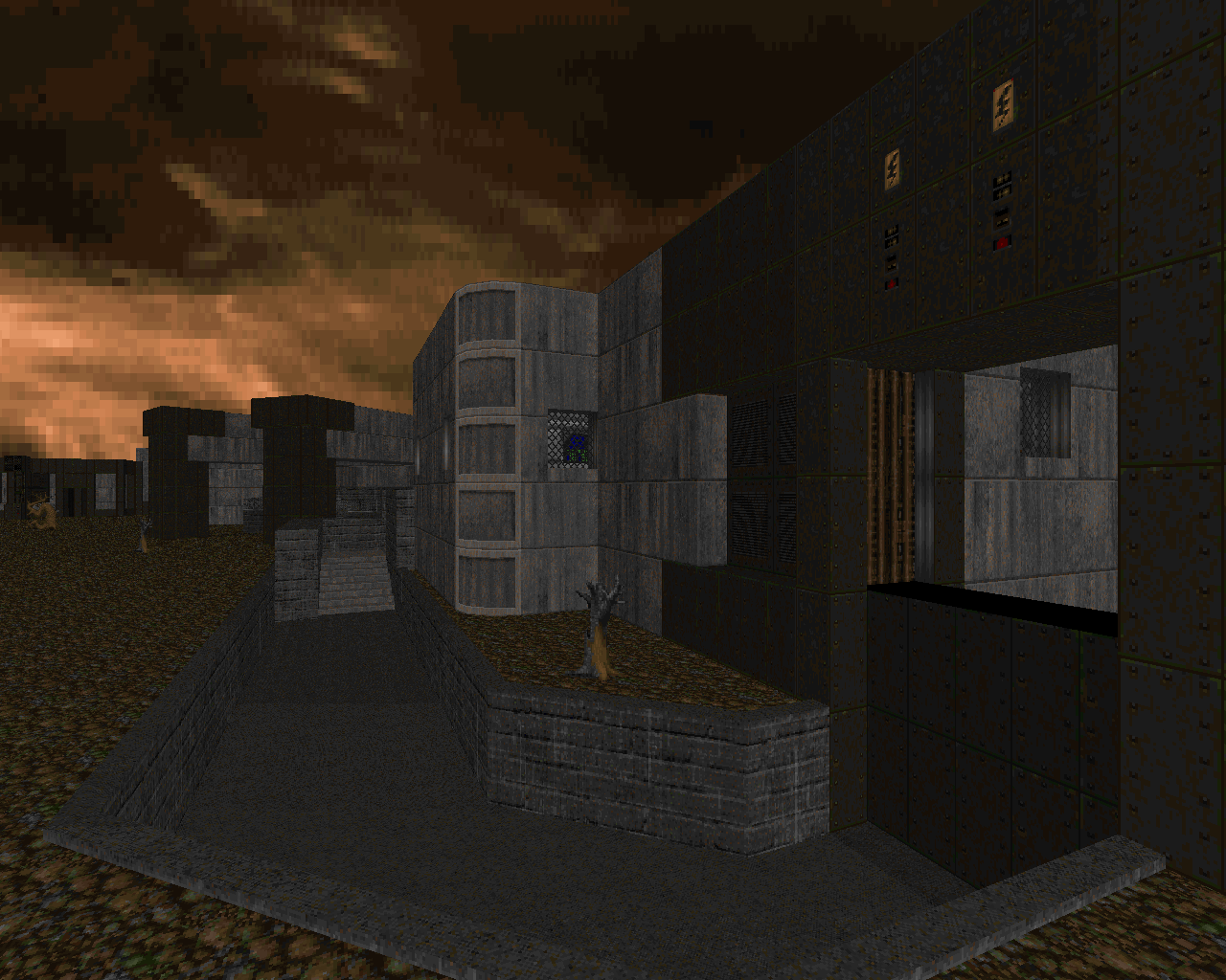
The larger architectural structures, particularly the ones you can see when you’re outdoors and have a larger field of view, have interesting shapes and frequently use contrasting textures to develop the sense of interplay between overlapping/connected structures. Larger details are landscaped out of these structures in a way that makes their profile interesting to look at from varying angles. The smaller detailing that exists is generally formed via nesting, in accordance with the concept of material texturing; a section is cut out of a texture that matches up with the lines of that texture, and the hole it leaves is occupied by another texture that is perfectly sized to fit the gap.
Espi was a master of “material texturing” – the idea that textures should be treated as though they are building materials rather than wallpaper pasted over a surface
Espi also uses a lot of midtextures (grates, fences, hanging cables) in place of sector details, which helps keep the line count down and makes certain details much easier to construct (such as the spaceship that forms the exit of the last map). Like Romero’s maps in Knee-Deep in the Dead, Suspended in Dusk is full of spots where you can look through an opening or across a chasm and see other parts of the map, which adds to the feeling of complexity; the midtexture wizardry augments the visual interest of these views while also frequently forming a natural-looking barrier. Every detail in Suspended in Dusk is very individualized, in contrast to the “copy-paste” style of detailing that is sometimes used in more complex maps and frequently derided by critics of those maps—so you never really see the same thing twice, but the aesthetic feels very cohesive because it’s all constructed using consistent methodology and techniques.
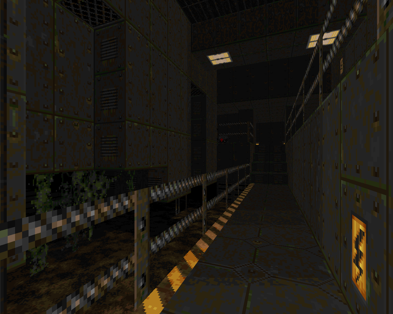
Espi’s mapping style is one of those that gets away with not being particularly combat oriented, because despite its simplicity, the player has plenty of other things to focus on, and because the combat design is also simple, you have the opportunity to focus on those things. Challenging or monster-dense combat certainly isn’t outside the realm of possibility in vanilla mapping—Hell Revealed, Kama Sutra, and Back to Saturn X would all have something to say about that—but I think Espi would probably have felt that such combat detracted from his style of design. Suspended in Dusk is all about atmosphere, after all.
The vanilla resurgence was about going back to the beginning: simplicity as a response to complexity, purity of design as a response to perceived excess
And when it comes to vanilla maps, atmosphere is achieved more through suggestion than through effects, which is one reason Suspended in Dusk feels so artful. Partly it’s the dusky sky and the grungy textures that suggest the ache of things long gone. Partly it’s the subtle lighting and the feeling that the base is a derelict, frozen in mid-motion, its absences all the more conspicuous because of how realistic every detail feels. Partly it’s the little bits of story, the approach through rocky canyons and the way the buildings suddenly loom into view, the rooms and pieces of machinery that seem to have a lost purpose, hinting at things unseen and unknown. Partly it’s the way the map always seems to extend far beyond the spaces you can interact with, as though it fits into a wider world. But most of all, it’s the starkness itself that makes the mapset so vividly haunting. Even the monster placement is a part of that; because it’s more about presentation than bite, it gives you the feeling of carefully carving your way through a realistic setting, revealing new pieces as you go, again hearkening all the way back to Knee-Deep in the Dead. The vast majority of modern retro mappers have followed suit, though not all; for a mapper whose core goal is simplicity, any perceived complexity is a distraction, whether it’s complexity of combat or aesthetics or features. It’s not just that working within the limits of vanilla Doom forces a mapper to accomplish more with less, thereby honing their skills; it’s the idea that the bare bones of map design are beautiful in and of themselves.
-
 Back to Saturn X E1 and E2 - esselfortium et al. (2012/2014)
To the Limit
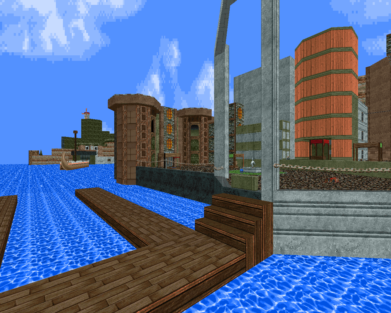
Esselfortium has pointed to Espi as one of her biggest influences, and a number of maps in her three-megawad uber-project employ techniques used in Suspended in Dusk, particularly the maps made by essel herself. It’s quite a bit more than a simple tribute, though. Back to Saturn X is more about the question of just how much juice can be squeezed out of the vanilla Doom engine, both in terms of technical achievements and gameplay. The incredibly detailed artwork and highly efficient, highly saturated palette are suggestive of something far more modern than you ever would have seen in the ‘90s, almost like an idealized, retro-futurist version of the Doom community’s standard nostalgia. The combat, too, feels more modern, taking its ideas about map flow and combat pressure from the Scythe 2 lineage to create something of a hybrid between contemporary complexity and the simplicity of the classics.
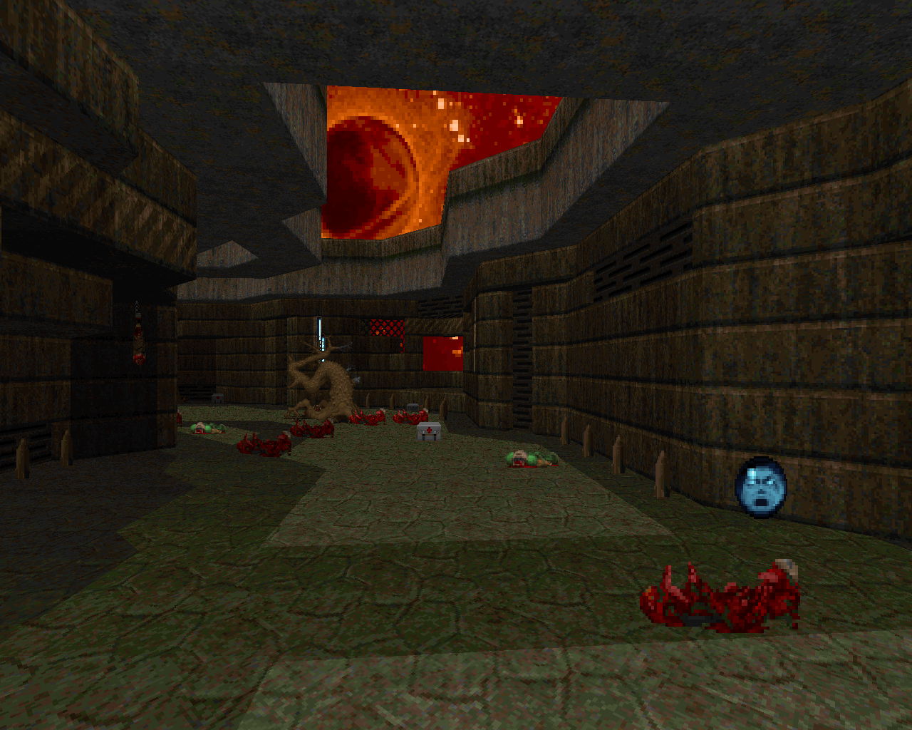
The two currently released megawads manage to sneak in all sorts of cool geometric voodoo to create lighting and other effects that appear more advanced than vanilla should allow. But above all, the scale and beauty of the maps push the absolute limits of vanilla Doom, to the point that “Speedtraps for the Bee Kingdom” (E2 map 20) and “Unstable Journey” (E2 map 25) are both at the blockmap size limit, meaning that adding just one more sector to either of them would cause a crash (incidentally, there’s one other vanilla map known to be at this limit: none other than “Misri Halek”).
Back to Saturn X is about how much juice can be squeezed out of the vanilla Doom engine, both in terms of technical achievements and gameplay
In short, BTSX packs in a lot of wow factor, which amplifies the message that all the crazy things it gets away with shouldn’t be possible in vanilla Doom at all. As a result, it’s become something of a paragon for many vanilla enthusiasts—why bother with advanced port features or mapping formats at all when you can create something like this in vanilla? My impression is that this was always the message BTSX wanted to send, the raison d'etre for mappers like esselfortium.
