-

-
Chapter 10:
Murder Machines
-
As you’ve probably gathered, the Doom community’s neo-classicists can be grouped into a few different schools of mapping. If Scythe 2 and its successors are a continuation of Alien Vendetta’s legacy, and Suspended in Dusk and its children are often a throwback to Doom itself, then it’s no surprise that people are still carrying on the challenge-oriented ideals of Plutonia and Hell Revealed as well. Hardcore players keep getting better, after all, and nothing is going to be able to keep them at bay for very long.
It’s hard to have a conversation about challenging combat in the Doom community without someone bringing up the term “slaughter”—usually derogatorily, since the challenge aficionados tend to prefer terms like “combat puzzle” and “stuff that isn’t boring.” There are always plenty of people fanning the flames on both sides, and it’s a common joke at this point that inexperienced players will describe virtually anything that they find difficult as “slaughter,” including mapsets more in the vein of Plutonia or the Scythe series. Plutonia’s “Go 2 It” is widely regarded as the first slaughtermap, but you’re not likely to find any exact consensus on what the word means, and its origins are somewhat uncertain—though classic mappers like Anders Johnsen have noted that similar terms were in circulation as early as the ‘90s to describe WADs like Hell Revealed, and they gained traction on forums and in text files for mapsets like Alien Vendetta and Deus Vult 2 throughout the 2000s.
It’s hard to talk about combat in the Doom community without someone bringing up the term “slaughter”—but you’re not likely to find any consensus on what the word means
Hardcore players will generally recognize that “slaughter,” despite being a fraught term, does refer to a distinct genre of mapping—though its branches don’t all necessarily trace back to the same trunk. Matt Tropiano’s “For We Are Many” (Community Chest 3 map 29) and Huy Pham’s Deus Vult series, which were early examples of hyper-dense slaughtermaps and distant forerunners of the modern genre, evolved out of the type of combat you see in the later maps of Scythe 2 and Alien Vendetta. Meanwhile, death-destiny was developing a Plutonia/Chord-inspired mapping style that revolved around the extremely unfriendly placement of small groups of monsters but frequently extrapolated that type of combat into much larger, denser playgrounds. Throughout the 2000s and 2010s, TimeofDeath developed multiple unusual combat modes guided by a variety of eclectic interests, including coop play and rocket jumping, often featuring them in enormous maps with many hundreds or thousands of monsters. Call it convergent evolution, if you will. But the primary school of design that has dominated hardcore challenge mapping throughout the 2010s can easily be traced back to one insane level designer.
-
 Sunder - Insane_Gazebo (2009)
The Hornets’ Nest
The first thing anyone will notice about Sunder is that it’s huge. Huge and visually intricate, creating a sense of scale that was previously unrivaled and has rarely been matched even in the decade since its initial unfinished release—probably because it’s very difficult to pull off successfully with the classic sidedef limits, and perhaps because its many creative children have “known better” than to try and chain every other design choice in the service of creating that enormous scope. Certainly Sunder goes all in—the feeling it gives you of being completely dwarfed, of being surrounded by fractal patterns of detail expanding outward at a cosmic scale, is so jaw-dropping that it alone is worth the price of admission. The early maps are large and atmospheric, but you get your first true taste of this feeling while attempting to traverse the massive grounds of “Pale Monument” (map 08), and then again as you descend the elevator at the beginning of “The Cage” (map 09), watching what seems like an entire world unfolding before you. “Hag’s Finger” (map 10) does one better, though at the opening standstill you might not even realize it; it’s not until you take your first steps forward and your vision’s 3D triangulation kicks in that you realize how utterly enormous the structure you’re looking at actually is. The visual style reaches its pinnacle in “The Furnace” (map 11), which is so mind-bogglingly huge that it’s almost impossible to absorb any given view of it.
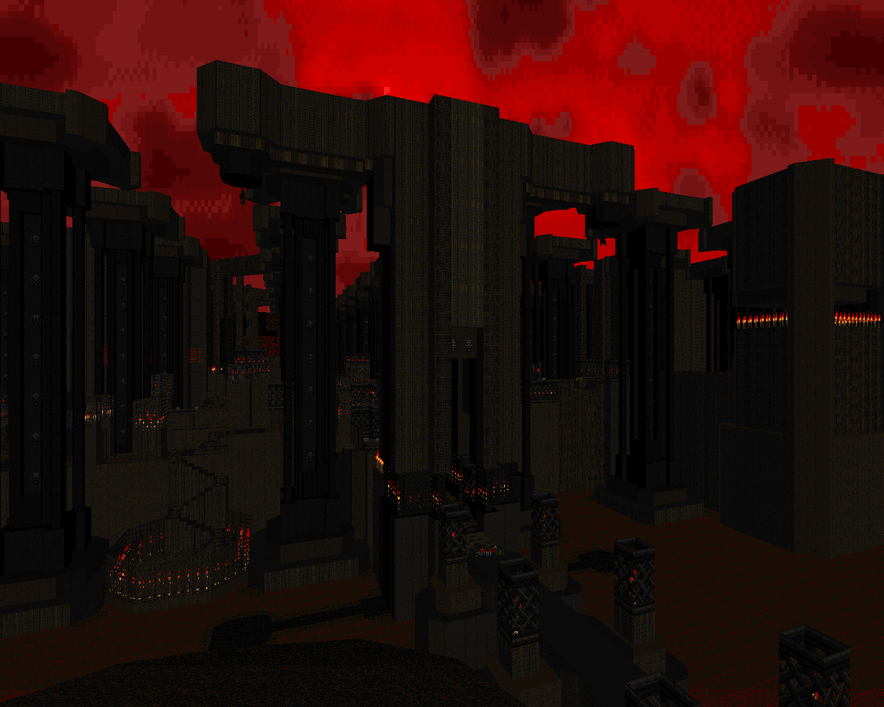
It’s not just that the spaces are large, but more importantly that they keep giving you a sense of an enormous view that stretches on into infinity, no matter where you are, and that view seems to always be filled with complex structure. The detailing is a dramatically scaled-up version of Scythe 2’s simple but easily expandable style—tons of borders and fringes, elaborate pillars, rocks with liquid falls, attention to silhouettes where sky is showing—but with a twist of madness that perhaps comes from the art of H.R. Giger: so much complexity, and with individual shapes that are so illogical, that it creates a sense of something totally alien and unfathomable. More than the size of the maps, this visual style is what later slaughter works have tended to imitate, though again, few have managed to match Insane_Gazebo’s levels of awe-inspiring structure because their vision is tempered by sanity, both for better and for worse.
More than the size of the maps, the visual style is what later slaughter works have tended to imitate, though few have managed to match Insane_Gazebo’s levels of awe-inspiring structure
In Sunder, the thematic concept, atmosphere, and psychological impact of the map come first, and the combat mechanics and choreography generally come second. Though some seasoned mappers may tell you otherwise, this is an option that you have as a level designer; if you’re expected to marry visuals and gameplay into one unified whole, then you can approach it from either end just as effectively, establishing whatever your first priority is and building everything else to work around it. In Sunder’s case, the combat appears to grow out of the author’s deep fascination for the scale and otherworldliness of the settings as he’s creating them, using the density and enormity of the combat as yet another psychological element while creating (for the time) complex and challenging fights around the spaces that already exist.
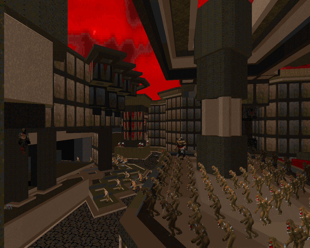
This willingness to play with and take inspiration from spaces as they’re being created, to allow them to expand and have a life of their own, is perhaps what led to Sunder’s greatest breakthrough with regard to gameplay. Sunder’s combat puzzles take place on a scale as enormous as the maps themselves. Virtually all earlier slaughter-scale hardcore maps followed in the style of Hell Revealed—including the larger late-game maps in Scythe and Scythe 2—meaning that the combat happened a piece at a time, allowing you to carve out your foothold, clean up, and move on to the next challenge or slide across the center of the map to deal with the next block of entrenched enemies. The discrete chunks of action don’t blend unless the player actively tries to blend them, if at all. In Sunder’s larger spaces, the entire map can become one gigantic fight, almost effortlessly, a hornet’s nest that you can stir up at will. Even in the smaller earlier maps where the arenas do tend to be presented as discrete units, there’s a lot of play in how you can approach them. Insane_Gazebo was the first, or among the first, to develop combat puzzle choreography on such an extensive scale. And because of the freeform nature of these combat sprawls, and the extent to which the monsters themselves are free-roaming, the enemies rather than the player become the besiegers, in direct contrast to the old Hell Revealed style. In this new mode, evasion and mobile crowd dynamics become the key to success, and the player’s ability to react to a changing environment is critical. The importance for modern slaughter can’t be overstated; simply put, hardcore challenge mappers locked into Sunder’s new gameplay mode and never, ever went back.
Hardcore challenge mappers locked into Sunder’s new gameplay mode and never, ever went back
The beautiful thing about having the monsters and the environment so blended as a unified, overarching threat is how hostile it makes the maps feel. That feeling of total hostility is exemplified early on in “Precarious” (map 05), which sees you running tight platforming sequences while under heavy fire, a chasm of deadly lava far below—but it’s a major part of the experience in every map in the set, even when the environmental hazards are lighter, partly because the scale and atmosphere of the maps get deep inside your head and partly because the thousands of monsters that populate each map seem to be crawling out of the walls most of the time. It’s as though the map itself is a malevolent living thing that lusts for your demise.
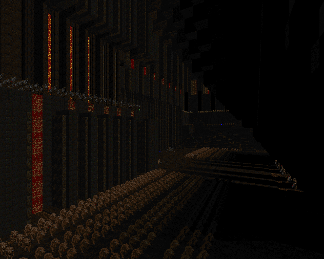
Interestingly, you could just as easily frame it as the exact opposite, and say that the map is a cold, dead machine, totally unfeeling, a construct whose only purpose to kill you. In some ways, Sunder builds on the ideology of ‘90s challenge mapsets like Plutonia and Hell Revealed, where nothing else matters except the player’s sense of being pressured and challenged, and takes it to its logical conclusion. But with Sunder, the aesthetics finally become an important aspect of that. The sheer enormity of the environments, the alien complexity and mad structure, and the hostility of the challenges—it all comes together to create the sense that you’re nothing more than a rat trapped in an endless god machine, and there’s never any way to truly escape, just some new trial of skill around the next corner. And really, isn’t that what hardcore players wanted all along?
Sunder offers the feeling of being up against overwhelming odds, rather than actually pitting you against overwhelming odds
Compared to modern hardcore mapsets, Sunder usually doesn’t push all that hard (though a handful of segments remain pretty harsh). The niche that it created has come to be populated by absurdly skilled players, and it demands much tougher and more refined challenges. But maybe that was never the point of Sunder, per se. Sunder is so much about the impression it leaves on you, the spectacle of everything you encounter. For players who are newer to the genre—or those who existed at the time of its semi-release, who didn’t have the benefit of having played Sunlust or other more dynamic works that owe their existence to Sunder—the mapset offers the feeling of being up against overwhelming odds, rather than actually pitting you against overwhelming odds. Part of Sunder’s widespread appeal is that its psychological experience and beauty are fairly accessible because the gameplay doesn’t shut as many people out of them. Players who have a decent amount of experience with Doom and really commit to it will generally be able to overcome its challenges…and because the spectacle is so intense, they’ll gain immense satisfaction from doing so.
-
 Stardate 20X6 and Swim With the Whales - Ribbiks (2013)
Killer Colors
If you were around in 2013 or have read the Cacowards from that year, you probably know how big a deal it was when Ribbiks showed up with his first two major mapsets. Sunder was something of an art piece—complicated to replicate and notably unrefined in some ways, it was a pretty difficult concept for other mappers to work with, especially those who were fond of Scythe 2’s sleek gameplay style (i.e., everyone). It was Ribbiks who finally made it work.
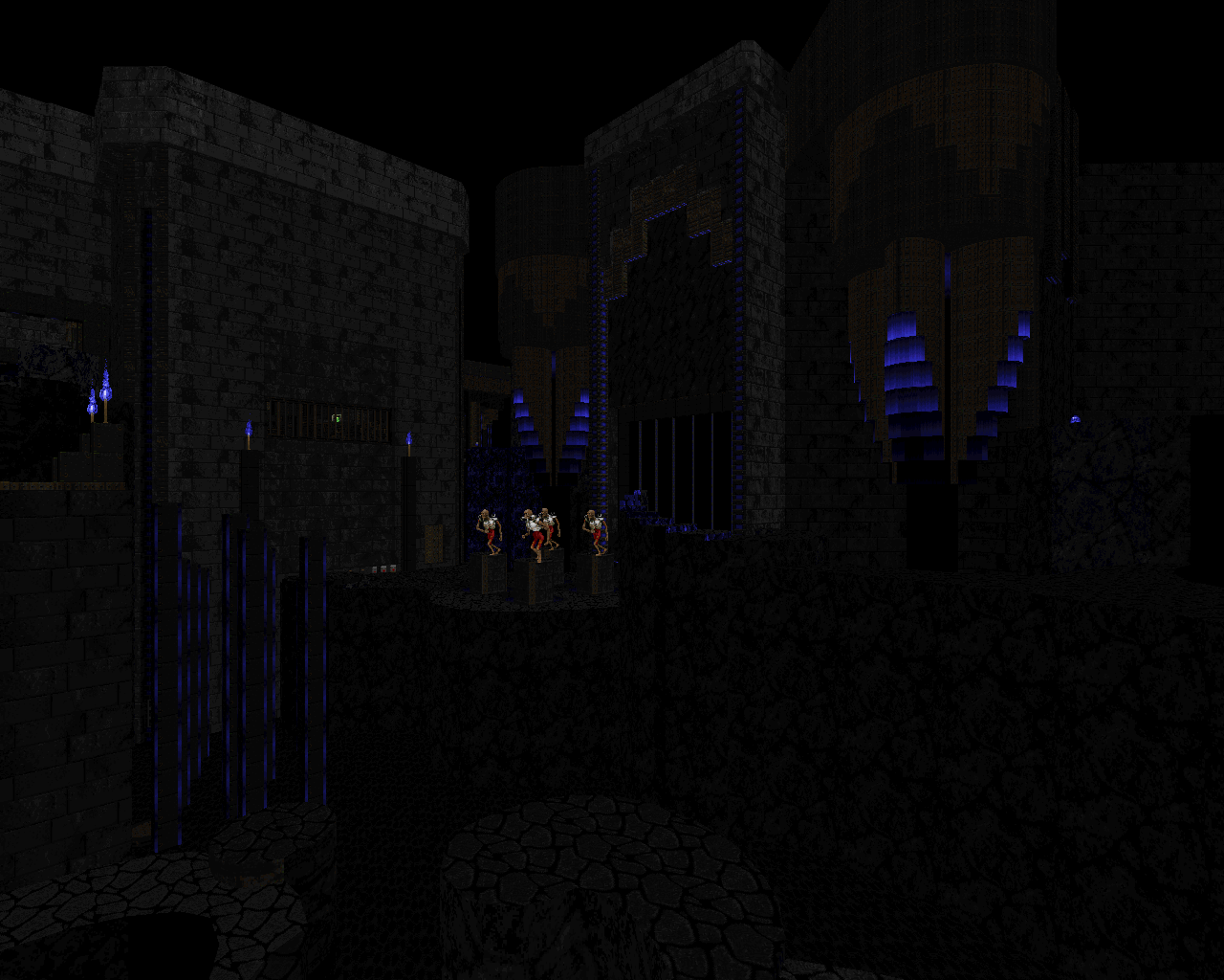
Ribbiks’s visual style is more simplified than Sunder’s, closer to its Almian influences and typically working on a much smaller scale. Each mapset is built around visual unity a la Scythe 2’s episodes, but with a color rather than a texture scheme as the unifying factor. The use of color was strikingly unique at the time, since most maps before then had been based around Doom’s color palette, which doesn’t offer deep representation for cool colors like blue and purple; each of Ribbiks’s mapsets required the creation of a new palette. The maps rely on strong contrast to set the aesthetic, with the primary color serving as bright highlights against grungy metal and other dark, nearly colorless texturing.
This type of setting may well be the ultimate expression of the map as unfeeling machine
Despite all the differences, this style retains a lot of Sunder’s mood elements, particularly the sense that the environment is a pure mechanical construct. Ribbiks uses a ton of metal, usually in jagged or geometric patterns that work like a smaller version of Insane_Gazebo’s aesthetic; in the midst of this, he places distinct landmark details, such as the towers in “Magnus” (Stardate 20X6 map 07) and the glowing metal spirals in “Swim With the Whales” (SWTW map 03), which call to mind Sunder’s visual complexity without expanding it to the entire map. Ribbiks is well known for establishing his environments as a series of islands in the midst of pitch-black void space, which aids both the color contrast and the sense that the setting is abstract and isolated. This type of setting may well be the ultimate expression of the map as unfeeling machine, which is probably why it’s so hard to find a post-Ribbiks hardcore mapset that doesn’t use it.
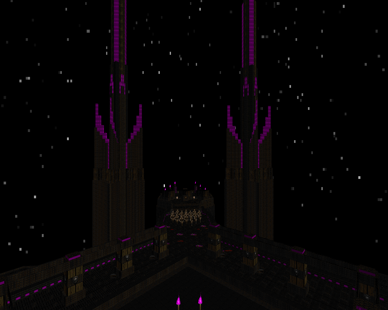
And for Ribbiks, the psychological feeling of hostility simply is not enough—the maps have to be hostile in the truest sense. They have to murder the shit out of you. Like an evolved version of the challenges present in Plutonia, the Chord series, and death-destiny’s work, Ribbiks’s gameplay (combat dynamics and everything else) frequently toes the line between acceptable design and being a total asshole, appealing to the best players because it pushes their skills – his more moderate maps demand a solid baseline of knowledge and skill, and his harder ones are designed so that you can only beat them if you’re extremely good, which has led to Ribbiks being one of the few voices championing Hurt Me Plenty as the “intended” experience and Ultra-Violence as a step beyond (though Ribbiks’s HMP is still harder than Sunder). His work is full of actively belligerent setpieces and other challenges—such as the fight with teleporting conveyor-belt Cyberdemons in “Ride the Dolphins” (SWTW map 02), the extended platforming sequence in “Vehelits” (SD20X6 map 06), and the truly unforgiving Arch-Vile horde fight at the end of “Magnus,” where a single misstep is death—that could easily induce a ragequit from many players but are welcome changes of pace for their intended audience. Ribbiks’s later work perhaps exemplifies this even more; the most famous example is certainly the Arch-Vile carousel in “Go Fuck Yourself” (Sunlust map 29), but the more avant-garde Magnolia deals almost entirely in challenges that are, shall we say, exclusive. Though Ribbiks’s popularity shows that his maps are more manageable than they may seem, his gameplay stylings have opened the gate for modern hardcore mapping to ascend to a truly niche domain, with more fine-tuned combat mechanics and more refined combat puzzles that cater to the best of the best.
