-
 PainSlayer - Agent_Ash
Doom 2, GZDoom
It's been interesting watching attempts to recreate other games in Doom grow and evolve over the years. It doesn't seem like so long ago that we were still looking at grainy screenshot-based sprite-ifications of 3D models paired with janky DEHACKED, or even EDGE's DDF taking the community into its wobbly first steps into plain-text mod scripting. Yet here we are, basically worlds away from such origins, with improvements in both skill and available tools allowing for painstaking, gorgeous adaptions that blend one classic into another with a surprising amount of grace, preserving the strong points of both games.
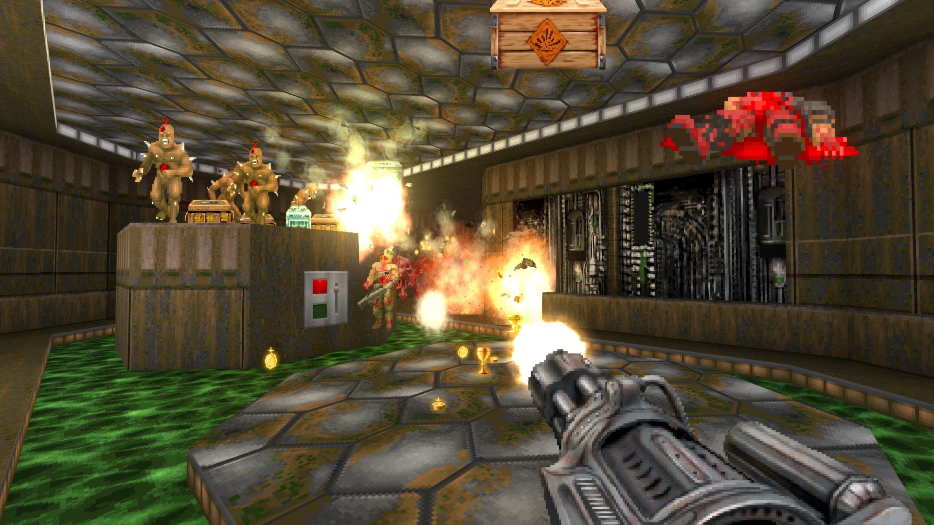
Painslayer, as the name suggests, transplants the gameplay from 2004's Painkiller into GZDoom, and it's quickly clear just how much effort has been put into recreating and imitating the original game's experience, right down to the rotating compass on the HUD. A host of useful options, like swapping primary and alternate fires on specific weapons, are present, and among them is the ability to enable Painkiller style player movement. This feels pretty close to the original (right down to the crazy bunny hopping!) and really changes the feel of gameplay as you stomp through your favorite mapsets... and this is even before factoring in the weapons and the cards.
The Painkiller arsenal - which traditionally consists of common FPS weapons bolted together into primary/altfire combos - is lovingly recreated with all its perks and quirks, from juggling enemies with the titular lasso-blade-thing, to hanging their impaled (and comedically flat) corpses against walls with the Stake Gun, to the numerous obscure Combo Attacks that many weapons include. What isn't copied over is their sprites, which have been lovingly recreated from scratch in a well-rendered and animated pixel-art style. If Painkiller came out on the BUILD engine, this is what the weapons would look like.
While Agent_Ash could be forgiven for stopping with just recreating Painkiller's movement and weapons, he went further. Monster corpses dissipate into Souls, which can be picked up. Upon collecting 66 souls in a single map, you temporarily transform into a hulking, invulnerable demon, with an instant-kill hitscan attack and a screen filter showing off GZDoom's shader functionality, with monsters glowing bright red against a greyscale world and the screen dramatically rippling with every blast of your powers.
The icing on the cake is the Tarot Card system. At the start of every map, your Black Tarot board will open, letting you equip and swap out Silver Cards for passive boosts (higher base health, more ammo from pickups...) and Gold Cards for active effects you can trigger once per map (speed boosts, quad damage, slowing monsters down...), with new cards earned by either finishing maps or spending the gold you find during play. This adds a bit of extra depth to proceedings, forcing you to weigh up one buff against another in building a deck to fit your play style, while also letting you put together your own personal screw-you button with which to better survive massive encounters. Well, massive encounter, non-plural. Only once per level, remember.
There's a lot of love for the original Painkiller in this faithful tribute, with enough tweaks, adjustments, adaptions and sheer technical prowess to raise it from a mere Xerox to something that raises the bar for Game-X-But-In-Doom mods. I can't wait to see new mods and modmakers accept and meet that challenge, but in the meantime, this is the best thing to come of the Painkiller franchise in years. Not that that's necessarily a hard bar to meet - those expansions, man! - but it's a target that it more than exceeds with panache to spare.
- Kinsie
-
Doom 2, GZDoom
March of 2020 was a uniquely chaotic moment in time; across the globe we were frantically trying to grasp the ramifications of a global pandemic and making the best of a tumultuous moment in history. We used the internet to preserve our interpersonal contacts—taking advantage of video streaming, forums, and messaging applications to fill the void caused by social distancing—while others used their newfound free time to indulged their creative hobbies. It was in this environment that GZDoom began incorporating one of the most widely requested missing features: widescreen graphical support. Ports had, for years, supported widescreen gameplay resolutions, but title, intermission, and ending screens remained locked at 4:3. This injustice simply would not stand, said Nash.
Unknown to all but the most senior members of the Doominati, id software employee and Cacoward-winning coder, @sponge, had also been sent home and was working remotely on the Doom unity port—in parallel to GZDoom—adding official widescreen support. This provided Doom, Doom2 and Final Doom with official widescreen assets, but anyone who has played the Command and Conquer remaster or any projects by NightDive Studio can tell you that no company cares about the preservation of classic gaming more than the die-hard fanbase. Nash laid down an impressive set of expectations for his comprehensive widescreen mod…
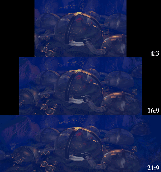
First and foremost was the preservation of the original 4:3 images. This meant that the core 320x200 fullscreen artwork that shipped with every idtech1 game had be pixel perfect while simultaneously introducing new artwork to accommodate the increased real estate players would see on screen. This is harder than it sounds… trust me. Not only did it require a technical understanding of Doom’s palette and methods for compressing artwork similar to those from 1993, you also needed a keen imagination; what did the intermission images look like beyond the existing boundaries? What exactly is that blue blob in the lower left corner of the Doom 2 title screen?
Second, Nash was determined to provide widescreen assets for every commercial idtech1 game supported by GZDoom—not just Doom. This meant that, in addition to the aforementioned Doom/Doom2/Final Doom which had official artwork, Heretic, Hexen and Strife would also have their assets extended… as well as Hacx, Chex Quest and Harmony. This might be the most ambitious aspect of the entire Widepix mod; Doom has a lot of fullscreen images, but covering all commercial games was a massive undertaking. For some games, this also meant extended sprites; Hexen in particular needed significant asset modifications to prevent the weapon artwork from cutting off at the edge of the screen—also, that stupid Hacx shotgun.
Finally, Widepix was not simply designed to accommodate the industry standard 16:9 aspect ratio, goodness no. Nash’s final rule for this mod was to support ultrawide monitors with a resolution of 21:9. This meant an additional 67 pixels of new artwork had to be drawn on each side—in addition to the 53 pixels each side needed to be 16:9 compatible. This might not sound like much, but considering the original fullscreen art for these games was 320 pixels, ultrawidescreen support meant that a whopping 43% of each new fullscreen image was brand new artwork.
Thanks to Nash’s herculean efforts, GZDoom players can now enjoy a complete widescreen experience—without pillarboxing—while playing every commercial idtech1 game ever made. Widepix might be the first passive gameplay mod ever awarded; the project doesn’t affect your gameplay experience in the slightest, but, as someone running Doom on an ultrawidescreen monitor, I can tell you there aren’t many mods that make Doom look this good…
-
 Corruption Cards - CutmanMike
Doom 2, GZDoom
A good few years ago, there was a burst of small "mutator" mods for GZDoom, ala their UT99 namesakes, with a similar aim – smaller alterations to monster, weapon or map behavior to make things interesting without completely changing everything as gameplay mods tend to do. The end result was a smattering of tiny, fun tweaks and gimmicks that kept things fresh without unnecessarily file size blowouts, and you occasionally still see them pop up in one form or another, usually to crack a joke on Twitter or show off some neat scripting party trick. Corruption Cards takes the philosophy of these small plugins and expands upon them in a fresh and highly-replayable way.
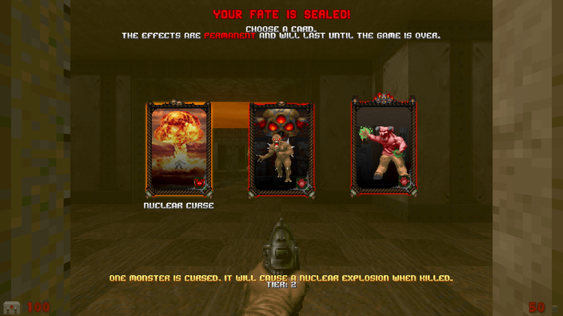
At the start of each map, you’re presented with a choice of one of three cards, each presenting a different wrench to throw into the works. These range from the typical stat buffs like faster monsters, to more monsters spawning in at the least opportune time or place, all the way through to more esoteric selections like occasional bouts of acid rain in outdoor areas or monsters afflicted with curses that mess with you if you kill them. Every three maps, you have to choose a card that sticks for the rest of your playthrough. Rinse and repeat until you’re dealing with a combination of gimmicks, like monsters that explode on death while also leading around weaker mini-monsters on leashes. There's a surprising amount of strategy in taking the cards you’re dealt and choosing your poisons, figuring out how to best mitigate (or exploit!) their effects.
So, what are the key ingredients that elevate Corruption Cards above other mutator-style mods? First, the technical side of things. The mod has grown alongside ZScript over the last couple of years, and it carefully utilizes and exploits its capabilities to make its alterations to Doom’s inhabitants without replacing any of the pre-existing characters or weapons. This allows the mod to co-exist in relative harmony with other mods and mapsets, to the point of automatically generating new cards to apply effects to any custom monsters it finds! I’m personally a huge proponent of combining mods together and supporting "mods of mods", so this is a massive bonus in my eyes.
Secondly, the polish. Monster buffs are accompanied by particle effects, buff-triggering sound cues and other audiovisual niceties that make it clear what each monster’s deal is, with lots of additional subtle polish like flying monsters having appropriate means of becoming volant (wings, jetpacks, rocket thrusters...). It’s always clear what’s going on, and when you have monsters becoming enraged at half health, flying, spewing acid blood, turning into statues and occasionally threatening to go up in a thermonuclear fireball, avoiding player confusion is more important than ever. And the menu at the start of each map looks and acts fantastically, with a level of menu polish that’s only started to be seen over the last year as powerful libraries like ZForms have taken form and done the necessary heavy lifting.
Finally, the balance and customization. There are all sorts of settings to dial in, and the included presets are carefully tweaked to keep things exactly as fair (or unfair!) as you want them to be. Whether you only want certain types of effects (monster effects, world effects etc.) or want to go hardcore and make every card permanent so that your playthrough ends with 30+ horrible side effects simultaneously jostling for attention, there something there to suit your needs. There’s even a seeded Daily Challenge mode, for competing with friends!
Corruption Cards takes a simple concept and goes above and beyond with the execution, resulting in a brilliantly flexible way to add extra zest to your map library for future playthroughs. You might actually recognize it from last year’s Mini-Mod Safari, but it’s grown so much in content and polish since then that it deserves its own time in the sun for its ability to bring newfound enjoyment to maps you’ve long-since stomped through a hundred times over.
- Kinsie


