Text File
===========================================================================
Archive Maintainer : doom1 map, non-port, single-player
Primary purpose : Single+Coop play
===========================================================================
Title : Waste Treatment Center #911
Filename : wtc911.wad
Release date : December 19th, 2002
Author : Owen "Sarge Baldy" Lloyd
Email Address :
owen_lloyd@hotmail.com
Other Files By Author : a bunch of unreleased ones, including Mount Doom
Misc. Author Info : Operates website Sarge Baldy's Hardass Doom Reviews.
Spends way too much time on #zdoom.
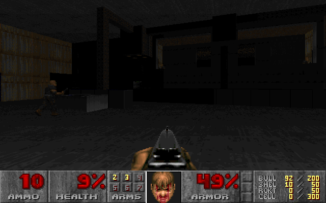
Description : A weird lil map that looks too bright on GL source ports,
and too dark on software mode. Somewhat Knee-Deepish, pretty
linear but I put a lot of work into it, so hopefully it should
be pretty enjoyable. May eventually become part of a set.
Additional Credits to : John Romero: my idol.
cph: for his BSP program and general friendliness
Danarchy: for being so damn cool
Matt Tagliaferri: for his nice but error-loaded DoomCAD
===========================================================================
* What is included *
New levels : Most definitely :)
Sounds : Nope.
Music : No, but I switched it up.
Graphics : Mmmm sort of.. I only really modified original ones tho.
Dehacked/BEX Patch : Nope.
Demos : Nope.
* Play Information *
Game : Ultimate Doom
Map # : E1M1
Single Player : That was the plan.
Cooperative 2-4 Player : Probably not a good idea.
Deathmatch 2-4 Player : I started to set this up but fell short. Not recommended.
Difficulty Settings : DURRRRRRRRRRRRR
* Construction *
Base : All me, baby.
Build Time : This took me about a lot of hours or so
Editor(s) used : DoomCAD 6.1 (my fave)
WadAuthor (for a couple things DoomCAD can't handle)
Wintex 4.7
BSP 5.1
Paint
ZenNode 1.1 (used during testing)
Ports used during testing:Eternity 3.31 beta 2 (used during testing)
Doom Legacy 1.40a (used during testing)
Known Bugs : None, but if you find some please tell me about them.
* Copyright / Permissions *
Authors MAY use the contents of this file as a base for
modification or reuse, granted you ask me for permission first.
You MAY distribute this file, provided you include this text file, with
no modifications. You may distribute this file in any electronic
format (BBS, Diskette, CD, etc) as long as my name is in there somewhere.
You don't have to tell me, but I'd like to know if someone wants to do this.
* Where to get the file that this text file describes *
Web sites: http://www.onid.orst.edu/~lloydo/
FTP sites: ftp://3darchives.in-span.net/pub/idgames/ and other mirrors of this
