About This File
This is my first serious(?) WAD. It started a long time ago (1998), when I decided to make something more serious than TsotsoFX (Which got a rather "funny" review at doomworld ;) I started with Deu, with a theme of a base inside a rocks and caves, the player starting from a cave with dead human bodies and destroyed walls. Then I had to remove some ugly detail which also caused a visplane error and much later I continued the project with Doom Builder.
Well, now this thing doesn't even load with the old engine of Doom, however I use Zdoom anymore, so I didn't even bothered to search what it is.
The level ended preety weird, some areas are full of monsters, some random rooms here and there (Like I was bored and wanted to finish with this WAD fast, designed some boring empty rooms and filled it with monsters ;P). It doesn't have any consistent theme anymore as I originally planned..
But there are some preety nice stuff that you should check. First, there are many diferrent ways to go through the level (non linear). There are two diferrent ways to get the secrets at the two pillars near the beginning. Areas are connected via many diferrent ways, many walls at some caves must be shot to reveal new secrets (might be kinda annoying for someone to search I think now, but search for jagged walls)
There are few nice rooms I love (like the big sea, harbor with pillars, final areas (with a dighole in the end and the sign of Epsilon Team to end the level (What an absurd idea I had ;P)))
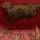
And especially the mighty easter egg!!! Search for the rocks near the sea and you will open a place where I used some additional graphics and a scrolling set of 1 length linedefs to produce the effect of moving sinus rasterbars (like in the old C64 and Amiga demos) plus two scrollers in parallax. I have more ideas for some tricky stuff with new gfx and scrolling textures for the future..
That was long. I am used to writting bigger texts than the usual ;P
p.s. And not to forget. In the very beginning you have to shoot the rocky wall near the one barrel to go on.. (Might be annoying with those shooting walls, not gonna do it again ;)


