Jump to content
  • NOTE: There is a known issue with the most recent entries having screwed-up information and links. Some databases are out of sync and we haven't been able to fix it yet.

tectonic

   (34 reviews)

Guest

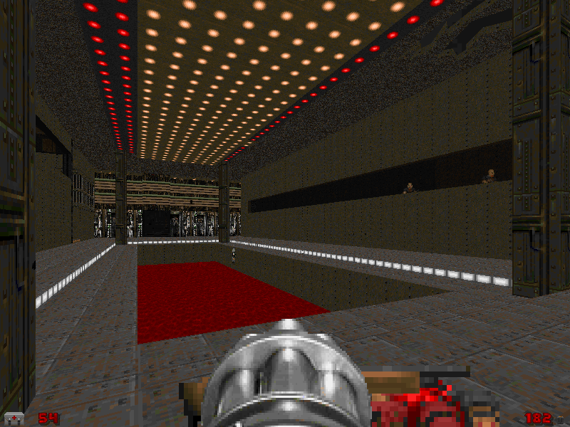
5 Screenshots

About This File

UAC VOICE LOG...

"Progress with the new base is going well. The base is hidden away in some previously unknown ancient ruins."

UAC VOICE LOG....

"Yesterday several workers reported "deep earth movement" in the southern sectors, lava began to flow and work has been halted. 7 ceilings have collapsed and engineers have been called."

UAC VOICE LOG....

"2 engineers have gone missing and there have been 4 large explosions, we need backup we are under attack from a large unknown force........................"

User Feedback

Join the conversation

You can post now and register later. If you have an account, sign in now to post with your account.

Guest

Guest

Unknown date

  
4/5 for good detail work a few missing lower unpeggs bu nothing worth complaining about, a bit too easy but fun gameplay! A megawad with this detail would be gold!

Share this review


Link to review
Guest

Unknown date

  
A pleasantly unpretentious map - good clean fun in attractive surroundings. I'll also give it 4/5 - a bit generous, but it's too good to get a 3.

Share this review


Link to review
Guest

Unknown date

  
Looks nice without overusing detail, but the gameplay is fairly dull.

Share this review


Link to review
Guest

Unknown date

  
KICKS MEGA ASS I GIVE U A FIVE!!!! ***** 5/5 GREAT DETAILING IMAGINE HOW GREAT THIS WOULD BE IF U PUT ZDOOM EFFECTS INTO IT!?!?!?!?!?! OMG!!!! ok im done. :)

Share this review


Link to review
Guest

Unknown date

  
Excellent level. Has good detail and design. Maybe a bit to much powerups and weapons but quite a maze of a map which made it hard since i couldnt find the blue key. But overall its whole design and maze like map is what its best feature is

Share this review


Link to review
Guest

Unknown date

  
I would also give it a 3 because of lacking gameplay and a little confusion of running around and pressing buttons, but the details brings it to 4, esp. those broken ruins and stuff..

Share this review


Link to review
Guest

Unknown date

  
A short map that will last for two or three tries. In terms of detail is quite average with little texture variation and mostly brown themes. Gameplay wise it´s not exciting, but it´s quite "open ended" and will provide switch hunters with nice fun. The monsters were well positioned but were not enough, some more could have been used in ambushes. Finally, the map is not hard and there´s ammo and items to go on a rampage. A nice map given it´s the second work of the author. 3 stars.

Share this review


Link to review
Guest

Unknown date

  
You should always 'overuse' detail. This was pretty dull with a 60 or so monster count.

Share this review


Link to review
Guest

Unknown date

  
This map was ugly, too easy and didn't have any sort of level progression. It wasn't a level, just a collection of rooms thrown together. 2/5

Share this review


Link to review
Guest

Unknown date

  
too easy... 2/5

Share this review


Link to review
Guest

Unknown date

  
Hey, thanks for the constructive critisism, where are all these missing textures? This wad as never crashed for me. I asked for play testers and got told to piss off..... email me if you have the time. thankyou for all your pointers.

Share this review


Link to review
Guest

Unknown date

  
Fair stuff, nothing great but some effort in it, good for a quick blast. And under these circumstances wotw. I'd say 3 or a lil better.

Share this review


Link to review
Guest

Unknown date

  
Way too easy, gameplay was boring because of the lack of monsters.The detail was good enough ive seen worse than this.Ill give this map 3 stars, for me this is an average map. The map didn't chrashed for me also, but then again I played it with zdoom.

Share this review


Link to review
Guest

Unknown date

  
Too unlinear. Too few monsters. Incorrect textures used for switches (use textures where switch is out, not where it's in). The only good side is detail, because layout is crap too. 2/5 - Zalewa

Share this review


Link to review
Guest

Unknown date

  
This feels like a good level from 1995. It's short and simple, with some odd quirks (the level has half a dozen super shotguns lying around, the switches work "backwards"). Apart from a nice-looking broken bridge the design hails from the mid-1990s. It's decent fun to play, although there should have been more monsters and less health and ammo. The final battle is a disappointment, because there isn't one. And there's nothing really port-y about it.

Share this review


Link to review
Guest

Unknown date

  
Luvly. Cool idea and design. Perhaps it's quite too generous with ammo and bonuses, but who cares. Looks pretty and plays good 4/5 -- Brun Ohn

Share this review


Link to review
  • File Reviews

    • By D3rpyD00dlez · Posted
      I genuinely enjoyed this mod with its level design and music. It was challenging and interesting and it kept me playing a while after beating it to try to find anything. though I would say it was slightly repetitive and overwhelming with enemies at some moments.
    • By LouigiVerona · Posted
      Writing a review for Darkening 2 is tough. It's a beloved megawad, and for good reason. As many other reviewers have said, it is historically a very important project.   It was an important megawad for me personally. I fell in love with the first level in particular. The music, the realistic architecture, so reminiscent of the video games of the 90s... It all left a lasting impression. And it was one of the most beautiful wads I've seen at the time.   But I rarely played anyt
    • By Ofisil · Posted
      A competently made map, for sure, but fun? It's way too long and repetitive, with same-y combat & ambush scenarios used again and again, and with way too much enemies, and not that much of a challenge, even for me who isn't exactly fond of "SUPER HARD WAD #9263!!!!11!. You can cut the whole thing in half, and then cut THAT half in half, and it would be a better map. Is it bad? No, just a little bit above average, mostly because it drags a bit too long.
    • By MrSkeltal · Posted
      Generally good map design, but the difficulty as is the case with pwads tends to be uneven even on HMP, especially when you mix them with what slaughtermaps tend to be (monster spam). Too many parts where, after pressing a switch, you'll spend some time killing enemies only to realise the map maker tried to get cute and spawned a bunch of hidden archviles somewhere to start reviving everyone while you were busy wasting ammo. This is especially unfun in parts with very little cover where you'll b
    • By Ranger Qwerty · Posted
      I like the part where I pay for the numerous murders I committed by getting beaten up by either a Mancubus or an Arachnotron, it changed my outlook on Monster Priority. Thank you "Problematic" Revenant #7, I have yet to find a way to repay him.
×
×
  • Create New...