Text File
===========================================================================
Title : Ultimate Doom Poster
Filename : poster.png
Author : Peter Heinemann
Uploaded by : Simon Howard (fraggle)
Email : fraggle@gmail.com (Sorry, I do not have Peter
Heinemann's current email address)
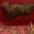
Description : This is a reconstruction of a Doom poster seen in
a photo of Id's offices. The poster features a
red demon face set against a black background, a
large version of the image that appeared on the
cover of the "Ultimate Doom" box. The poster
itself apparently was never commercially
available, implying that the poster in the Id
photo was a one-off one-of-a-kind print.
This is a high quality file suitable for
printing as a poster at a print shop. As a
result, the file itself is very large.
I (fraggle) am uploading this to the idgames
archive; Peter Heinemann gave me this file to
host several years ago as he needed web hosting
for it. His original description of this file is
included below.
===========================================================================
* Original text file *
Hi,
this is a kind of "reconstruction" of the big demon poster hanging at
id's headquarter, that - as far as I know - was never for sale. I took the
demon from the early Ultimate Doom game box (Mac version) and the Doom tag
from the poster that came with the later Ultimate Doom box (also Mac
version). Some assembling, retouching...
Please do not sell this poster. And don't pirate their games. 'nuff
said...
Before shopping for a large printout, please ask at the printshop for
a "trial" print of a smaller area, just for the case that the colours
need some adjusting. But I guess it will print out fine. It does not
need to match a "Ferrari red", better look that the "Doom" tag has the
correct colours, the demon looks frightening in almost every "teint",
even in green ^_^
Those large prints are expensive, so better ask for a smaller piece
before ordering the whole cake ^_^
The measurements in centimeters (Metrical System Rule The World!):
70,04 x 105 cm
Resolution: 150dpi
RGB Tiff
The measurements in inch:
27,573 x 41,34 inch
Resolution: 150dpi
RGB Tiff
Give the people in the printshop this data, they will prepare the file for
the print.
Don't safe the file as a jpeg (.jpg). Better leave it like it is.
Made with Adobe Photoshop 4.0 Mac. I love Macs and Doom ^_^
150dpi is enough for a printout on large format bubblejet/inkjet printer,
and you will view the print from a wider distance, so there is no need
for a 2400dpi resolution.
As you can see on the included photo (not taken by me) that shows the
original poster at id, a red coloured picture frame would make a nice
addition.
Keep on dooming!
-Peter Heinemann
Two things by the By: If English is not your first language, don't
attempt to learn English from this "readme" and please - if you still
live with your parents - tell your mom or your little sister about the
poster before you hang it in your room ^_^
===========================================================================
* Copyright / Permissions *
You MAY distribute this file, provided you include this text file, with no
modifications. You may distribute this file in any electronic format (BBS,
Diskette, CD, etc). Please do not sell this file. I have received
permission from the original authors of any modified or included content
in this file to allow further distribution.
* Where to get the file that this text file describes *
The Usual: ftp://archives.3dgamers.com/pub/idgames/ and mirrors