Jump to content
  • NOTE: There is a known issue with the most recent entries having screwed-up information and links. Some databases are out of sync and we haven't been able to fix it yet.

Nightomb (2x2 series)

   (40 reviews)

Guest

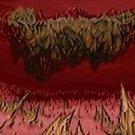
2 Screenshots

About This File

One level for any limit removing port.

The idea for this PWAD came from iddqd.ru. The main concept is: you should create a level using only two IWAD textures and two IWAD flats. Thanks Shadowman for inspiration.

PrBoom-Plus 2.5.0.1+ or (G)Zdoom are recommended.

WARNING #1: You should not use glboom at all and glboom-plus before 2.5.0.1 with this PWAD to avoid HOMs.

WARNING #2: You should disable "Try to emulate intercepts overflow" setting in PrBoom-Plus (overrun_intercept_emulate 0 in cfg), because there is a place where this overflow will happen permanently with all the ensuing consequences (semi-noclip)

MIDI: Equinox. Sounds: Power Slave, Half-Life, Doom3.

Dehacked patch, in-wad demos and PWAD composing: Andrey "entryway" Budko.

User Feedback

Join the conversation

You can post now and register later. If you have an account, sign in now to post with your account.

Guest

Guest

Unknown date

  
This has got to be one of the best maps I've ever seen. Moody as hell. I'll admit that rocket launcher room had me for a bit. Darn fucking doom lighting levels don't work well with subtlety.

Share this review


Link to review
Guest

Unknown date

  
At first... I thought this was a really solid, decent wad. After playing the entire map, I read the map was subtitled (2x2). It wasn't until AFTER I played the map that I realized the map uses just 2 flats and 2 textures. I believe that is the mark of an excellent mapper. Good use of lighting and architecture to disguise the limitations.

Share this review


Link to review
Guest

Unknown date

  
A truly memorable map, with visuals and atmosphere that far exceed what's considered typical of doom. Now, if only PHARAO from TNT was like that... -Maes

Share this review


Link to review
Guest

Unknown date

  
Traps you in the rocket launcher room with no way out. Sorry, 0/5, even though it was very nice and atmospheric up to that point - but bugs like that are unacceptable.

Share this review


Link to review
Guest

Unknown date

  
Nice atmosphere. Map makes you think, and does so well. Impressive that only 2 texes and 2 flats were used! New mappers take notes! :P

Share this review


Link to review
Guest

Unknown date

  
Awesome design but a bit too much running around and searching. 4/5 - Optimus

Share this review


Link to review
Guest

Unknown date

  
Another gem from Alexander. 5/5

Share this review


Link to review
Guest

Unknown date

  
Excellent ! On saying that though, there could have been a bit more health/ammo.

Share this review


Link to review
Guest

Unknown date

  
Very clever and slightly creepy survival map. Makes amazingly good use of limited resources, features and health to create a fairly harrowing experience. The only thing that there's a lot of is ammo. 5* -Phobus (slight issue with direction at times, but not enough to detract from the score I think)

Share this review


Link to review
Guest

Unknown date

  
A dark, harrowing claustrophobic map with an emphasis on both physical and environmental traps to constantly keep the player wary. The puzzles themselves are not too arduous as the layout is mainly linear, a careful eye and degree of perception is all that is required. Considering the unique concept and chilling atmosphere which certainly got my heart racing, combined with the intriguing gameplay I'd have to award this no less than 5, would love to see more in a similar style by Eternal. 5/5 - B.Krypto.

Share this review


Link to review
Guest

Unknown date

  
A masterpiece.

Share this review


Link to review
Guest

Unknown date

  
An excellent level. There was just enough ammo to complete it, and the stage as a whole was very atmospheric and creepy. Very well-done. The only issue that I had while playing it was that I couldn't figure out what triggered the third of the metal doors in the labyrinth (where the Revenants were behind the first two), but aside from that it was very fun. 5/5

Share this review


Link to review
Guest

Unknown date

  
I can tell this is using music from Daggerfall, but otherwise this is a beuty of a map with a kind of subtle arabian style, I also like the sprites used for the torches.

Share this review


Link to review
Guest

Unknown date

  
Amazing work. I wouldn't have believed that it is still possible to make a DOOM map this creepy.

Share this review


Link to review
Guest

Unknown date

  
Scared the living hell out of me. Amazingly clever design and extreme attention to detail. So atmospheric it'll give you nightmares. Not easy, though do-able. Some switches are not so obvious, which can lead to a bit of wasted time. 4.9/5 -jj

Share this review


Link to review
Guest

Unknown date

  
Strange concept to use so really few textures but it was quite atmospheric and a good fight. Still beatable on UV but finding the secrets make life better. Some of the riddles needed some time to be solved (blocked path) but it was still ok. 4/5 Caco

Share this review


Link to review
Guest

Unknown date

  
Clever game play, totally different. I had to think outside the box for this one. The graphics were good. Even though you had a strict limit, the map came out beautifully. But it was still kind of eerie and haunting since it was a crypt. The music was pretty good, not perfect, but good. Good work! 4/5

Share this review


Link to review
Guest

Unknown date

  
Looks mega awesome. Ammo and health were too tight for me to enjoy it. I can't stand maps like that. I ended up god moding through the last half of the map because of that, and all the traps, and because I suck. I rated 5, though. I think Eternal should've got mapper of the year for 2008.

Share this review


Link to review
Guest

Unknown date

  
There are couple of places on the map where you can get stuck for some additional time for finding a way, if you were not attentive enough, but a common atmosphere including the good selected sound effects deserves a praise - 4.5

Share this review


Link to review
Guest

Unknown date

  
No one's done this before. Brought back the first fears like in doom when you started-- and saw a cyber.

Share this review


Link to review
Katamori

Unknown date

  
^ Thanks for the information! I've heard this music several times before but I didn't know its source. =) Of course, the map itself is amazing. 5 stars. - Katamori

Share this review


Link to review
Avoozl

Unknown date

  
The author forgot to mention the music was from Daggerfall. :P

Share this review


Link to review
Guest

Unknown date

  
Amazing 5/5

Share this review


Link to review
Guest

Unknown date

  
Very good and creative. *****

Share this review


Link to review
DoomTheRobot

Unknown date

  
Really great and creative wad! Honestly, I was creeped out while playing this wad. 5/5 - DoomGeek101

Share this review


Link to review
  • File Reviews

    • By D3rpyD00dlez · Posted
      I genuinely enjoyed this mod with its level design and music. It was challenging and interesting and it kept me playing a while after beating it to try to find anything. though I would say it was slightly repetitive and overwhelming with enemies at some moments.
    • By LouigiVerona · Posted
      Writing a review for Darkening 2 is tough. It's a beloved megawad, and for good reason. As many other reviewers have said, it is historically a very important project.   It was an important megawad for me personally. I fell in love with the first level in particular. The music, the realistic architecture, so reminiscent of the video games of the 90s... It all left a lasting impression. And it was one of the most beautiful wads I've seen at the time.   But I rarely played anyt
    • By Ofisil · Posted
      A competently made map, for sure, but fun? It's way too long and repetitive, with same-y combat & ambush scenarios used again and again, and with way too much enemies, and not that much of a challenge, even for me who isn't exactly fond of "SUPER HARD WAD #9263!!!!11!. You can cut the whole thing in half, and then cut THAT half in half, and it would be a better map. Is it bad? No, just a little bit above average, mostly because it drags a bit too long.
    • By MrSkeltal · Posted
      Generally good map design, but the difficulty as is the case with pwads tends to be uneven even on HMP, especially when you mix them with what slaughtermaps tend to be (monster spam). Too many parts where, after pressing a switch, you'll spend some time killing enemies only to realise the map maker tried to get cute and spawned a bunch of hidden archviles somewhere to start reviving everyone while you were busy wasting ammo. This is especially unfun in parts with very little cover where you'll b
    • By Ranger Qwerty · Posted
      I like the part where I pay for the numerous murders I committed by getting beaten up by either a Mancubus or an Arachnotron, it changed my outlook on Monster Priority. Thank you "Problematic" Revenant #7, I have yet to find a way to repay him.
×
×
  • Create New...