Jump to content
  • NOTE: There is a known issue with the most recent entries having screwed-up information and links. Some databases are out of sync and we haven't been able to fix it yet.

DOOM 2: EVOLVED (Version 1.2 Doomworld Release)

   (35 reviews)

Guest

3 Screenshots

About This File

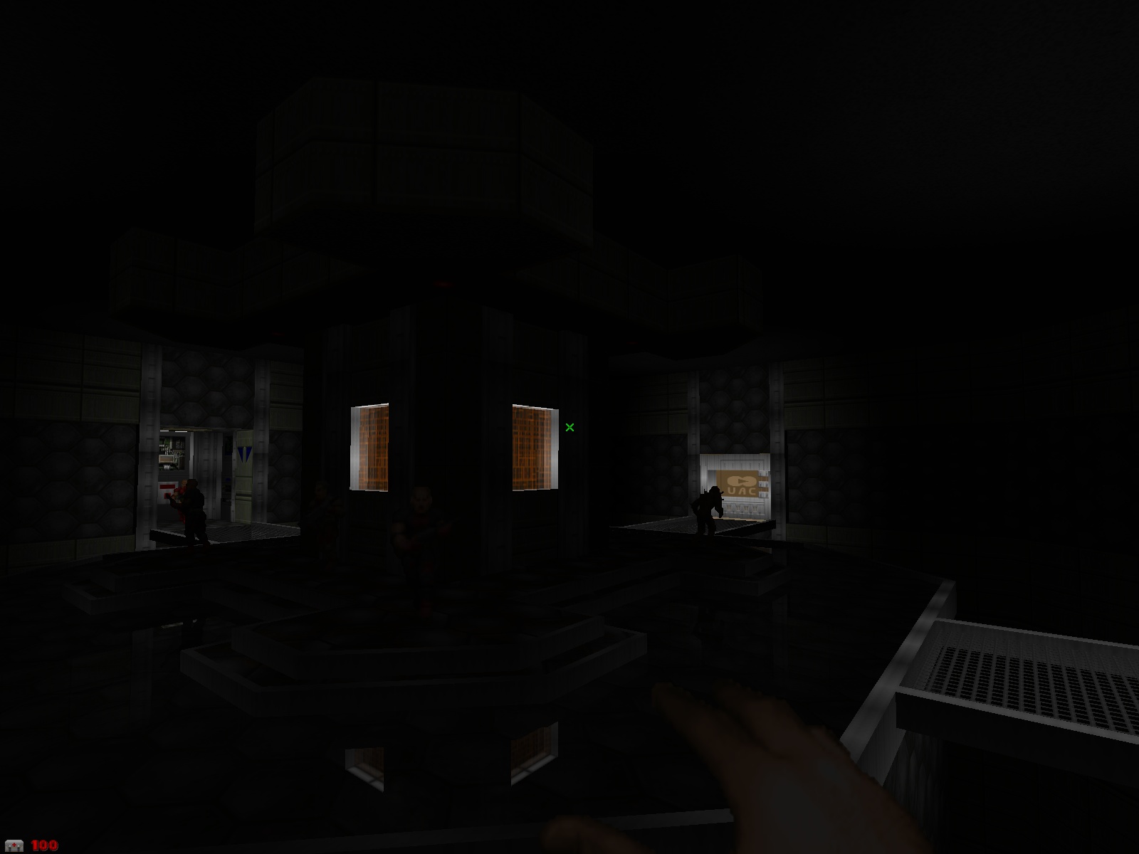
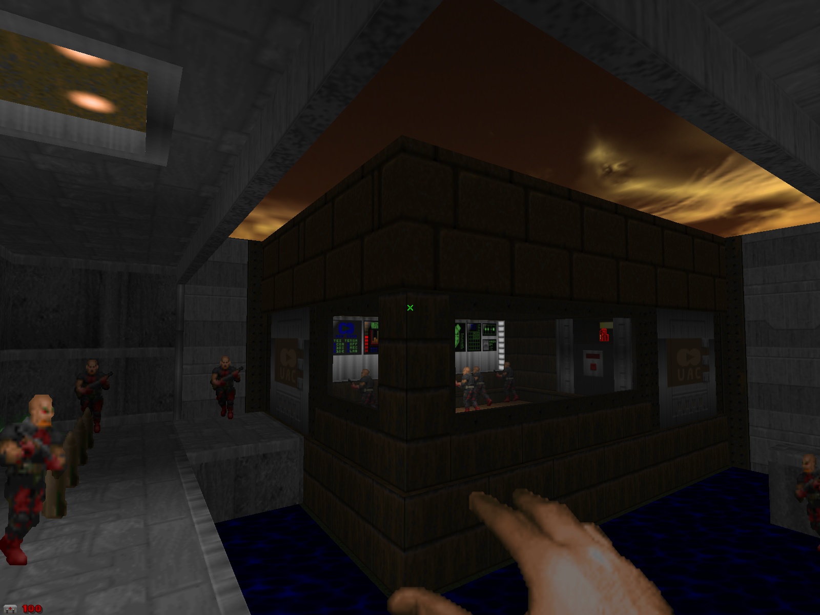
A remake of the first 3 levels of Doom 2: Hell on Earth, designed for GZDoom 1.1.6+. Features up to 10 times the detailing of the original levels plus Quake lighting, reflective floors, ACS scripting etc etc.

Although it is a remake (from scratch, I might add), there are parts of the levels which radically differ from that of the original design.

Incorporates textures by Nick Baker, skybox art by Mighty Pete and the title screen was done (poorly) by me.

Version 1.2 Includes the following fixes:

-Stealth monsters replaced -Texture alignment fixes -Deathmatch player position bug fixes -Linedef impassible flag bug fixes -Internal DOOMDEFS lump added (No need for external lights.wad)

User Feedback

Join the conversation

You can post now and register later. If you have an account, sign in now to post with your account.

Guest

That One Gecko

  
Loved the detail added because it brings new life to the classics. Played with Brutal Doom and was not disappointed!

Share this review


Link to review
NuMetalManiak

  
yeah I don't understand that "you forgot something you need" script. I picked up the SSG on MAP02 then exited, not sure about that. other than that, cool three-map pack.

Share this review


Link to review
Guest

Unknown date

  
Those are some pretty good levels! My only complaint would be at the end of stage 2, the "You're forgetting something you'll need" message... I figured out that it was referring to the green armor toward the beginning of the stage, but it's a shame that if a player is doing well enough to not need the armor, they have to self-harm with rockets just to pick it up and end the stage. 4/5; fix that one issue and it's 5/5 easily.

Share this review


Link to review
Guest

Unknown date

  
Great wad, loved the re-imagining of the first three DOOM II levels. The detailing, texturing and "Quake lighting" really add a nice flavor to the game and add a layer of visual impressiveness to the game that I haven't seen often. I would love to see more of these re-imagined levels for DOOM engine games.

Share this review


Link to review
Guest

Unknown date

  
Wow, that was beautiful. I played it with Cosmetic Doom and holy liquid fuck, 5/5. Map 3 in the courtyard area was beautiful. Highly recommended - Bukkake Windmill

Share this review


Link to review
meapineapple

Unknown date

  
Entryway was laggy for me at parts, but the other maps were fine in terms of performance. All of it was very pretty and the gameplay was enjoyable. FDA: https://dl.dropboxus ercontent.com/u/1011 6881/modding/doom/De mos/D2EVLV12-meapine apple-FDA.lmp

Share this review


Link to review
Guest

Unknown date

  
Average at best. The gameplay is generally worsened from the originals. Looks decent enough though. 3/5 -Kristus

Share this review


Link to review
Guest

Unknown date

  
Awesome!Hope more levels will be made.

Share this review


Link to review
Guest

Unknown date

  
Not bad. A detailed, interesting spin on Doom2, some parts are not as I would have made them and lack the atmosphere of the originals. Game balance is shot, far too much health and ammo, and weapon progression is messed up. Way too many hitscanners in Map03's red key trap. Very skilled use of scripting & GZD features. You obviously have a very developed, futuristic mapping style, I'd love to see your original single player maps. 2.5/5 -jj

Share this review


Link to review
Guest

Unknown date

  
Played this with the stealth monsters and did not like it (id=15507), but now I look forward to the full set of top-notch remakes. 5/5

Share this review


Link to review
Guest

Unknown date

  
Nice changes from the previous version, good stuff here

Share this review


Link to review
Guest

Unknown date

  
Very Nice! Good detail and good gameplay when creative liberties were taken. 5/5

Share this review


Link to review
Guest

Unknown date

  
I probably shouldn't be commenting on my own wad, but that message on map02 is for the double barrel shotgun, not the armor -Dave ;)

Share this review


Link to review
Guest

Unknown date

  
Good mapset. But IMO would be better if all the doors could be opened before they are closed completely. Like "D" actions work. 5/5

Share this review


Link to review
Guest

Unknown date

  
First two maps were good, the third was average. A decent map set that remakes the original DooM II levels. 3/5.-Candle M

Share this review


Link to review
Guest

Unknown date

  
These remakes are beautiful and quite original and up-to-date. But you still manage to keep their nostalgic qualites. I wanna see more!!! 4.5/5

Share this review


Link to review
Guest

Unknown date

  
a great remake, it devides you between known memories and new explorations 5/5

Share this review


Link to review
Guest

Unknown date

  
Awesome, I don't see many OpenGL mods, such as this or TCOTD:A. Gets a Some Soviet Seal of Approval. 5/5 -Some Soviet

Share this review


Link to review
Guest

Unknown date

  
Meh. It was ok. It looks great, but the gameplay was pretty boring. I hope you make something original next time.

Share this review


Link to review
  • File Reviews

    • By D3rpyD00dlez · Posted
      I genuinely enjoyed this mod with its level design and music. It was challenging and interesting and it kept me playing a while after beating it to try to find anything. though I would say it was slightly repetitive and overwhelming with enemies at some moments.
    • By LouigiVerona · Posted
      Writing a review for Darkening 2 is tough. It's a beloved megawad, and for good reason. As many other reviewers have said, it is historically a very important project.   It was an important megawad for me personally. I fell in love with the first level in particular. The music, the realistic architecture, so reminiscent of the video games of the 90s... It all left a lasting impression. And it was one of the most beautiful wads I've seen at the time.   But I rarely played anyt
    • By Ofisil · Posted
      A competently made map, for sure, but fun? It's way too long and repetitive, with same-y combat & ambush scenarios used again and again, and with way too much enemies, and not that much of a challenge, even for me who isn't exactly fond of "SUPER HARD WAD #9263!!!!11!. You can cut the whole thing in half, and then cut THAT half in half, and it would be a better map. Is it bad? No, just a little bit above average, mostly because it drags a bit too long.
    • By MrSkeltal · Posted
      Generally good map design, but the difficulty as is the case with pwads tends to be uneven even on HMP, especially when you mix them with what slaughtermaps tend to be (monster spam). Too many parts where, after pressing a switch, you'll spend some time killing enemies only to realise the map maker tried to get cute and spawned a bunch of hidden archviles somewhere to start reviving everyone while you were busy wasting ammo. This is especially unfun in parts with very little cover where you'll b
    • By Ranger Qwerty · Posted
      I like the part where I pay for the numerous murders I committed by getting beaten up by either a Mancubus or an Arachnotron, it changed my outlook on Monster Priority. Thank you "Problematic" Revenant #7, I have yet to find a way to repay him.
×
×
  • Create New...