Jump to content
  • NOTE: There is a known issue with the most recent entries having screwed-up information and links. Some databases are out of sync and we haven't been able to fix it yet.

The Plasticine Cacodemon

   (44 reviews)

Guest

About This File

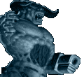
A replacement set of sprites for the Cacodemon. The novelty is that the sprites were produced starting from photos of a self-made static plasticine model of a cacodemon, just like id did. The model was based on the id original, but is different in its own way. Try to see ;-)

User Feedback

Join the conversation

You can post now and register later. If you have an account, sign in now to post with your account.

Guest

Guest

  
Not very good, to say the least.

Share this review


Link to review
Guest

  
legendary!

Share this review


Link to review
Guest

Unknown date

  
Ugly as hell, and the offsets aren't even remotely good. Coupled with the widely varying angles you took the pictures at, the flat blob looks like it's constantly jumping around in a 5-foot radius. Also, id never made a model of the Cacodemon, easily recognizable by the repeating bulbous pattern on its body which never changes depending on the angle you're viewing it at.

Share this review


Link to review
Guest

Unknown date

  
this is NOT mediocre,this is A good Sprite replacement,when you check it against the original Caco sprites this stands out.the poster below didn't compare this sprites against some others,like the one from FreeDoom.-A.Nonymous 4/5

Share this review


Link to review
Guest

Unknown date

  
^ Bert Glanstron, is that you?

Share this review


Link to review
Guest

Unknown date

  
death frames arent too hot but this is pretty nice, an interesting spin on our old friend the Cacodemon

Share this review


Link to review
Guest

Unknown date

  
I'm sorry. This is just not a good set of sprites. The effort of actually trying o make new sprites from scratch is one I support. But This example doesn't demonstrate any tangible modeling skill what so ever. 2/5 (2 for effort)

Share this review


Link to review
Guest

Unknown date

  
THIS IS AWFUL! AVOID IT AT ALL COSTS! 0/5!

Share this review


Link to review
Guest

Unknown date

  
The sprites actually look pretty good. Some of the frames need a little work on the edges so there aren't as many messed up pixels. 4/5

Share this review


Link to review
Guest

Unknown date

  
Pretty good, not the greatest quality sprites in the world but I was expecting something a lot worse.

Share this review


Link to review
Guest

Unknown date

  
hahaha it's moving. Looks like do by a kid. 0/5s

Share this review


Link to review
vtm

Unknown date

  
creepy

Share this review


Link to review
Guest

Unknown date

  
Looks nice. 4 stars

Share this review


Link to review
Guest

Unknown date

  
Maes, you da dawg! ... what an awesome wad! 5/5 ... :-)

Share this review


Link to review
Guest

Unknown date

  
This appears as the product of a diseased 4-year-old mind. I've gotten nightmares where I have been pursued by this thing.

Share this review


Link to review
Guest

Unknown date

  
I'll give them credit since they went to do what id did for creating sprites. Though eh, looks really goofy.

Share this review


Link to review
Guest

Unknown date

  
For those who gave bad reviews, get this through your heads, NOTHING IS PERFECT, ACCEPT IT! Anyway, I think the idea is nice. It shows effort and noone has to be a great artist to show it. Of course with more practice, you can probably make the model look more like the original. I used to do stuff like this also (mainly the Space marine). Keep doing what you do, Maes, I know that your next set of models will make a lot of these bad reviewers shut up. -Alando1

Share this review


Link to review
Guest

Unknown date

  
^^ lol stfu & die. What's easier than seeing the cacos right in front of your face at the start of map01?

Share this review


Link to review
Guest

Unknown date

  
its ok.pretty pointless though

Share this review


Link to review
Guest

Unknown date

  
Everybody is tired of your constant bullshit, Maes.

Share this review


Link to review
Guest

Unknown date

  
Not that bad but not great either. The shape of the body seems not right somehow. 3*

Share this review


Link to review
Guest

Unknown date

  
this should be Made into a custom Realm 667 monster!

Share this review


Link to review
Guest

Unknown date

  
ugh was there no priority for graphical cleanup at all? the sprites look like they're surrounded by a cloud of jpeg artifacts

Share this review


Link to review
Guest

Unknown date

  
Judging from this wad and your constant bullshit on the forums, I can tell that you are a talentless 13-year-old boy.

Share this review


Link to review
Guest

Unknown date

  
Fun.

Share this review


Link to review
  • File Reviews

    • By D3rpyD00dlez · Posted
      I genuinely enjoyed this mod with its level design and music. It was challenging and interesting and it kept me playing a while after beating it to try to find anything. though I would say it was slightly repetitive and overwhelming with enemies at some moments.
    • By LouigiVerona · Posted
      Writing a review for Darkening 2 is tough. It's a beloved megawad, and for good reason. As many other reviewers have said, it is historically a very important project.   It was an important megawad for me personally. I fell in love with the first level in particular. The music, the realistic architecture, so reminiscent of the video games of the 90s... It all left a lasting impression. And it was one of the most beautiful wads I've seen at the time.   But I rarely played anyt
    • By Ofisil · Posted
      A competently made map, for sure, but fun? It's way too long and repetitive, with same-y combat & ambush scenarios used again and again, and with way too much enemies, and not that much of a challenge, even for me who isn't exactly fond of "SUPER HARD WAD #9263!!!!11!. You can cut the whole thing in half, and then cut THAT half in half, and it would be a better map. Is it bad? No, just a little bit above average, mostly because it drags a bit too long.
    • By MrSkeltal · Posted
      Generally good map design, but the difficulty as is the case with pwads tends to be uneven even on HMP, especially when you mix them with what slaughtermaps tend to be (monster spam). Too many parts where, after pressing a switch, you'll spend some time killing enemies only to realise the map maker tried to get cute and spawned a bunch of hidden archviles somewhere to start reviving everyone while you were busy wasting ammo. This is especially unfun in parts with very little cover where you'll b
    • By Ranger Qwerty · Posted
      I like the part where I pay for the numerous murders I committed by getting beaten up by either a Mancubus or an Arachnotron, it changed my outlook on Monster Priority. Thank you "Problematic" Revenant #7, I have yet to find a way to repay him.
×
×
  • Create New...