Jump to content
  • NOTE: There is a known issue with the most recent entries having screwed-up information and links. Some databases are out of sync and we haven't been able to fix it yet.

Idoom mapping contest #1: Quake World

   (20 reviews)

Guest

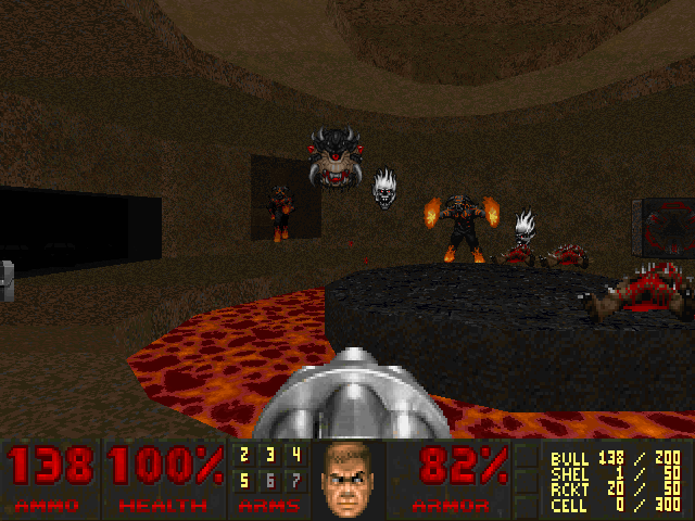
3 Screenshots

About This File

Quake themed wad comprising 7 maps and each was made by different author. The point of this project was to bring more beginers into mapping and give him feed-back.

MAP LIST ------------------------ MAP01 - Easy Start Author: Klofkac

MAP02 - Entryhall Author: Des_Arthes

MAP03 - Abandoned Planet Author: Enkeli33

MAP04 - Strogg Encampment Author: Pipicz

MAP05 - Quakeway Author: Damned

MAP06 - Edge of Chaos Author: Jaeden

MAP07 - Quakoom Author: Method

User Feedback

Join the conversation

You can post now and register later. If you have an account, sign in now to post with your account.

Guest

Guest

Unknown date

  
Nice theme, nice maps. 4/5

Share this review


Link to review
Guest

Unknown date

  
It's great as long as I play it in the easiest difficulty level or else there is not enough ammo. The air trap in the first level annoying. Sometimes there are a lot of enemies and also running around not knowing where to go next. Depends on the map. Most are quite cool. Overall I quite enjoyed playing this. 4/5 - Optimus

Share this review


Link to review
Guest

Unknown date

  
good monster & weapon design..

Share this review


Link to review
Guest

Unknown date

  
Irritating sprite replacements, poor maps and very poor use of the Quake textures. 1/5

Share this review


Link to review
Guest

Unknown date

  
Funny, but the quake textures are poor, and the music in L1 irritating. 4/5

Share this review


Link to review
Guest

Unknown date

  
Nice maps, but sprites and textures could be better i.e. shotgun is off center and looks spazzy on reload, barons don't seem to animate properly when they walk and throw massive weird spiky rock things. Texture colors seem a bit washed out. I still think 4/5 though so good job.

Share this review


Link to review
Guest

Unknown date

  
I don't know what this does have to do with Quake apart from textures. This completely doesn't have the Quake's atmosphere. Also CTRL+C CTRL+V 1/5 Zalewa

Share this review


Link to review
Guest

Unknown date

  
Bad 2/5

Share this review


Link to review
Guest

Unknown date

  
Level 1-way too basic L2-short but kinda challenging, not too bad L3-big, fun, however rather easy L4-medium sized, a bit easy, still fun L5-lots of ammo but limited health=unfrustrating challenge, best map in the pack L6-again a challenge, should still have enough ammo, some interesting however questionable parts L7-design and architecture best in pack however very frustrating, bare minimum supply of both health and ammo Overall 3.25/5

Share this review


Link to review
Guest

Unknown date

  
I love Quakish styled maps, absolute brilliant work. 6/5 - BloodMarine -

Share this review


Link to review
Guest

Unknown date

  
I agree with the first reviewer ;) We will try to be better next time. - 3/5 Damned

Share this review


Link to review
  • File Reviews

    • By D3rpyD00dlez · Posted
      I genuinely enjoyed this mod with its level design and music. It was challenging and interesting and it kept me playing a while after beating it to try to find anything. though I would say it was slightly repetitive and overwhelming with enemies at some moments.
    • By LouigiVerona · Posted
      Writing a review for Darkening 2 is tough. It's a beloved megawad, and for good reason. As many other reviewers have said, it is historically a very important project.   It was an important megawad for me personally. I fell in love with the first level in particular. The music, the realistic architecture, so reminiscent of the video games of the 90s... It all left a lasting impression. And it was one of the most beautiful wads I've seen at the time.   But I rarely played anyt
    • By Ofisil · Posted
      A competently made map, for sure, but fun? It's way too long and repetitive, with same-y combat & ambush scenarios used again and again, and with way too much enemies, and not that much of a challenge, even for me who isn't exactly fond of "SUPER HARD WAD #9263!!!!11!. You can cut the whole thing in half, and then cut THAT half in half, and it would be a better map. Is it bad? No, just a little bit above average, mostly because it drags a bit too long.
    • By MrSkeltal · Posted
      Generally good map design, but the difficulty as is the case with pwads tends to be uneven even on HMP, especially when you mix them with what slaughtermaps tend to be (monster spam). Too many parts where, after pressing a switch, you'll spend some time killing enemies only to realise the map maker tried to get cute and spawned a bunch of hidden archviles somewhere to start reviving everyone while you were busy wasting ammo. This is especially unfun in parts with very little cover where you'll b
    • By Ranger Qwerty · Posted
      I like the part where I pay for the numerous murders I committed by getting beaten up by either a Mancubus or an Arachnotron, it changed my outlook on Monster Priority. Thank you "Problematic" Revenant #7, I have yet to find a way to repay him.
×
×
  • Create New...