Jump to content
  • NOTE: There is a known issue with the most recent entries having screwed-up information and links. Some databases are out of sync and we haven't been able to fix it yet.

Creature of Despair

   (15 reviews)

Guest

6 Screenshots

About This File

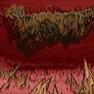
This was originally suppose to be a slaughter map for DoomHero85's slaughter WAD project, but then I decided to release it as a standalone map since it was too different from the rest of the maps in his project.

It's still a slaughter map though.

It was inspired by the "Slough of Despair" from the original Doom.

User Feedback

Join the conversation

You can post now and register later. If you have an account, sign in now to post with your account.

Guest

Erick


Pretty meh and dull with not so interesting surprises and level design. For a supposed slaughtermap, it's pretty easy not because you have plenty of ammo, but because there are no encounters where the swarms of enemies do anything to stress you out. You don't feel overwhelmed since a bit of strafing (or a bit cover, yay) eliminates any challenge there is, and you won't see any enemies like Arch-Viles or Cyberdemons at all. Oh you do have one Spider Mastermind but you can kill her no problem.


The map looks ugly even with the "Slough of Despair" influence because even then, that map has more going for it in gameplay and atmosphere than this pile of rocks and gray. I'd rather pass on this one.

Share this review


Link to review
Guest

Unknown date

  
This map is very easy considering it is a slaughter map. I beat it on my first try. Not very good design, but decent gameplay and I would recommend it if you are bored. 3/5

Share this review


Link to review
Guest

Unknown date

  
I need armor...

Share this review


Link to review
Guest

Unknown date

  
mon armour, mon ami... )

Share this review


Link to review
Guest

Unknown date

  
It's a bit of a good slaughter map with a little E3M2 design. I liked it. 4/5 - Optimus

Share this review


Link to review
Guest

Unknown date

  
Just what it says on the tin: slaughter. Not the best slaughter map, not the prettiest slaughter map, but certainly solid, although it would've been more fun with more rockets and/or a BFG. 3/5 - ZZ

Share this review


Link to review
Guest

Unknown date

  
This map is the melee essence. The concept is simple, and the map design too. But the result is funny. 4/5

Share this review


Link to review
Guest

Unknown date

  
I don't know what the ever slaughter map is like... but I liked this one.

Share this review


Link to review
Guest

Unknown date

  
A slaughter map that falls strictly into the "average" category. The gameplay can be amusing as it's remarkably easy (considering the amount of enemies and lack of armor), but it's also extremely flat. I guess it takes that from its "Slough of Despair" influence. It's fairly ugly and bland, but I wouldn't call it downright disastrous... 2.5/5 - Snakes.

Share this review


Link to review
Guest

Unknown date

  
are your savegame buffer big enough?

Share this review


Link to review
Guest

Unknown date

  
I feel good in this slaughter map, but too bad it's looking not so good, just average with its good gameplay, I also missing a BFG for secret or something to prevent get boring too fast... 2.5/5 -playerlin

Share this review


Link to review
  • File Reviews

    • By D3rpyD00dlez · Posted
      I genuinely enjoyed this mod with its level design and music. It was challenging and interesting and it kept me playing a while after beating it to try to find anything. though I would say it was slightly repetitive and overwhelming with enemies at some moments.
    • By LouigiVerona · Posted
      Writing a review for Darkening 2 is tough. It's a beloved megawad, and for good reason. As many other reviewers have said, it is historically a very important project.   It was an important megawad for me personally. I fell in love with the first level in particular. The music, the realistic architecture, so reminiscent of the video games of the 90s... It all left a lasting impression. And it was one of the most beautiful wads I've seen at the time.   But I rarely played anyt
    • By Ofisil · Posted
      A competently made map, for sure, but fun? It's way too long and repetitive, with same-y combat & ambush scenarios used again and again, and with way too much enemies, and not that much of a challenge, even for me who isn't exactly fond of "SUPER HARD WAD #9263!!!!11!. You can cut the whole thing in half, and then cut THAT half in half, and it would be a better map. Is it bad? No, just a little bit above average, mostly because it drags a bit too long.
    • By MrSkeltal · Posted
      Generally good map design, but the difficulty as is the case with pwads tends to be uneven even on HMP, especially when you mix them with what slaughtermaps tend to be (monster spam). Too many parts where, after pressing a switch, you'll spend some time killing enemies only to realise the map maker tried to get cute and spawned a bunch of hidden archviles somewhere to start reviving everyone while you were busy wasting ammo. This is especially unfun in parts with very little cover where you'll b
    • By Ranger Qwerty · Posted
      I like the part where I pay for the numerous murders I committed by getting beaten up by either a Mancubus or an Arachnotron, it changed my outlook on Monster Priority. Thank you "Problematic" Revenant #7, I have yet to find a way to repay him.
×
×
  • Create New...