Text File
===========================================================================
Advanced engine needed : None
Primary purpose : Single play
===========================================================================
Title : Brutalist Doom
Filename : brutalst.wad
Release date : August 5th 2014
Author : 1337 Doomer
Email Address : 1337doomer@gmail.com
Other Files By Author : 64.wad
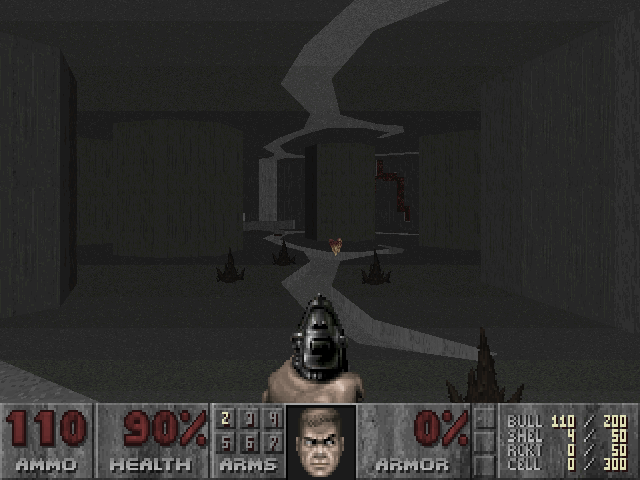
Description : Brutalist Doom is a WAD that retextures Doom to a
have a Brutalist architecture. From Wikipedia:
"Brutalist architecture is a movement in
architecture that flourished from the 1950s to
the mid-1970s, descended from the modernist
architectural movement of the early 20th century.
Brutalism became popular with governmental and
institutional clients. Examples are typically
massive in character (even when not large),
fortress-like, with a predominance of exposed
concrete construction."
Critics of the style have described it as
"cold-hearted", "inhuman", "hideous", and
"monstrous", and for projecting an atmosphere of
totalitarianism and urban decay. Brutalist Doom
recreates this atmosphere, primarily through the use
of a replacement TEXTURE1 resource, but also with a
custom dehacked patch, texture replacements and
a custom palette.
===========================================================================
* Doom II Alternative Story *
Following your defeat of the Spider Mastermind, you step through a doorway and
emerge from hell to see the green fields of Earth!
Or at least, they were green fields, once. Three years have passed since you
were shipped off to the Martian moon bases, and in that time, Earth has been
undergoing its second industrial revolution. Under the banner of progress,
the almighty Union Aerospace Corporation has poisoned the atmosphere with
pollution and covered the Earth in an endless concrete jungle.
A nearby pool of blood (there are no rabbits any more) reveals that you're not
the only one who came through the portal. The demons have already come
through before you and begun their invasion of Earth en masse. Facing
overwhelming odds, your outlook is bleak, but it's a bleakness tempered by the
knowledge that the UAC has already ruined the planet anyway. Even if you do
manage save Earth, it might not even have been worth saving.
* Theme *
Thematically, Brutalist Doom represents not only the literal architectural
style of exposed concrete for which brutalism is well known, but also attempts
to reproduce the emotional sensation of stark hopelessness that it
projects. Brutalism is perhaps emblematic of a repetitiveness and monotony
found in modern western society; an architectural expression of a wider
totalitarian philosophy that emphasizes soullessness, corporate consumerism
and materialism.
Doom is a game where players fight monsters from hell, but it has been said
that hell is this same sense of repetition and monotony:
He said it was again the beginning of the unfinished, the re-discovery of
the familiar, the re-experience of the already suffered, the
fresh-forgetting of the unremembered. Hell goes round and round. In shape
it is circular and by nature it is interminable, repetitive and very
nearly unbearable.
-- Flann O'Brien, "The Third Policeman"
Brutalist Doom expresses this through repetitive gray concrete textures,
almost all of which look identical. Doomguy is trapped in an endless,
featureless maze where every wall appears the same. Is this a world anyone
would want to save? Monotone hues are accentuated by a dehacked patch that
removes the color from many sprites: monsters, decorations, even barrels
have had their contents reduced to a blank monotone.
In the world of Brutalist Doom there is no music and almost no color: the
palette is replaced by a heavily saturated version, simulating senses
dulled from the monotony of a Kafkaesque nightmare. In a telling sign, the
saturation can occasionally fade - albeit briefly - when acquiring new
"things" (consumerist propaganda in effect), when experiencing pain
(whether caused by others or self-inflicted), or under the influence of
drugs (those berserk pack stims at least do something).
* What is included *
New levels : No
Sounds : No
Music : There is no music in Brutalist Doom.
Graphics : Yes
Dehacked/BEX Patch : Yes
Demos : No
Other : New saturated palette.
Other files required : None
* Play Information *
Game : Doom 2 / TNT / Plutonia (works with all)
Single Player : Designed for
Cooperative 2-4 Player : If you want
Deathmatch 2-4 Player : If you want
Other game styles : None
Difficulty Settings : N/A
* Construction *
Base : New from scratch
* Copyright / Permissions *
DO WHAT THE FUCK YOU WANT TO PUBLIC LICENSE
Version 2, December 2004
Copyright (C) 2004 Sam Hocevar <sam@hocevar.net>
Everyone is permitted to copy and distribute verbatim or modified
copies of this license document, and changing it is allowed as long
as the name is changed.
DO WHAT THE FUCK YOU WANT TO PUBLIC LICENSE
TERMS AND CONDITIONS FOR COPYING, DISTRIBUTION AND MODIFICATION
0. You just DO WHAT THE FUCK YOU WANT TO.
--
Incorporates a few textures from Freedoom.
Copyright (c) 2001, 2002, 2003, 2004, 2005, 2006, 2007, 2008, 2009, 2010
Contributors to the Freedoom project. All rights reserved.
Redistribution and use in source and binary forms, with or without
modification, are permitted provided that the following conditions are
met:
* Redistributions of source code must retain the above copyright
notice, this list of conditions and the following disclaimer.
* Redistributions in binary form must reproduce the above copyright
notice, this list of conditions and the following disclaimer in the
documentation and/or other materials provided with the distribution.
* Neither the name of the freedoom project nor the names of its
contributors may be used to endorse or promote products derived from
this software without specific prior written permission.
THIS SOFTWARE IS PROVIDED BY THE COPYRIGHT HOLDERS AND CONTRIBUTORS "AS
IS" AND ANY EXPRESS OR IMPLIED WARRANTIES, INCLUDING, BUT NOT LIMITED
TO, THE IMPLIED WARRANTIES OF MERCHANTABILITY AND FITNESS FOR A
PARTICULAR PURPOSE ARE DISCLAIMED. IN NO EVENT SHALL THE COPYRIGHT OWNER
OR CONTRIBUTORS BE LIABLE FOR ANY DIRECT, INDIRECT, INCIDENTAL, SPECIAL,
EXEMPLARY, OR CONSEQUENTIAL DAMAGES (INCLUDING, BUT NOT LIMITED TO,
PROCUREMENT OF SUBSTITUTE GOODS OR SERVICES; LOSS OF USE, DATA, OR
PROFITS; OR BUSINESS INTERRUPTION) HOWEVER CAUSED AND ON ANY THEORY OF
LIABILITY, WHETHER IN CONTRACT, STRICT LIABILITY, OR TORT (INCLUDING
NEGLIGENCE OR OTHERWISE) ARISING IN ANY WAY OUT OF THE USE OF THIS
SOFTWARE, EVEN IF ADVISED OF THE POSSIBILITY OF SUCH DAMAGE.
* Where to get the file that this text file describes *
The Usual: ftp://archives.3dgamers.com/pub/idgames/ and mirrors
