Text File
===========================================================================
Advanced engine needed : no
Primary purpose : Single player
===========================================================================
Title : Erkattäññe: 11 maps, 2 flavors.
Filename : erkatane.wad
Release date : 08/23/2015
Author : Nicolas Monti
Email Address : nicolasmonti83@gmail.com
Other Files By Author : deiminma.wad (Deimos Immaculated)
eviltecc.wad (Eviltech)
favie112.wad (favillesco - episode 1)
favie211.wad (favillesco - episode 2)
reticue1.wad (reticula - episode 1)
faviae10.wad (favillesco alpha - episode 1)
faviae21.wad (favillesco alpha - episode 2)
Misc. Author Info : I'm a 32 years old doomer, I make maps when it's
possible for me because most of the time I'm busy
with other stuff. beyond that I keep interested on
everything related to doom, I believe mapping is
a true art which requires lots of effort,
motivation and skills.
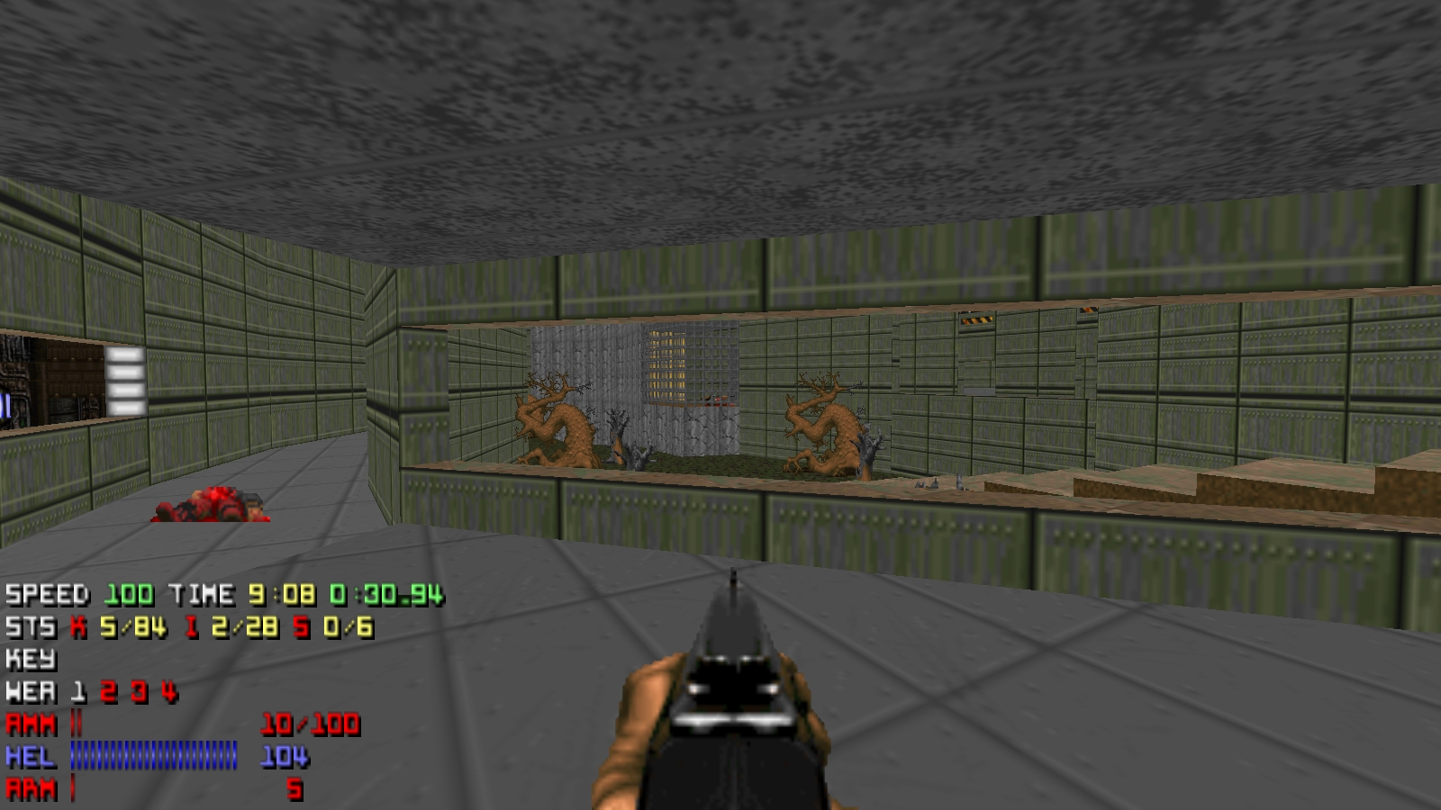
Description : The main goal was to create a vanilla classic
episode themed on Doom2 techbases. I was as well
influenced by d2twid and 1994-1996 maps regarding
to the very raw detailing employed. The maps are
small to mid in size and the average enemy count
is around 100 per map. There is virtually no
texture alignment except for some doors and
switches, taking advantage of the sector height
sometimes for that work, and I made no use of
support2/3 to separate different textures, using
just angles as in some iwad maps. On the other
hand I wanted very consistent themes so I used
just 40 different textures per map as a
constraint, including those for doors and keymarks
as I realised some iwad maps use very few
textures too.
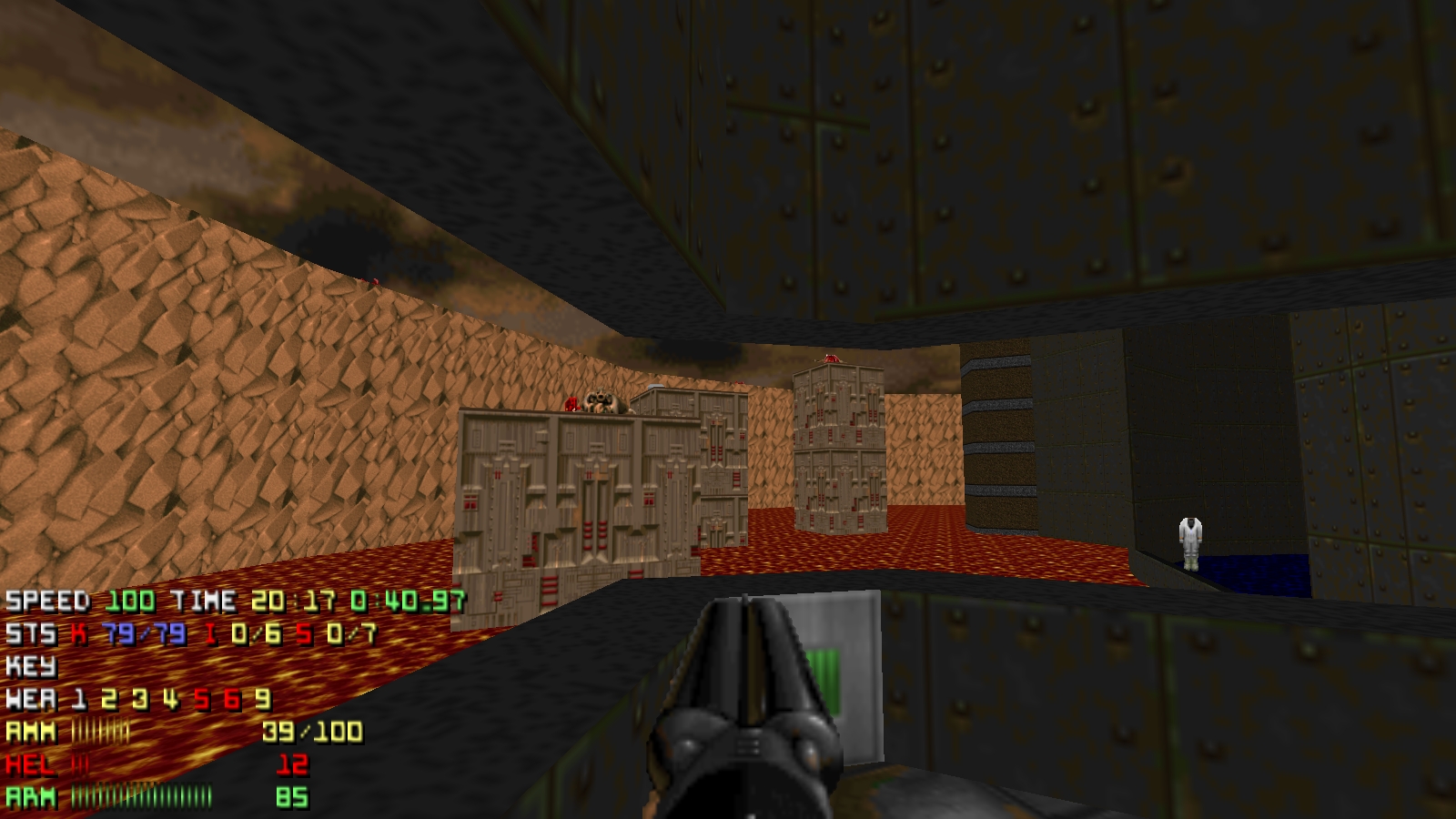
This Wad additionally comes with erkaknee.wad
a complete conversion of the main episode to
the "knee deep in the dead" theme. I used just
the shareware flats and textures, just as I did
with the favillesco episode 1, so no crates,
compohso, gray, support3 or other textures
we often see in E1 styled maps, nothing wrong
with that, but I wanted to keep the vibe as
close as possible to the original episode,
although theese layouts weren't conceived as
E1 maps. The conversion process was painfully
surgical, I replaced all the flats and textures
manually -not by a software 1 to 1 replace tool-
because I had to rethink from scratch what E1
textures and flats would suit the preexisting
rooms.
Additional Credits to : srk:.
Firedust
Glaice
Louigi Verona
Grazza
SavageCorona
skepticist (for changes in updated version)
Scifista42 (for changes in updated version)
Deadwing
kraflab
Salt-Man Z
Rampancy
yakfak
For playtesting, pointing out bugs, giving support
and valuable criticism, helping to a more polished
final version.
Changes made for this version (6th sept 2015):
Map02: computer map no longer strafe-runnable
Map06: Hell knight no longer stuck in N Area
Map09: 1 cell pack replaced with armor bonus
and 1 cell pack replaced with shotgun shells
Map10: 1 cell pack replaced with rocket
Map11: blue door now requires blue key *_*
===========================================================================
* What is included *
New levels :
Map01: 1st Matters
Map02: The Scorpion
Map03: The Islet
Map04: Urinals
Map05: Camara Obscura
Map06: Dead Signal
Map07: The Fountain
Map08: Peri Physeos
Map09: Abudhnas
Map10: High Voltage
Map11: Erkattanne
Sounds : No
Music : Yes
Graphics : No
Dehacked/BEX Patch : Yes
Demos : No
Other : No
Other files required : No
* Play Information *
Game : Doom2
Map # : Map01 to Map11
Single Player : Designed for
Cooperative 2-4 Player : Yes
Deathmatch 2-4 Player : Yes
Other game styles : No
Difficulty Settings : Yes
* Construction *
Base : New from scratch
Build Time : 1.5 months, on and off (from 7/4/2015 to 8/8/2015
for the main episode and 2 weeks more for testing
and the E1 remake)
Editor(s) used : Doombuilder, Slade, Doomword.
Known Bugs : Map09 may crash on vanilla when crossing some
linedefs due to very tall sectors.
I'd recommend saving before taking big jumps,
otherwise it's fully compatible.
May Not Run With : -
Tested With : Chocolate doom (if something is broken using
another port, blame that port, because
this is a vanilla wad ;) ).
* Copyright / Permissions *
Authors may NOT use the contents of this file as a base for
modification or reuse. Permissions have been obtained from original
authors for any of their resources modified or included in this file.
You MAY distribute this file, provided you include this text file, with
no modifications. You may distribute this file in any electronic
format (BBS, Diskette, CD, etc) as long as you include this file
intact. I have received permission from the original authors of any
modified or included content in this file to allow further distribution.
* Where to get the file that this text file describes *
The Usual: ftp://archives.3dgamers.com/pub/idgames/ and mirrors
