Jump to content
  • NOTE: There is a known issue with the most recent entries having screwed-up information and links. Some databases are out of sync and we haven't been able to fix it yet.

50 Shades of Graytall

   (52 reviews)

Guest

14 Screenshots

About This File

50 Shades of Graytall is a project designed around creating maps with interesting architecture and gameplay despite being limited to a selection of arguably hideous textures. Started in response to a silly post made in the Editing forum which led I and several others to attempt maps using the (slightly edited) rules in the post, hoping the result would be decent. Eventually opened up to the community and here we are! Hope you enjoy the maps and if you don't hey Doom projects cant be graytall the time

User Feedback

Join the conversation

You can post now and register later. If you have an account, sign in now to post with your account.

Guest

baja blast rd.


VemV8k3.png   NIq8hzW.png


ACRCNeg.png   FJTnvXx.png


50 Shades of Graytall is a seemingly improbable success of a project that was born when Gez I believe jokingly suggested a texture theme composed of a pair of Doom 2's awkward misfits -- GRAYTALL and FIREBLU -- and a texture designed for basically one purpose (it's in the name): DOORTRAK. And then miraculously, Someone actually did it. 


Naturally its restrictions would seem to consign it to the garbage bin, but it worked out very well, becoming a darling of the community (but not of livestreams).  


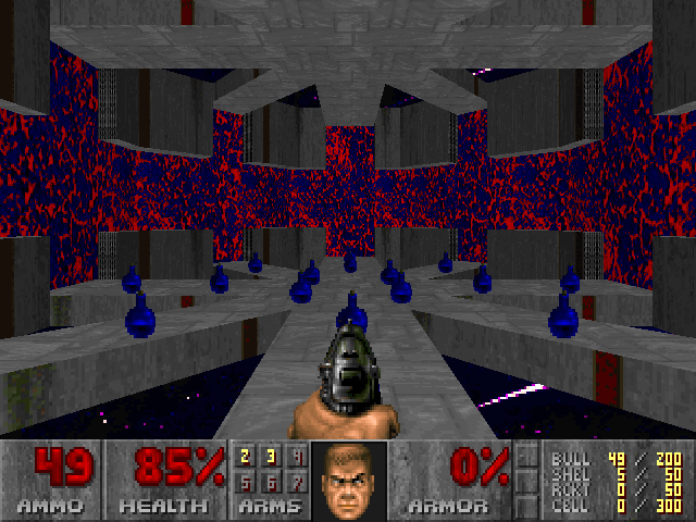
Part of the reason 50 Shades of Gray worked so well visually was that despite the apparent memeiness of the theme, the chosen assets complemented each other quite snugly. GRAYTALL, with its obnoxious off-center red strip and that ugly arrow-like splotch, is tricky to get a handle on as a mapper, but with some anger effort spent on alignment, it gives you pretty red borders, either around the original gray core or freestanding, with can be fit to planes of arbitrary width. FIREBLU is an eyesore embodied, but with its purple-blue scheme, it comports well with the red strip of GRAYTALL -- in big picture terms, it functions as a splash of color among the other two desaturated materials. DOORTRAK is a crime painted '90s style over vast surfaces, but over sleekly shaped smaller ones it's not so bad, and something about being the only dark texture means that eventually your mind starts to perceive it as shade and contrast itself, rather than "this ugly thing customarily used for doors." 


kk9U2sg.png


Add a very pretty primary skybox -- all inky blue and pink-tinged splotches, all stars and comets and nebulas in a spacebound sky -- that is fittingly sort of a "serious" take on FIREBLU in spirit. Add each mapper's ability to choose one texture to use for floor and ceiling (usually ones that meshed with the texture theme in some way). In the end, the working materials were ultimately quite harmonious in their minimalism.  


The project head Marcaek was also picky about what maps he accepted, sending rougher work back to the drawing board or in some cases serving up outright rejections (especially to work sent in batches by one particular person who likes to chuck lower-effort maps at every community project within earshot). That makes him kind of the bad guy, some might argue, but strict QC is often a necessary evil for ensuring quality with open submissions. 


Handed all of these elements with few defined rules or instructions for making it all work, the varied cast of mappers (which, looking at the roster again, has a suspiciously high number of "big names") did their own thing, in different ways, which was the final element of the magic gluing it together.


R95CkQD.png 


The typical 50 Shades map is fairly short and to the point, almost as if motivated to end before your eyes started yelling about the overexposure to FIREBLU, but of course Mechadon threw a curveball by being himself, with a long odyssey that is honestly little different from his usual sprawling feat of relentlessly intertwining architecture and crazy interlocking angles, just with these textures instead. There are abstract little gameplay-oriented maps that focus on punchy, kinetic action in varying molds -- pistol-and-shotgun pecking early, a brief and hyperviolent BFG romp late, and every degree in between. Some mappers attempted to reach into other dimensions entirely, fashioning surrealistic art pieces that compensated for the narrow palette by concocting something out of nothing -- as with Dobu's exploiting negative space in the form of invisible sectors, and NoisyVelvet being, "Hey, HOMs are a texture too!" Of course there were crates. Contrasting the natural lean towards abstraction is a bit of stubbornly playful representation: castles, faces, giant stick figures crafted out of sectors.


In sum, it's good shit. 


vAF8kH9.png

Share this review


Link to review
galileo31dos01

· Edited by galileo31dos01


Done with these settings:


- GLBoom+ 2.5.1.4. complevel 9

- Ultra-Violence

- Continuous combined with pistol start mindset.

- Saves every 10 minutes or dobu's traps so.


Phew, enough DOORTRAK for a year... I mean, a very well done megawad consisting of a special limited texture selection and diverse gameplay. That this is product of a meme in the community is out of my knowledge, since 50 Shades was launched way before I registered in the forum. Joke or not, the concept is intriguing: only the popularly acclaimed "ugliest" textures to create interesting maps, focused on what mappers can do with such strict rule so their creations are appealing in every sense possible. Because we are here to judge, I'll say the results are really impressive in general. The mappers involved brought tons of ingenious ideas to contrast each texture and make the best of them. I'm someone who wasn't very familiar with these three textures, more specific with DOORTRAK and GRAYTALL, until now. The first one has to be my least favourite, it's exclusive to doors, borders and certain structures like the tunnel in NoisyVelvet's map, which was combined with hall of mirrors in a very creative way. On the other side, GRAYTALL covers the majority of layouts' walls. It's partially plain as a single texture when its red stripes are too near from each other, in my opinion, not so much when they're spared or only the gray part is visible. However, the usage is generally decent due to light variation, the darker the better, also contrasted with FIREBLU's striking visual, the last texture that stands out in every context. There're also a few flats and ceilings to add some extra colour and some neat pitch black shadows, but another important complement is that amazing space sky. Whoever did it deserves an award, I absolutely loved how some mappers exploited it as either a texture replacement for switches, or simply the void. DGM's map is an example where it can be appreciated in its essence. The music selection isn't listed in the text file for some reason, I can say many are recognizable at first "glance", then others more speedy or chill midis according to the case, generally fitting. 


Gameplay is serious business. It's the kind that keeps you on your toes pretty much all of the time, and entails acquired skills to play on UV. The interesting part is that each map was designed by a different person (minus a collaboration map), therefore the diversity, many of which I have experienced their content before. For those who are new to the mappers involved, you'll get to find their names in the tally, or else on the internet. Naturally, I had expectations of what some of the mappers were capable of. The strategic set piece encounters from Ribbiks' map 12, or Mouldy's introduction into the slaughter-ish camp in his map 08, are examples of nothing to be disappointed at. Same for Mechadon's massive map 10 which serves fantastic non-linearity for days, and Joshy in his classic hectic start followed straightly by slaughter including a couple nonsense intermissions (more specifically, pain elementals in the open). Jimmy's remake of Entryway is a fun starter, easy to take your first steps into the new world of unpopular-only textures. For the rest of mappers, I had a few vague conceptions of their styles in other community projects, that after playing this megawad I will be able to recognize them. I know Xaser likes to play with circular very tall towers, his map is a huge infinite symbol whose gameplay is partially engaging, like the RL vs. pain elementals trap. Dobu Gabu Maru must have been an archvile in another life, otherwise it's out of my knowledge why such a mean-spirited map. It's ingenious, let's get that straight, the way he created architecture out of the sky and shadows and all that intricate geometry, which is put to maximum devilish reasons, and I liked the frantic setups even if it was near impossible to feel comfortable in the limited available space. TimeOfDeath did a decent boss map, the mix between resource and layout tightness. His etiquette two-(BFG)shots incidental mini setups against cyberdemons is present, they only persisted in the same exact contexts more than I like to see, but there're more variants of hard setups to experience too, and includes a full view of the mister of your dreams, or nightmares (I'm talking about the giant dude at the end, ok?)... On another side, there're some ups and downs from the rest of maps. I have to praise NoisyVelvet for such a great exploratory level, including the aforementioned tunnel of hall of mirrors, and a creepy face at the end. I also dig Megalyth imposing FIREBLU room with several setups for pressure-inducing. The one by Marcaek (not the credits map) left a sour taste in my mouth at first, since I'm not a fan of running away from monsters all the time. It gradually turned more palatable as I became more comfortable with the concept. Breezerp did a solid short BFG-spamming map, even though it's not my type of gameplay. Those by Quakis, Alfonzo, Ezormer and shockblast4 are somewhat similar, in regards to progressive difficulty and resource management, all of them enjoyable in their own way. Last but not least, the bonus map, a throwback into the old-school style of congested rooms, which can only be understood after a full playthrough. Don't try this map blind without a sense of exploration, if you have touched any Hell Revealed wad before you'll know what I'm talking about...


Secret-wise, to begin with, depending on the author, some went for something more exploratory full of secrets, while others dismissed the idea of placing at least one (Joshy, ahem...), nothing wrong with it though. It's wasn't easy to find all of them in the bigger maps, but still fun to be encouraged to explore and find extra portions that covered half of the map. I'm not sure why a couple of secrets in Mechadon's map are not hinted at all, like one required to shoot random FIREBLU, or maybe I needed glasses to detect a tiny difference between all of the FIREBLU walls, no idea. As to the bonus map, well it was expected to have important "mandatory" secrets, but it seems like not everyone moved on from the HR era, by the time this megawad was being made. Just don't go too far if you haven't found the, big thing, yet. Anyway, for favourite maps I'll pick 03, 06, 08 and 12.


On the subject of bugs, I found out that in map 08 a random monster from the first ambush might not pop up, could be a pinky or a hell knight. In map 15 it is possible to get stuck in the last step of the spiraled stairs, more specifically the point where a bunch of pinkies teleport in, the step never raised on my first try. There is also an unintentional HOM in the tower of sergeants. Lastly, not a bug per se but I found it weird that the chaingunners in the blue key trap in map 16 were stuck in their cubicles, still able to shoot, because there're teleport linedefs in the borders.


Overall, just a lovely mapset I recommend to anyone out there. Be smart and choose the appropriated difficulty, I'm sure lower skills are more accessible to casual players. Also, granted you'll end up loving FIREBLU if you haven't yet. One last thing, try to find the caged dog in map 07, it looks a bit like a floating skull on fire (; . My rate is 8/10.

Share this review


Link to review
Gato606


Not bad for a minimalistic project with the challenge of very limited textures palette.  The design and architecture looked nice.  For some reason, the floor and sky texture didn't show properly for me when playing it on GZDoom with the HXRTC mod.  It was enjoyable till the slaughterfest maps appear, I think that broke the balance the maps had on the starting maps.

Share this review


Link to review
Gallic00


Was very enjoyable.  The maps were varied in style and gameplay so I was never bored.

Share this review


Link to review
Aldaraia


Surprisingly good mapset. Despite my initial expectations, the severely limit texture choices weren't much of a bother for most of the levels. There are times where the minimalist textures almost fade away from oversaturation, leaving you with a heightened focus on gameplay aspects (all which are great). Some maps are maddening, others - masterpieces. I wasn't expecting a space battle emulation in MAP14 though.

Share this review


Link to review
BigDickBzzrak

  
Starts out quite good, but becomes a bunch of goddamn unplayable slaughtermaps towards the end. Meh.

Share this review


Link to review
trrobin

  
A very mixed bag. The textures are obviously unpleasant, which was the point, although it doesn't stop them from bringing down the tone. Gameplay wise, the first levels get progressively better, peaking at the excellent level 10 only to go downhill after that, sometimes quite severely. You're left with an average wad that could have been saved by ending at map 10. Pity.

Share this review


Link to review
Bryan T

  
There's no such thing as "too hard on UV". The only thing I don't like about this is the weird looking doors. It kept me wanting to play, so it gets a 5 from me.

Share this review


Link to review
molten_

  
some maps are creative, and gameplay is decent, but nothing can make those textures look good. sorry.

Share this review


Link to review
Guest

  
Game play is good. The obnoxious textures, or lack there of, are very annoying.

Share this review


Link to review
Guest

  
Didn't like the sky under Doomguy's feet.Made me want to pee.

Share this review


Link to review
mrthejoshmon

  
An ok concept but (obviously) an assault on the eyes. The set does play well and is as fun as Graytall can get, a little bit slaughtery but not too unfair.

Share this review


Link to review
Doomkid

  
I thought the concept was cute and original, and considering the textures given they are wonderful in the visual front. The gameplay was great on some, on some it was just asinine. Some of those maps names made me laugh my ass off though. This deserves a solid 3.5*

Share this review


Link to review
Guest

  
Shitty idea with shitty execution. So tired of all these gimmick wads lately, whatever happened to making something that's good on it's own? The only redeeming factor about this turd is the title screen. -Mr Delilah

Share this review


Link to review
AnonimVio

  
I thought this rocks.

Share this review


Link to review
Demonologist

  
I thought the same.

Share this review


Link to review
Guest

  
I thought this sucked.

Share this review


Link to review
NuMetalManiak

  
yay another mapset that delves into super hard gameplay at a point just like everything else I've played this year. 10, 12, 14, 15, and 16 are great, everything else less so.

Share this review


Link to review
Tristan

  
Too hard on UV

Share this review


Link to review
Guest

  
Unusual mapset, only 3 wall-textures are used. The maps live from great architecture, lighting, layout and the authors creativity. The slaughter fights in later maps... ok, I wished these maps were 'normal' maps.

Share this review


Link to review
Dime

  
fireblu seizures hurt body, dis is bad.

Share this review


Link to review
Megalyth

  
These maps made me throw up out of my eyes 0/5

Share this review


Link to review
Guest

  
Is there a different texture pack that will make this look better?Gameplay id decent, but the graphics are awful!

Share this review


Link to review
AD_79

  
Fantastic mapset. also lol at people not being able to handle a little difficulty and rating the set low because of it

Share this review


Link to review
Guest

  
^That's entirely too broadbrushed. Non-slaughter fans will want to play the first 5-7 maps (6 and 7 definitely apply lots of pressure though). EVERYONE should play Map10, it's a masterpiece, period, regardless of having over 800 monsters. You can try lower skill if the slaughter sections seem like too much. 4* for accomplishing maps that look reasonable, Map10, and some other decent outings.

Share this review


Link to review
  • File Reviews

    • By D3rpyD00dlez · Posted
      I genuinely enjoyed this mod with its level design and music. It was challenging and interesting and it kept me playing a while after beating it to try to find anything. though I would say it was slightly repetitive and overwhelming with enemies at some moments.
    • By LouigiVerona · Posted
      Writing a review for Darkening 2 is tough. It's a beloved megawad, and for good reason. As many other reviewers have said, it is historically a very important project.   It was an important megawad for me personally. I fell in love with the first level in particular. The music, the realistic architecture, so reminiscent of the video games of the 90s... It all left a lasting impression. And it was one of the most beautiful wads I've seen at the time.   But I rarely played anyt
    • By Ofisil · Posted
      A competently made map, for sure, but fun? It's way too long and repetitive, with same-y combat & ambush scenarios used again and again, and with way too much enemies, and not that much of a challenge, even for me who isn't exactly fond of "SUPER HARD WAD #9263!!!!11!. You can cut the whole thing in half, and then cut THAT half in half, and it would be a better map. Is it bad? No, just a little bit above average, mostly because it drags a bit too long.
    • By MrSkeltal · Posted
      Generally good map design, but the difficulty as is the case with pwads tends to be uneven even on HMP, especially when you mix them with what slaughtermaps tend to be (monster spam). Too many parts where, after pressing a switch, you'll spend some time killing enemies only to realise the map maker tried to get cute and spawned a bunch of hidden archviles somewhere to start reviving everyone while you were busy wasting ammo. This is especially unfun in parts with very little cover where you'll b
    • By Ranger Qwerty · Posted
      I like the part where I pay for the numerous murders I committed by getting beaten up by either a Mancubus or an Arachnotron, it changed my outlook on Monster Priority. Thank you "Problematic" Revenant #7, I have yet to find a way to repay him.
×
×
  • Create New...