Text File
===========================================================================
Advanced engine needed : GZDoom (recent and open gl) or Zandronum 3.0
Primary purpose : Two levels included
===========================================================================
Title : Dark Fortress and the House That Sits in the Center
Filename : gzforthousem.wad
Release date : 5/20/2018
Author : Guy M. Babin
Email Address : [redacted]
Other Files By Author : main2.wad (main2d2.wad), zdmpro11.wad, and others not
to mention
Misc. Author Info : Hobbyist who like creating media stuff.
Description : This edition combined the two wads together with added new sky and music.
GZDoom features like 3D floor, mirrors, and swimmable water.
A simple fortress wad and a simple house wad.
MAP01 and MAP02
Music (MIDI2MUS) : D_RUNNIN ("Escape fron New York" by John Carpenter and Alan Howarth)
D_Stalks ("Escape fron LA" by John Carpenter and Shirley Walker)
===========================================================================
* What is included *
New levels : Yes (MAP01 to MAP02)
Sounds : No
Music : Yes
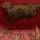
Graphics : Yes (sky texture)
Dehacked/BEX Patch : No
Demos : No
Other : No
Other files required : GZDoom (recent) or Zandronum 3.0 (recent)
Optional files : Brutal Doom v21 beta (with flashlight capability)
* Play Information *
Game : Doom 2
Single Player : Designed for
Cooperative 2-4 Player : Designed for
Deathmatch 2-4 Player : NO
Other game styles : None
Difficulty Settings : Not implemented (Hard)
* Construction *
Base : From scratch
Build Time : About two weeks
Known Bugs : Key Doors Won't Function on older Zandronum 2.0 (use 3.0)
May Not Run With : Other ports
Tested With : GZDoom, Zandronum 3.0
* Copyright / Permissions *
Authors MAY use the contents of this file as a base for modification or
reuse. Permissions have been obtained from original authors for any of their
resources modified or included in this file.
You MAY distribute this file, provided you include this text file, with no
modifications. You may distribute this file in any electronic format (BBS,
Diskette, CD, etc) as long as you include this file intact. I have received
permission from the original authors of any modified or included content in
this file to allow further distribution.
* Where to get the file that this text file describes *
The Usual: http://www.moddb.com/ and mirrors
Author's website: http://www.babins.org/Guy/
--end--
