Jump to content
  • 0

Aligning tips?


Contmotore

Question

Anyone else gets OCD triggered when things aren't perfectly aligned on the grid, or when walls seems to be of or not symmetrical with other walls? Or when a sector looks alright, but a wall isn't 32x pixels wide so your texture looks like crap?


Any good tips for staying on the grid, but still being able to make nice aligned walls and textures?
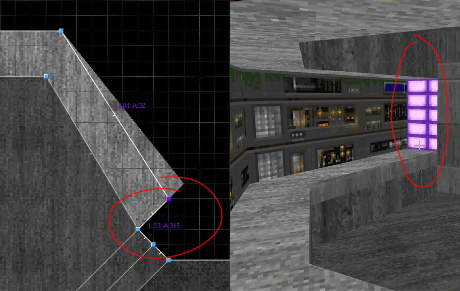
 

OCD-triggered.png.46d1641d2432c0d7bf01a7592f0912c2.png

Edited by Contmotore

Share this post


Link to post

20 answers to this question

Recommended Posts

  • 2

When I want to stick to the grid and/or not adjust the linedef lenghts or sector heights, I usually split the textures horizontally or vertically, and then adjust the offsets if necessary.


Horizontal splits:

Spoiler

T2W95Bl.png


Vertical splits:

Spoiler

M0hQTZ6.png


Sometimes it may require multiple splits in the same linedef to get some of the textures to look decent.


Edit: Added info on hiding the dummy sector of the vertical split.

Edited by Worst
Improved vertical splits guide

Share this post


Link to post
  • 1

Trust me, you don't have OCD for this - you just like things to be done right ;)


One of the things that I think was mentioned in the "Things you just found out about Doom" thread is that the Stair Builder tool in Doom Builder can be used to make perfect 90-degree alcoves even on diagonal walls, if you tell it to build just one stair! It takes some experimentation to get working, but once you get it, it saves a lot of fiddling around with decorative panels to line them up right.


Edit: And to add to Aurelius's comment below, in GZDBBF you can snap all your vertices to the nearest whole grid number by using the "Check off-grid vertices" option in the map analysis mode on F4.

Edited by DavidN

Share this post


Link to post
  • 1
6 hours ago, Contmotore said:

Any good tips for staying on the grid, but still being able to make nice aligned walls and textures?

This is something you shouldn't necessary aim for on every instance. The currently available nodebuilders and configs for them make it quite feasible to get off the grid for details such as that (even in vanilla) without risking a slime trail bonanza. Just press that Shift key while you drag your vertex and make that linedef accept a life as a power of two.

Edited by Aurelius

Share this post


Link to post
  • 0

Think I already found a solution for it. By adding more vertices to a line for different textures.


Still, it can't be pixel perfect when dividing a wall with an odd number of pixels in length.

Share this post


Link to post
  • 0
28 minutes ago, Worst said:

When I want to stick to the grid and/or not adjust the linedef lenghts or sector heights, I usually split the textures horizontally or vertically, and then adjust the offsets if necessary.


Horizontal splits:

  Hide contents

T2W95Bl.png


Vertical splits:

  Hide contents

cXdrpRY.png


Sometimes it may require multiple splits in the same linedef to get some of the textures to look decent.

Damn, those are some lovely tips! Didn't think of just changing the offset of that lamp texture.


One question about the vertical split, how do I prevent the lines from being merged?

Edited by Contmotore

Share this post


Link to post
  • 0
26 minutes ago, Contmotore said:

One question about the vertical split, how do I prevent the lines from being merged?

If you mean the original wall line and the line of the new dummy sector that is drawn over it, then the answer is: you don't prevent it, but instead you adjust the new dummy sector floor and ceiling heights to be at the height level where you want the vertical split to be, so that there is no space between the floor and ceiling.

After this you usually have to re-texture the line, since the new dummy sector will have erased the middle texture, and the new wall will actually be using an upper and a lower texture.


You may also notice that both the upper and lower texture in the line will use the same offsets. This is a limitation of the doom map format, and you can't do much about it aside from changing 'Upper unpegged' and 'Lower unpegged' flags and hoping that it looks better. (UDMF map format however supports separate upper and lower texture offsets.)

Share this post


Link to post
  • 0
43 minutes ago, Contmotore said:

One question about the vertical split, how do I prevent the lines from being merged?

Found it! Instead of dragging I click on the vertex properties and change it's position. Then I can simply delete the vertex and have an overlapping sidedef.

Share this post


Link to post
  • 0
20 minutes ago, Worst said:

If you mean the original wall line and the line of the new dummy sector that is drawn over it, then the answer is: you don't prevent it, but instead you adjust the new dummy sector floor and ceiling heights to be at the height level where you want the vertical split to be, so that there is no space between the floor and ceiling.

After this you usually have to re-texture the line, since the new dummy sector will have erased the middle texture, and the new wall will actually be using an upper and a lower texture.


You may also notice that both the upper and lower texture in the line will use the same offsets. This is a limitation of the doom map format, and you can't do much about it aside from changing 'Upper unpegged' and 'Lower unpegged' flags and hoping that it looks better. (UDMF map format however supports separate upper and lower texture offsets.)

Ah, now I understand your method of doing this. I thought I had to overlap the linedef, which is actually also a nice trick. The only downside is that it's not so easy to customize anymore and it might get merged when dragging things around.

Edited by Contmotore

Share this post


Link to post
  • 0

If you're on UDMF, another approach is the auto-scale option (Ctrl-Shift-A with the wall selected IIRC). 


This will automatically scale the texture to fit the wall. As long as the resulting scale isn't too extreme (anything below 1.2 or above 0.8 seems to work) it's very hard to notice the different size to the pixels.

Share this post


Link to post
  • 0
32 minutes ago, Bauul said:

(Ctrl-Shift-A with the wall selected IIRC). 


That's auto-align thing to linedef, auto-scale is Ctrl-Alt-A in UDMF

Edited by reflex17

Share this post


Link to post
  • 0
6 hours ago, Worst said:

When I want to stick to the grid and/or not adjust the linedef lenghts or sector heights, I usually split the textures horizontally or vertically, and then adjust the offsets if necessary.


Horizontal splits:

  Hide contents

T2W95Bl.png


Vertical splits:

  Hide contents

cXdrpRY.png


Sometimes it may require multiple splits in the same linedef to get some of the textures to look decent.

I never knew about dummy sectors until today

Share this post


Link to post
  • 0
6 hours ago, Worst said:

Vertical splits:

  Reveal hidden contents


It would be a good idea if you marked that line as secret to make it look like any other wall on the automap, and mark the lines in the sector behind it as hidden so those don't show up.

Share this post


Link to post
  • 0
12 hours ago, Ichor said:


It would be a good idea if you marked that line as secret to make it look like any other wall on the automap, and mark the lines in the sector behind it as hidden so those don't show up.


Good point, I've edited my post accordingly.

Share this post


Link to post
  • 0
17 hours ago, Ichor said:


It would be a good idea if you marked that line as secret to make it look like any other wall on the automap, and mark the lines in the sector behind it as hidden so those don't show up.

Marking the lines in the sector as hidden seems to be a good idea, but I don't really understand what you mean with marking a line as a secret?

Edited by Contmotore

Share this post


Link to post
  • 0

A line with the "secret" flag will appear on the automap as a regular one-sided line (i.e., in red, when using the standard vanilla automap colors). This allows to disguise secret doors as regular walls, hence the name being "secret". Your automapping software doesn't detect this wall is actually a door.


A line with the "hidden" flag doesn't appear at all.

Share this post


Link to post
  • 0
9 minutes ago, Gez said:

A line with the "secret" flag will appear on the automap as a regular one-sided line (i.e., in red, when using the standard vanilla automap colors). This allows to disguise secret doors as regular walls, hence the name being "secret". Your automapping software doesn't detect this wall is actually a door.


A line with the "hidden" flag doesn't appear at all.

Think I understand what you mean, but I couldn't find the option "hidden" in UDF. I'm guessing it's the "Show as 1-sided on automap" for UDF?

Share this post


Link to post
  • 0

Yes, the "secret" flag results in the line being shown as one-sided, so it's perfectly possible it's called "show as one-sided" in editors.


Likewise, the "hidden" flag might be more descriptively called "don't show on automap".

Share this post


Link to post
  • 0
Just now, Gez said:

Yes, the "secret" flag results in the line being shown as one-sided, so it's perfectly possible it's called "show as one-sided" in editors.


Likewise, the "hidden" flag might be more descriptively called "don't show on automap".

I meant the "secret" flag indeed. Thanks, it all makes sense now. :)

Share this post


Link to post

Join the conversation

You can post now and register later. If you have an account, sign in now to post with your account.

Guest
Answer this question...

×   Pasted as rich text.   Restore formatting

  Only 75 emoji are allowed.

×   Your link has been automatically embedded.   Display as a link instead

×   Your previous content has been restored.   Clear editor

×   You cannot paste images directly. Upload or insert images from URL.

×
×
  • Create New...