Jump to content
  • PL2: Mordeth Award contender finally hits the streets


    The Green Herring

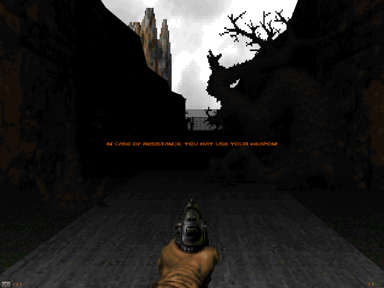
    Plutonia 2, the unofficial sequel to The Plutonia Experiment from Final Doom, was started in 2000, but had not seen the light of day for years. After eight years of development, however, it has finally been released. Click here to download the megawad. It is playable on all vanilla-compatible ports, but requires The Plutonia Experiment IWAD to play. The package also includes a desktop icon, as well as an additional text file with extensive details about the megawad and its team. Go 4 it, lads!

    Happy new year!


    User Feedback

    Recommended Comments


    Awesome.

    And I'm pretty sure I just found a bug in Chocolate Doom -- massive gameplay lag while playing MAP23 (or its DEMO1). Works excellent on my Pentium II with vanilla Doom though (and that computer is 20x slower than the one I used Choco with :P)

    Link to comment

    Congratulations Plutonia2 Team for finishing.:)
    Started my mandatory playthrough and loving every second of it. It's awesome!

    Question. Map03 is called Skull Island in the PL2INFO.txt file but the ingame map says Emerald Eve. Which one is correct?

    Link to comment

    Awesome! I'm gonna try to beat this before 2008 ends! :D

    EDIT: Blargh! I only got up to MAP15 before the 2008. Oh well. I liked what I played. It's a pretty awesome mapset. I was playing a bit of it in coop with my brother. Anyways, Happy New Years everyone. :)

    Link to comment

    Great news indeed! This is a commendable effort and I'll be sure to enjoy every jungle themed bloody map in this pack.
    *dies*
    Ah, yes. Chaingunners standing on platforms in the far distance, I've missed you so much.

    Link to comment

    :O

    Epic in all kinds of ways.

    Spoiler

    Especially the music for MAP01, MAP05, MAP09, MAP10, MAP11, MAP18, MAP19, MAP25, MAP26, MAP30 and MAP32. :V :V :V

    Link to comment

    DeDo said:
    Question. Map03 is called Skull Island in the PL2INFO.txt file but the ingame map says Emerald Eve. Which one is correct?

    Skull Island is the name. Emerald Eve was a WIP name. Unfortunately I missed updating the DEHACKED lump in the WAD and MAPINFO. The CWILV gfx and the external DEH are correct.

    Link to comment

    I'm on map03 now, getting my ass handed to me on skill 2. :p

    The mapping so far is awesome, and the packaging (menu, hud, title, credits, intermission, etc.) is beautiful; the most professional I've ever seen in a Doom wad.

    Link to comment

    This is great news, I always liked the textures and themes in Plutonia, looking forward to play through the sequel. However I'd like to know what the right -complevel option would be for PrBoom-plus.

    Plutonia 2 is designed to run with DOOM2.EXE


    So this means -complevel 2, is that right ? Though that complevel has always seemed weird to me in PrBoom, because once I have the chainsaw (like right in the first map), I can't switch between the saw and fists anymore, even the key assigned to fists only switches to the chainsaw (the setting of the toggle under options/setup/weapons doesn't make a difference either).

    Btw one small "bug" I noticed is that in the options screen, the tables for general and setup are drawn in the normal Doom font (atleast in PrBoom-plus). Anyways, thanks for the release.

    Link to comment

    gravitar said:
    Though that complevel has always seemed weird to me in PrBoom, because once I have the chainsaw (like right in the first map), I can't switch between the saw and fists anymore, even the key assigned to fists only switches to the chainsaw (the setting of the toggle under options/setup/weapons doesn't make a difference either).

    That's exactly what vanilla does, if you have a chainsaw you can't select fists unless you are berserk. If PrBoom worked any differently there you'd see demo desyncs all over the place because you'd have weapon changes that weren't recorded in the original demo.

    Btw one small "bug" I noticed is that in the options screen, the tables for general and setup are drawn in the normal Doom font (atleast in PrBoom-plus).

    Yeah those options and therefore the graphics for them aren't in the vanilla IWAD. It's unreasonable to expect wad creators to replace all the port-specific menu graphics.

    (Blame id for being lazy and pre-rendering all the big font graphics instead of putting the font in the IWAD and rendering menu text strings in the code like they did with the small font. It's all kinds of annoying from a free software point of view - how do you both match the existing font but without having to supply your own non-free IWAD-derived graphics? Anybody got any good ideas?)

    Link to comment

    Really enjoying it so far, the levels seem to be really well designed with a great atmosphere. It's a testimony to the wonderful community that Doom has built up that over 15 years after it was originally released that hi-quality releases such as this one are still released for it.

    My one criticism with it is that one of Plutonia's real strengths was in making difficult, challenging levels with only 50-80 monsters and it seems that this sequel increases the monster level on most levels by quite a bit (Not to HR levels it seems, but enough to lose a bit of that Plutonia feel) Apart from that it it an amazing level set and everyone involved in it should be mighty proud with it!

    Link to comment
    RjY said:

    That's exactly what vanilla does, if you have a chainsaw you can't select fists unless you are berserk.


    You have answered something that has been a long mystery for me, thanks. Now on to Plutonia 2.

    Link to comment
    RjY said:

    (Blame id for being lazy and pre-rendering all the big font graphics instead of putting the font in the IWAD and rendering menu text strings in the code like they did with the small font. It's all kinds of annoying from a free software point of view - how do you both match the existing font but without having to supply your own non-free IWAD-derived graphics? Anybody got any good ideas?)

    An engine could extract the letters from the existing graphics, i.e. recreate the font. However I don't think all letters are represented (such as small 'q'). Plus it would fail miserably for when custom graphics are used.

    I don't think there is a 100% satisfactory solution. Making a font that looks the same may technically be a copyright infringement, though I tend to think of it as "fair use", since the intent is not to steal anytihing but just make sourceports more, well, "DOOMey".

    Link to comment
    RjY said:

    Yeah those options and therefore the graphics for them aren't in the vanilla IWAD. It's unreasonable to expect wad creators to replace all the port-specific menu graphics.

    (Blame id for being lazy and pre-rendering all the big font graphics instead of putting the font in the IWAD and rendering menu text strings in the code like they did with the small font. It's all kinds of annoying from a free software point of view - how do you both match the existing font but without having to supply your own non-free IWAD-derived graphics? Anybody got any good ideas?)


    I'd rather blame the ports for mixing their own graphics with the originals on the same page.

    As long as this only happens in submenus it's not a big issue though but some ports have done such things to the main menu and that's where it becomes really ugly. Such sloppiness by port authors can really destroy the impression any WAD being loaded with them might give.

    Related, if someone is interested, Here is one graphic that could be added for ZDoom's level statistics screen.

    Link to comment

    Ok guys, what the hell is up with map11. I've never been more lost in my entire life. Other then that, I love it.

    Link to comment

    I haven't played it yet but just looking at that in a map editor made me go Ugh! That's definitely one of the most insane things I have ever seen.

    Link to comment

    Checking out the maps using idclev, they look to mostly be medium-size, well-made levels. Looks like a fairly promising set. Now that you have probably had some time to play, I will ask, what are your opinions of this set?

    Link to comment

    I didn’t like the original Plutonia that much, but this kicks ass! Very enjoyable. I’m on map 10 now.

    Link to comment


    Join the conversation

    You can post now and register later. If you have an account, sign in now to post with your account.

    Guest
    Add a comment...

    ×   Pasted as rich text.   Restore formatting

      Only 75 emoji are allowed.

    ×   Your link has been automatically embedded.   Display as a link instead

    ×   Your previous content has been restored.   Clear editor

    ×   You cannot paste images directly. Upload or insert images from URL.


×
×
  • Create New...