-
Posts
88 -
Joined
-
Last visited
-
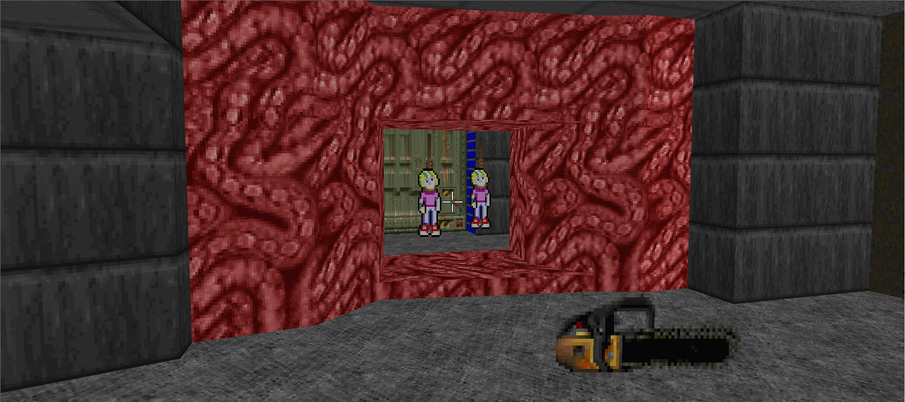
Hi, I'm on the hunt for a series of sprites to totally convert the commander keen ones, but NOT as to create an additional monster that is capable of attacking. What I'm thinking of are sprites which look like hell tendrils or gore being stretched the length of the commander keen model (72px in height and 16px in width), if anyone can provide an example of this but the dimensions aren't the same then I can do my amateur level of scaling and resizing of certain aspects. I think this is a rare ask, as most mappers choose to just implement an additional monster into the mix than deal with an identity crisis keen, so if a wad can't be found then are there any sprite artists available that want to strut their stuff and make a quick set (1 'idle' frame, 1 corpse frame, 1 damage frame and 10 death animation frames)? For a visual aid, I've prepared a small mock-up of a setting where this custom sprite would be applied:
-

DURANDOS:a hispanic deathmatch megawad
EmZee712 replied to Downcologo one's topic in WAD Releases & Development
A beta being hosted and the author saying "well it's fixed in the upcoming release"? Man I am getting major corectf vibes off that. That is a shame and now I wish I could have seen and played the final product before this so my critique would be more accurate and on the mark, but it is what it is. And that's fine, maybe it's time for fledgling mappers like yourself to learn the trade of dealing with troll criticism and when it's real criticism. Even today I still get trolls commenting on my maps, and I follow a system to figure out if it's a troll comment or a helpful critique. Don't stop at just the "this map is bad" comment and instead ask them to clarify some more; if they clarify by saying the map is bad again, then likely you have a troll trying to comment, but if they at least *try* and give something constructive, then it's a genuine comment from a player that may not be so knowledgeable about mapping. I actually tried to get Emann to clarify more when he mentioned last night that the maps were "bad" as everyone knows that's not really very helpful to mappers looking to improve. A lot of players that play the content that you release will often say what they feel off the top of their minds, now they are not dumb mind you, but these guys do help out in the long run and can provide clarity as people who don't live and breath mapping to give that outsider looking in perspective that a lot of mappers desperately could do with more of. This also puts you in a more advantageous position if it is a troll, I find that asking them to clarify quickly diffuses them as a troll because they see you acting not with emotion but as someone genuinely trying to learn and knowing if it is or not for sure makes it easier to simply put them on the ignore list. Do take that with a pinch of salt, you can't please everyone with your mapping, and I mentioned it before so I'll say it again, just enjoy mapping and you won't really go wrong. -

DURANDOS:a hispanic deathmatch megawad
EmZee712 replied to Downcologo one's topic in WAD Releases & Development
Played some for ZDS, now I have enough experience to relay back some of the excellent work that was done for this wad. I do want to say there was an unfortunate event when I was chatting about the maps where the map editors did not take too kindly to their maps being criticized which lead to some attempts at """trolling""" for some time. This will not effect my review, but mappers should understand that all media released can and will be subject to criticism of all types, whether they want to hear it or not. And behaviors like that certainly highlight a stubborn nature that makes me fearful if those particular mappers actually wish to improve their skill. I think now that there has been substantial changes between durango and this wad, I'll go through each map and break each one down individually for a more indepth review: Map01: Map02: Map03: Map04: Map05: Map06: Map07: Map08: Map09: Map10: Map11: Map12: Map13: Map14: Map15: Map16: Map17: Map18: Map19: Map20: Map21: Map22: Map23: Map24: Map25: Map26: Map27: Map28: Map29: Map30: Map31: Map32: In summation: Looks like a lot of people learned a lot from their time with Durango, and it shows in a really positive way. There are a lot more nuance issues to pick up through this wad, and it's clear that quite a few individuals were motivated to make their own start to a mapping career in this wad as well which is all very much welcome. Please continue to learn from the shortcomings and make even more maps as I'm sure you'll eventually land a very good batch of maps here soon with all that has been shown as an improvement with this current mapset. I will also second Decay's wishes and say no more dwango parodies - personal tangent, but whenever someone tells me that they make something "dwango inspired" they only ever are referring to exactly Dwango5 and the 5-6 maps that they remember fondly from that wad, no one recalls the other 13 (yes 13 wads excluding the spinoffs that Doomkid has done) of dwango where we learned through the many years that they are very much a product of their time and a reason why they are not really played much these days. Make your own flavor of doom map, that's a much better step than emulating a style that is definitely outdated to today's standards. -

DURANGO: a Hispanic Deathmatch Megawad
EmZee712 replied to Downcologo one's topic in WAD Releases & Development
After having a decently long session during ZDS, I can tell there was a lot of fun had when making this wad. However there is a glaring issue with how the wad is presented and really gives off the vibe of "privately developed and tested with close friends" as the balance and placement is all over the place in just about every map. Over abundance of weapons litter the floor in some maps with a large emphasis on wide open maps and very tight corridors and hallways. Clearly this is to entice and assist spamming of all varieties especially as player spawns are put into a neat line (normally 2-4 in a row) so that sitting in a corner and firing rockets away will always yield at least a killing spree. On the other side, this locks out some fundamental gameplay that is amusing for a lot of Doomers which is being able to move freely, but the small hallways and maps flushed with way more corridors making it so I have to stay put and basically wait for whoever is spamming a hallway I need to get into with a rl/plasma then I'm sat waiting and wasting time. Power items sit on top of platforms that need to be lowered with a switch that is way too far away; lowering any soulsphere megasphere or bfg basically arms everyone but you as you walk back only to get blasted by a number of bfg shots. Some closing nitpick thoughts; spawns that are in a pit that require you to take a lift to get out of is incredibly annoying and really detracts from the gameplay loop, honestly it's better to just take those out. A lot of the side hallways and gimmick rooms (see the pitch black room) could probably be removed entirely and make for a bit more of a tight experience in just about every single map currently. Maps that go in a circle and are basically copied and pasted (asymmetrical) need a lot more variety to keep them from getting stale and dull. Lastly, no spawn should ever face a wall, unless that wall is a switch/door that opens up to the rest of the map. Weapons should be at the top of a step and not to the side where players can easily walk over it when looking for an upgrade. I hope you and your team continue to enjoy making maps and take note to these criticisms as an opportunity to learn and grow, and remember that it is mostly about having fun at the end of the day. -
Well I honestly wasn't expecting that I guess, wrongfully assumed all the extra lmp files would cause complications. But oh well, shows me for not testing on more vanilla compat ports. Regardless I did create the gfx as promised, sorry again that it's not part of the main wad: https://allfearthesentinel.net/zandronum/download.php?file=vodmgfx.wad OP will be updated to include the addon for non MAPINFO lmp using ports.
-
I won't lie, I completely neglected those ports. I kind of would be surprised if the maps work as intended on both. As for graphics for map names, I did not include any of that in the final release but I could release an addon which will supply those graphics. Sorry for not having it to begin with. There was never an intention to I'm afraid. Hopefully as a consolation prize; I made the wad to build up my ability to adapt different styles of maps for a single player wad I'm currently in the making of.
-
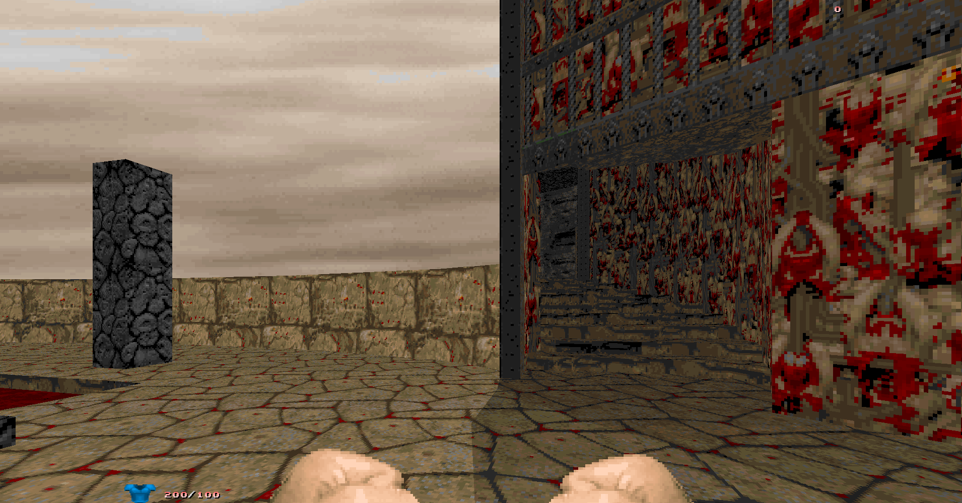
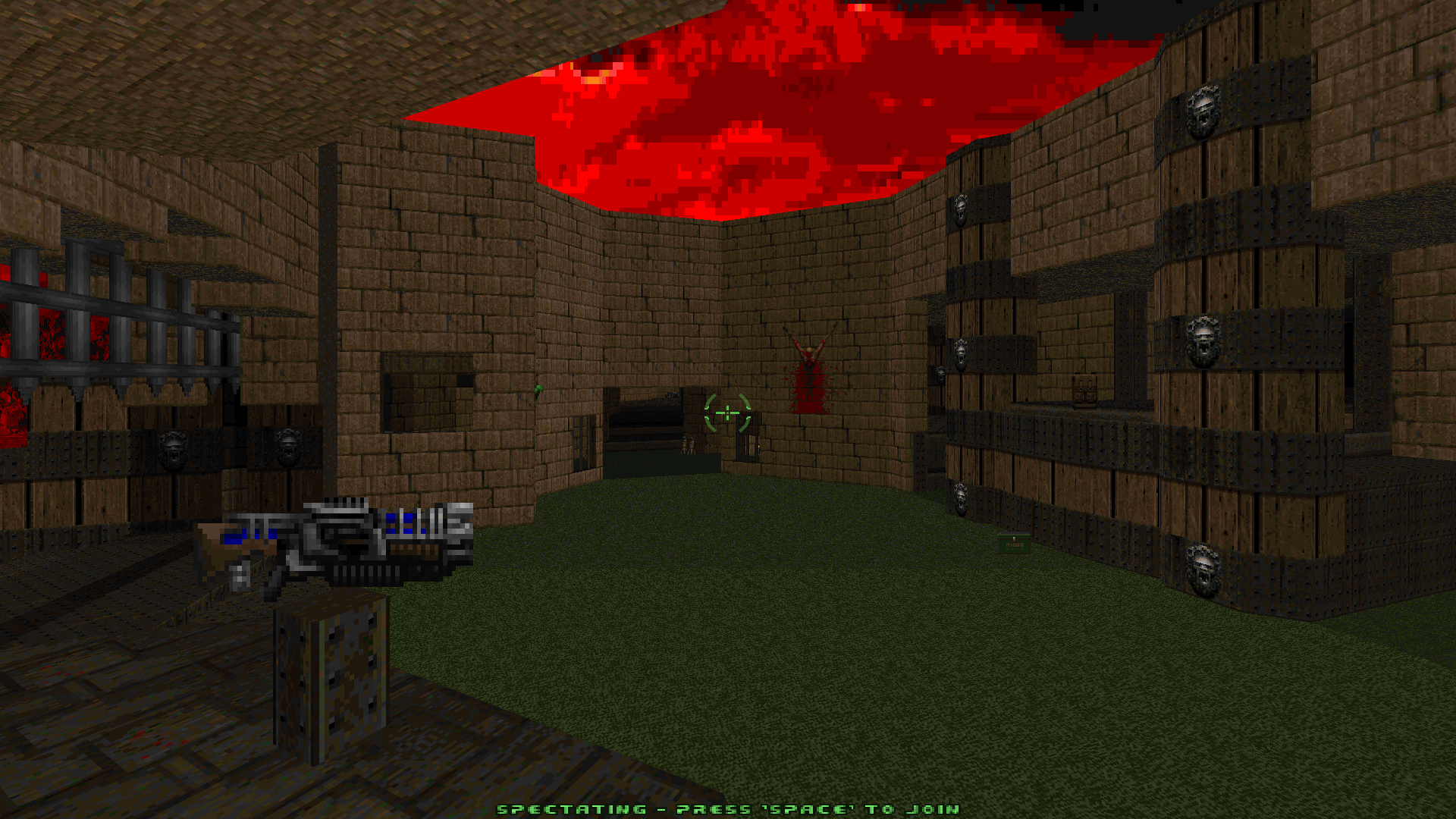
And as promised, I have completed work on vodm and it is now out in its most completed form: https://allfearthesentinel.net/zandronum/download.php?file=vodm.wad I decided to make one more final map as it came to my attention that I have not made a castle-like map at all so far. So I did that with the idea to use up all my other gothic textures I haven't really used up to this point. Screenshot below. Thank you all and hope you enjoy, will be uploading to idgames soon after generating the generic txt file and figuring out how to do it again.
-
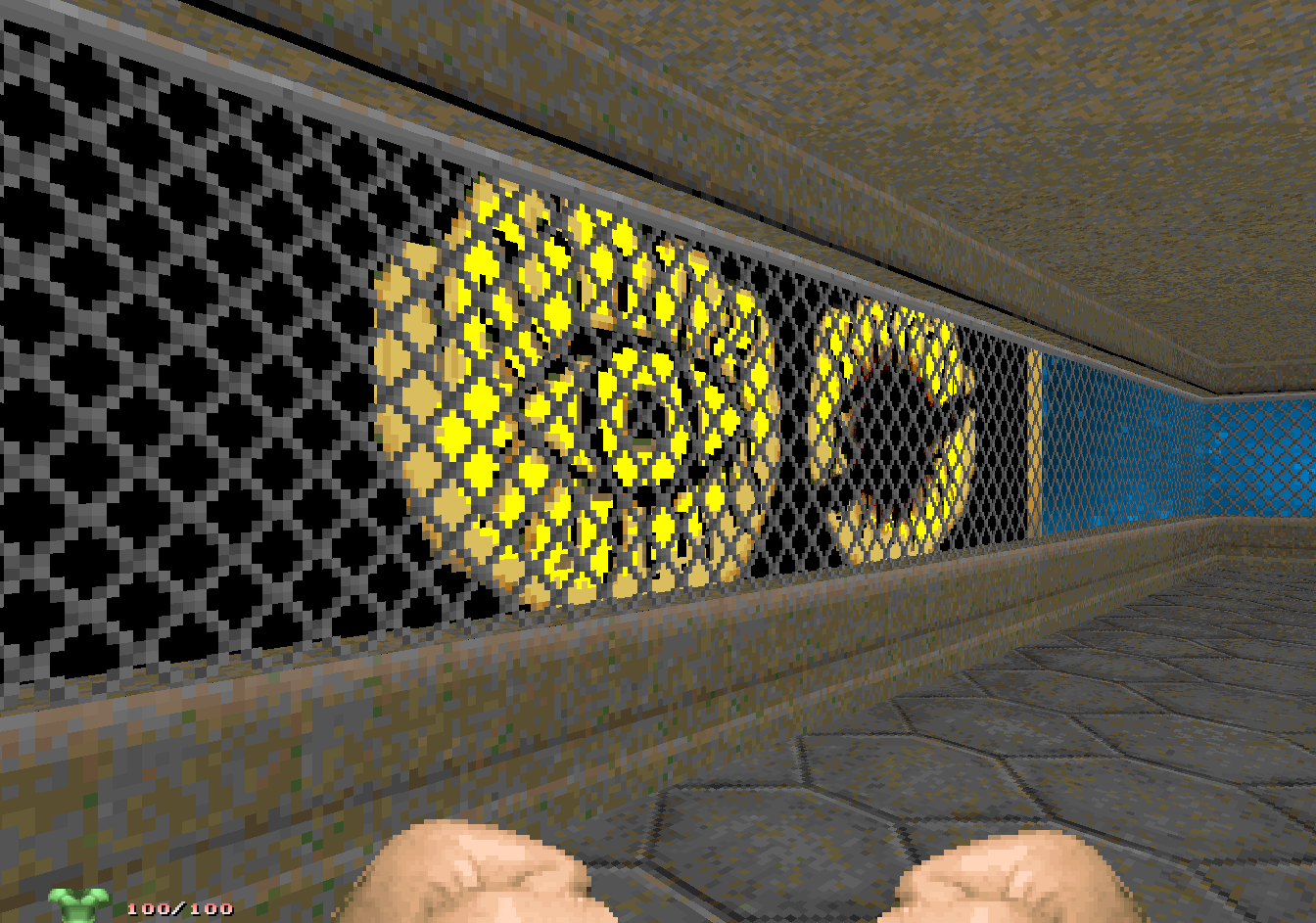
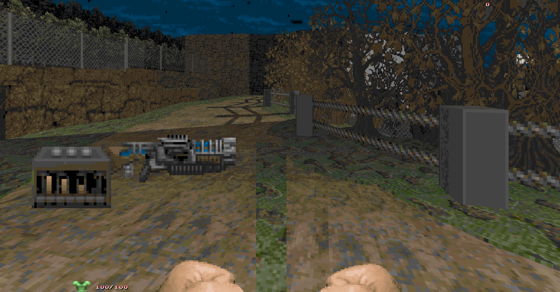
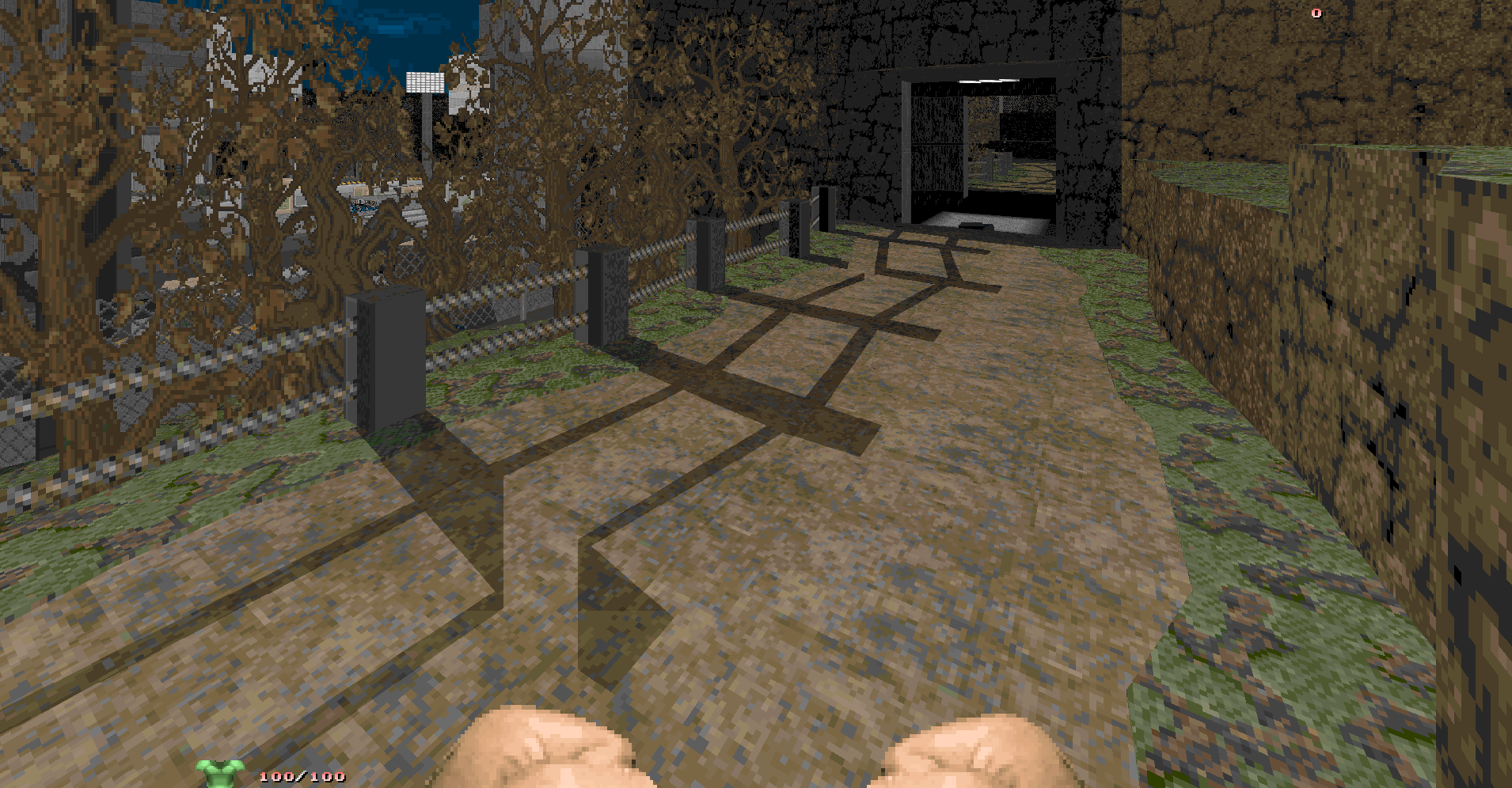
Quick update since the October post: 3 maps have been finished and 1 additional map has been added, vodm is now available as 'release candidate 2' with this release being the last to final release. Map13; A map based around a uptight deathmatch map I made sometime ago which only used two types of textures which were similar to eachother with the only difference being one set was brown and the other grey. This time I made the map have a little more flare and tried to incorporate more colors inbetween the dark and bland textures. Wide open outside and cramped interiors with an emphasis on letting players "go anywhere" if they can live long enough to get there. Map14; An urban center that is overtaken by mother nature and now serves as an arena for players. This was originally a speedmap with the intention to go indepth with details to build a theme around clashing of texturing. Map15; Maps based around "real" places never take off very well, but I've given it a try anyway. Main dance floor and seating areas give the map tall rooms with large spaces for long range fights where the VIP and amenities return to the claustrophobic. As this is DooM, the club is ran by satanists of course, so the club houses some dark secrets within its walls, hope you can hold your bladder. Map22; Lastly another map based on an uptight deathmatch map which, in itself, was also based on zdctf map09 and removing the base to base element in favor of a compact deathmatch map. The uptdm map sported far too open spaces outdoors with no real flow for the indoor sections along with too many busy textures and geometry that messed up player momentum. This more modernized version tries to raise the importance of indoor to outdoor ratio and move the bfg back into a familiar alcove. Same MIDI was imported as well. More Screenshots Download link of release candidate 2 - https://allfearthesentinel.net/zandronum/download.php?file=vodm_rc2.wad Top post has been updated with link and additional maps, also all new maps have been tested with Zan, Oda and ZDaemon and are compatible with each. Over the next month, maps will be tested and any gameplay tweaks will be included on final release. If anyone feels like getting in on this then just let me know, rest of the map pool is open and if any composers out there feel like struttin' their stuff then also feel free to let me know. Finished wad will be uploaded to /idgames following a final release.
-
Hi Ubergewei, I've also already tested these with ZD, they are 100% compatible. Also quick hotfix release because of nodebuilder destroying a few textures in a map and ruining a pool effect in another; https://allfearthesentinel.net/zandronum/download.php?file=vodm_rc1-hotfix.wad
-
Multiplayer deathmatch wad created for newschool mechanics in an old school format and design philosophy. I started this wad as a gimmick wad to test myself as a mapper and create maps with different mentality and ideas from how I normally map. The object is to familiarize myself with completely different methods so I can create a string of maps that don't become dull or appear as if certain concepts are repeated between them. I've even gone so far as to put restrictions unto myself such as; limiting the texture pool I can use to ones I hardly use, Placing weapons and spawns in preset locations and create the map around them, and various more that I will list below. I'm stuck with having not enough custom music to cover the rest of the maps that were not scored, if anyone wants to help with that, I'd be much obliged. Any and all feedback is welcome. Wad info: Designed for players 2-4 but it can absolutely fit more than that on most maps. Tested on Odamex for compatibility, and tested on Zandronum with crouch, jump, full or no air control and even rocket jumping. Thanks to Watakid for assisting with testing on Zan. Contains some custom textures, some from the alpha Doom wads, some from an old realm667 texture pack for brown rusted doom edits and some created by myself. Music was composed by TomD (99Frags) for 01, 02, 03, 04, 05, 06, 08, 09, 14 and 17. Play this with any settings or mods desired. Download: Vignettes of Deathmatch Addon Intermission GFX Map Names for Vanilla Doom Ports: vodmgfx Map List and their map-related gimmick: Map01 - A map designed entirely on a 45 degree angle Map02 - Tight and cramped map with a focus on circular stairs Map03 - Complete opposite to 02 with entirely opened up corridors and hallways for more midrange to longrange play Map04 - Theme-based map using doom2 brick textures that I would normally not use Map05 - Another thematic map based on the idea of excavating a grave site, even though there is clearly a lot of tech base still Map06 - Another 45 degree angle map with the idea that the arena must take place in space using an assortment of textures I was unfamiliar with Map07 - Just imitate what I think a typical exec map's gameplay is like Map08 - Create a map with plenty of detail using minimal (number undefined for 'minimal') amount of sectors Map09 - Similar to 08 but with more of a focus on midrange and longrange plays Map10 - Craft certain sections of the map first and then connect them afterwards. BFG cradle, rounded northend stairs and exit room were built first. Map11 - Dominate the entire map in SP_ROCK1, a doom2 texture I never use, and make it work as the main texture. Map12 - Similar to 10 but now the 'treading' for the map was created first and then populated afterwards with playable areas. Map13 - Texture combination imported from an old uptdm map I made where it was mainly a joke, this map promises to be more fun Map14 - Thematic map based on the idea of a urban center being overgrown by natural vegetation Map15 - Thematic map based around a dance club for doom marines with a twist Map16 - Map created by a competitive player named 'Razor' Map17 - Freestyle/Speedmap design, aptly textured similarly to greenwar Map18 - Freestyle/Speedmap design, aptly textured similarly to greenwar Map19 - Designed around BFG being the centerpoint, its area to be housed but still be visible from a lot of other areas within the map Map20 - Use Obsidian/Oblige to generate a random placement of weapons, powerups and teleport destinations then create the map around that. Then I deleted those weapons and powerups as they were very difficult to work with, but still had a uniquely designed map so I put in my own spawns/weapons. Map21 - I really dislike symmetrical arena maps, but I created this one to a similar vein with the caveat being the map needed to be tall and focus on chaingun and shotgun play. Simultaneously I spammed lots of ammo and health in the map, this will encourage more movement from players and also prove that mappers shouldn't be afraid to stick 50 surplus rockets in a dm map seeing as most players won't live long enough to go through that many rockets. Map22 - Another map that I had created in uptdm now redone again to have less obnoxious geometry and tighten the wide open spaces for a more compact deathmatch experience Map23 - A castle-like map and nothing more to it really. Only constraint I gave myself was to use all my gothic textures Enjoy
- 13 replies
-
13



.png.b17f56d0e9066ee5bffaa6b2cdb786b5.png)
.png.32fc608b7471fd0af188fb58f74ffde0.png)
.png.b5c69d95bf5a19bd3747340a8bf21229.png)
.png.b6e68c4db40a2c2e85bea5285af3112d.png)
.png.0539c3938f9bc578a7ff308234a4da59.png)
.png.f72caed43ccd641c4b18c07dcb055007.png)
.png.d8cdc1a0dd221a3a90b74f1b7c64a88b.png)
.png.bdb33ae35b1e92d7e6d6966e5b5be1d3.png)
.png.622000d594b1d3e01b2a39e0f8c246f7.png)