-
Posts
2150 -
Joined
-
Last visited
About Breezeep
-
Rank
Slipgate Sightseer

Recent Profile Visitors
111463 profile views
-
[-cl9] blue map for a belated birthday
Breezeep replied to bsharp's topic in WAD Releases & Development
Very solid map for a first release! And Pretty crazy skill on display for your age. I initially tried to play this on HMP and I noticed that the rocket launcher doesn't appear in that difficulty. Died a handful of times before I finally beat it. Good stuff and happy belated birthday. -

[WIP] OZONIA 2 development thread - Boom Megawad
Breezeep replied to Deadwing's topic in WAD Releases & Development
The blue trees are cool, but I'm not a huge fan of how they look with the default doom palette's blues. Maybe it wouldn't hurt to try adjusting the blue colors like Antaresian Legacy does? -

Decomission - [1 Limit Removing map / RC2]
Breezeep replied to Breezeep's topic in WAD Releases & Development
I'm really glad to hear you guys enjoyed this! I just updated the op with a newer version that fixes the stuck chaingunner and some automap tweaks. Please redownload. -
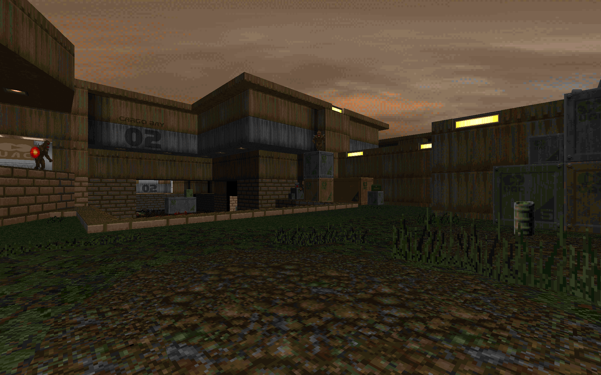
Decomission was originally meant to be part of a mapset of mine that never really materialized beyond this one map. I didn't want it to go to waste, so I thought I'd touch it up a little bit and put it out as a standalone release. It's nothing too difficult, just a standard romp in a storage facility that's seen better days. Difficulty settings have been implemented. Feedback is appreciated, as usual. Download [Google Drive]
- 27 replies
-
55
-
It's been said a bunch of times before, but my resolution for 2024 in terms of Doom is to actually commit to and finish at least one project. It's been like 2 years since I put something playable out there, but that might change if my executive dysfunction doesn't kick me in the ass.
-
-

What’s a theme / setting you’d like to see in PWADs?
Breezeep replied to EduardoAndFriends's topic in Doom General
I always like settings that feature natural greenery or snow. As long as you pick the right sprites and textures, you can make some pretty convincing lush environments. TPH E2M2- 124 replies
-
10
-

Godless Night [GZDoom episode || RC1 11/29/2023]
Breezeep replied to Tango's topic in WAD Releases & Development
Been looking forward to this one! Congrats on getting the beta out! -
Are you sure you're not loading the mod with anything else? I'd send MSX a PM about this if I were you.
-

MIDNIGHT - 7 maps in the gloom (+new vanilla version)
Breezeep replied to EANB's topic in WAD Releases & Development
Just wrapped up my playtrough. Good stuff! Really tight gameplay here, but it kinda got a bit hectic in some bits. One nitpick I have is that the blood flat looks a bit off: It looks like you grabbed a bunch of stuff from the 32in24 resource wad. I think putting in the 32in24 palette should fix this. -
You and me both! Real nice looking shots btw! I believe in you!
-
From what I've played of the base Q2 campaign, The thing that annoys me about how they recompiled the maps, including the ones in the expansions, is that they sometimes appear to be way too bright in some areas. There's a bunch of stuff that looks better than in the base game, but it's instances like these that just make me wish they just went and redid the lighting entirely for the remaster. I would prefer if they just toned down the brightness of some of the light sources (most notably the sky and lava) so that way it wouldn't look too overly bright.
-
God, Elon is such a fucking loser.


