-
Posts
598 -
Joined
-
Last visited
About holaareola
-
Rank
Member

Recent Profile Visitors
1997 profile views
-

What is health? - April Fools CP [Dev thread - RC1 out!]
holaareola replied to Astro X's topic in WAD Releases & Development
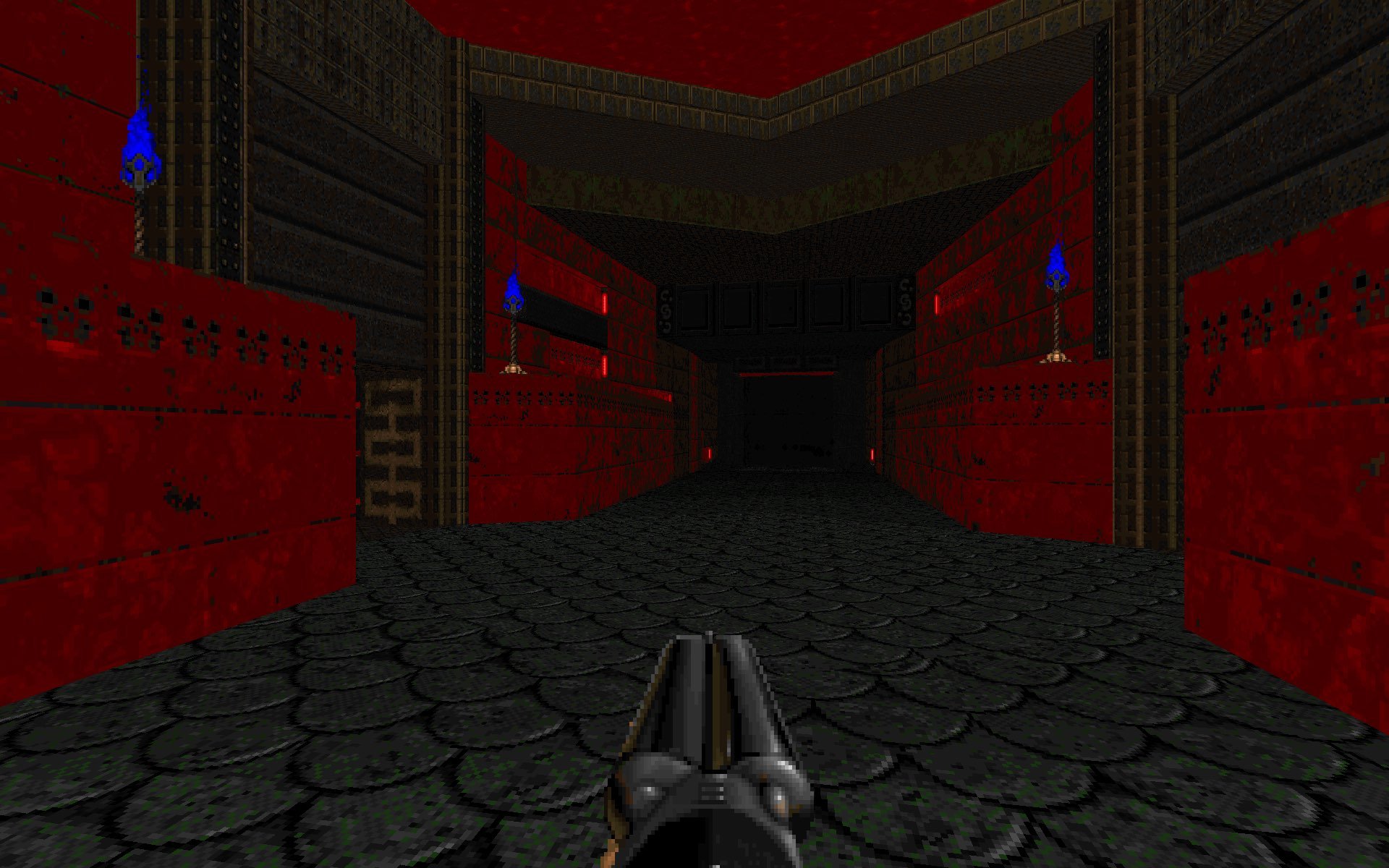
Due to my computer dying and having to switch to an unfamiliar editor followed by going on holiday -- where my girlfriend will kill me if I sit and Doom map, I'm behind on mine. I've got it playable to the end although there's a real lack of polish from RK onwards. Feel free to edit it, or not include -- I'll be back home tomorrow and will finish if the deadline is extended. Sorry for missing it! Halls of Sleeping Stone wih-map25-holaareola.wad.zip -
I respect the French commitment to protest and protecting their rights and way of life, but I suspect the pension situation is an economic time bomb with an ageing population expected to live longer than their forebears. This reality is why IMO, although detested by parties both left and right of Renaissance, the no-confidence votes failed and these reforms will pass. Someone's got to do it, might as well be the incumbent.
-

What Video Game Are You Currently Playing?
holaareola replied to Neurosis's topic in Everything Else
Saw a few classic Thief mentions in here, and I'm a Thief lover of some ardour. I remember years ago there was a pretty lively mapping (or Fan Mission by their lingo) scene. Anyone played any standout custom content for them? Harder to eclipse the base game than Doom IMO, but I suspect in any long running game community pre budget gigantitis, the community creations are reaching far above the originals they're building on. I was playing a bit of SOMA rweecently, atmospheric and enjoyable if mechanically a bit bereft as ever with Frictional games, but the plot was compelling -- as ever with Frictional games. But then my laptop GPU died. -

What is health? - April Fools CP [Dev thread - RC1 out!]
holaareola replied to Astro X's topic in WAD Releases & Development
Should have mine done over the next few days, I've been slowed down a lot because my PC broke down and I've had to use an old version of SLADE on my work Macbook, which has quite a lot of rough edges. I think a shorter set might actually work better given the central gimmick -- I've had fun playtesting my own map but could see it wearing out in a 32-level dose. I'm aiming to keep my map ~10 mins for that reason. It's a mix of set ups and run and gun. Difficulty is high though, at least for me. I noticed having no health really pushes me towards door hanging, so I removed all the doors. <<map shot removed as it had all the monster locations!!>> -
But of course!
-

What is health? - April Fools CP [Dev thread - RC1 out!]
holaareola replied to Astro X's topic in WAD Releases & Development
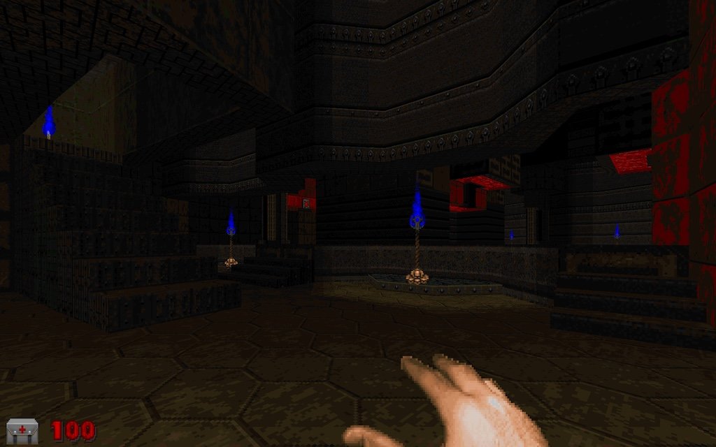
Little progress screeny. I'm enjoying how the threat of lost souls in particular is massively boosted by this. -

What is health? - April Fools CP [Dev thread - RC1 out!]
holaareola replied to Astro X's topic in WAD Releases & Development
Can I have Map25? -

Malevolence Episode 1 (9 maps Boom Compatible)
holaareola replied to Cheesewheel's topic in WAD Releases & Development
Finished this last week. Great set, I really enjoyed it. Ultra-fun levels which always kept the pace up, greatly helped by the focus on danger over kill duration in the new roster. Even the really highly populated levels never felt like a slog to tear through. One thing I noticed was it had a handmade feel that really gave it a classic charm for me. No major and obvious usage of repetitions / symmetries as have become much more common since UDB offered so many awesome sector tools. It had a sort of analogue wonkiness -- line segments not placed with obvious mathematical precision, weird room shapes. Other fragmentary thoughts since I didn't write stuff down at the time: - Map04 SSG (I think?) ambush in the square area was my favourite in the wad, Really enjoyed it, not sure exactly why. The surprise enclosed->exposed transition maybe? - Outdoor area in Map06 was so cool with the towers of white noise TV screens. The use of the TVs everywhere in general was an effective trope of the wad. - Train level was ridiculously fun. It's a rare setting in Doom, . - Loved the determination of the final map. You will press a switch, you will know what happens next, and you know it will happen even more than the last one you pressed! No deviation. - Finest use of the electrical column I've seen in any wad I can remember. Two examples that stand out. Inspiring. Please don't leave it at just the one episode, I want more! -
Nice work ENEMY!!!, thanks for making these available, saves a lot of conversion time. One of the things with texturing in vanilla doom is that typically large scale structures cause a lot of repeats due to the small textures. The GIMP script I've butchered together does a lot of slicing so that e.g. for some of the 512x512 big cliff textures it will dump out eight textures, each of them 256x128 for vertical stacking so you can have 512x512 of non-repeating detail onscreen in Vanilla. It also: - extracts and resizes textures suitable for 64x64 to flats - exports some larger textures to 128 in 64x64 pieces for big flats a la E1M8 tele - slices out a bunch of different bits from the trimsheet textures Two issues. The first is that even with just the first Makkon set (metal, stone and nature) and excluding some colours, it produces ~2500 palettised textures at 52mb. Obvs too big for a vanilla pack. I need to work out a way of making it so that people can choose the colours and sets they want. The other is that I still need to write something that will bundle these up into a wad and assemble the 256x128 patches into 512x128 textures. I remember Slade added scripting support a while back... does anyone know if it supports importing files, constructing textures out of patches etc? Seems a shame to sit on all these great textures when they could save people a lot of manual work.
-

What would you get Doomguy for Christmas?
holaareola replied to FelixTheNoodle's topic in Doom General
-

Anyone else tired of the "DOOM runs on anything" meme?
holaareola replied to TasAcri's topic in Doom General
Merry antichristmas, OP! //Edit: link YouTube app gave me link doesn't seem to be embedding right - it's a Doom Christmas bauble. -

Yuegong - Moon Palace (abandoned map)
holaareola replied to elend's topic in WAD Releases & Development
Awesome stuff. The intricate little touches and painstaking texturing give it a sense of place that seems to me quite unusual in the Doom world. - Light fitting design game is top drawer! - The research area design is astoundingly good to my eyes. Those beams are so chunky I can feel the weight only looking at them. - Outdoor stuff a bit flat visually (will always be a problem with large areas in GZDoom until lightmaps I guess) but the design itself is cool with the intriguing and unusual mix of sci-fi / traditional East Asian architectural elements. - The plant sprites and your new textures look great. You mention having posted some of the assets, any chance you'd bundle them together? - The little dispensary cubby textures are amazing. Would never argue against anyone spending less time at a computer, but hope you find the balance and that this or parts of it find its way to us in the future! -
Holy moly, E1M7. This is incredible! Tough combat but never grindy and what a sense of place. The haunted base feeling is nailed perfectly, so dark and eerie yet really vivid with the coloured lighting. That techy strip near the first area in the vanilla equivalent was extremely cool. Never seen this effect before, had to open the editor but still don't quite get how it's working. A weird interaction between the pulsing light type and change to brightest adjacent? Struggle to understand how this one is within the visplane, drawsegs and blockmap limits -- feels like it has some of the most expansive areas in the pack but they still look so detailed. The meticulous texturing here is superb and suggests a real weight and solidity to the architecture. A more chaotic and trap-filled character than the maps so far, I enjoyed it immensely. Big map anyway but it took me extra-long to get through because I stopped to gawp so often.
-
On map 6 atm. It's been incredible. It really pleases me to think that had there been the knowledge and tools this could have been released in '95. Hard to imagine more than this ever being eked out of our humble doom2.exe again. Some parts of this must have been absolute torture to make! Love the ingenuity with all the vanilla FX, magicking bugs into features. The transparent floors are so convincing and gave me flashbacks to the stippling in my first can't-afford-a-gpu experience of Quake 2. The coloured flashing area in M2 is incredibly well done- the careful selection of enemies kept the effect believable, felt like I had a bit of an perceptual illusion with my brain tinting the sprites the rest of the way to the ambient colour. The sum of all these tricks is so convincing, the eye gets used to slopes, transparency and coloured lighting. It's funny, because I remember back in the 90s thinking it was really crappy and hacky when seeing lighting baked onto textures etc. But really, why quibble whether an engine is actually calculating a pattern and colour of light on a surface? What is a 3d game if not an illusion anyway? It's objecting to one trick at one layer and ignoring a hundred others elsewhere. The effect is all. I've really enjoyed the downbeat and haunting reimaginings of the original soundtrack too (E1M4 aside). E1M9 has been my favourite map so far, incredibly atmospheric. But they've all been very fun so far, with a constant stream of enjoyable encounters, cool bits of imaginative architecture and visual design -- somehow so ingeniously packed into the punitive vanilla constraints that it appears to have been made without any constraints at all. Map 6 has certainly been the most sprawling so far, but very intelligently routed around the central control room so that it's remained quite navigable. Bbetween the grim visuals and music, it's very funny too, from the re-enactment conceit to the demon energy -> 120v converter. Plan phase 1: make demons leave. So good! Utterly inspiring stuff, perhaps especially to a vanilla masochist like me. The shield mechanic is surely a dehacked first? Looking forward to playing the rest!
-
For an early example of the midtex overdraw trick for reflections, check out https://www.doomworld.com/idgames/levels/doom2/deathmatch/m-o/mcfearsm from '96. Nowhere near as good as KDIKDIZD though, the recolouring and dithering really sell it.
