-
Posts
108 -
Joined
-
Last visited
About uber
-
Rank
gehennoid and proud

Recent Profile Visitors
3444 profile views
-
Speed Map Every (other) Day! (The Comeback)
uber replied to Bobby :D's topic in WAD Releases & Development
haaaaaaaaa -
I think you're not really approaching image editors properly then. My advice for anyone starting out is to begin with something simple - changing the coloring of an image, copypasting objects or applying basic filters... which, if not intuitive enough to figure out on your own, are bound to have easy-to-follow instructions for whatever program you're using. As you go on and get more ambitious/experienced, you'll naturally come up with more complex ideas that you'll either a) figure out how to achieve from the knowledge you've gained of your tools, or b) will have to look up elsewhere, which won't be as daunting since you'll already be more familiar with your software or just graphic design in general. As for the latter part of your message - it's not necessarily true that creativity just gets "locked off" once you get too old. The initial spark that gets a lot of us interested tends to come fairly early on, sure, but I've met people that had absolutely no background in any sort of visual arts just suddenly fall in love with editing, drawing and whatnot way past their childhood. And as much as we like to see those things as purely subjective there absolutely are concepts and rules that you can learn and use/subvert to your advantage to convey whatever you want, and while they're still dependent to some extent on physical skill/experience, there's absolutely nothing stopping you from learning those at any point in your life.
-

What were your very first mapping attempts like?
uber replied to Li'l devil's topic in WAD Discussion
Never actually built anything past this area...- 85 replies
-
13
-

You must choose between all WADs before or after 2010.
uber replied to Hayden49's topic in Doom General
After 2010. Even disregarding all the more innovative releases that don't have pre-2010 equivalents, I find the general level of quality has just gone up significantly in recent years - and since this is a matter of what I'd like to actually play, I'll gladly give up some of the classics in favor of newer wads that do a lot of the same things but better. -
pero qué desubicado
-
...
- 9895 replies
-
33
-
I'll always stand by the "two cakes" analogy regarding this topic. You don't need to outdo others or yourself every single time, and there's nothing wrong with clearly drawing from your favorite mappers or wads. Unless you're going out of your way to completely plagiarize someone else's work or are putting next to no effort on anything you create, there's bound to be little details or ways of going about stuff that are distinctively yours - and in a field where reasons to like maps can be super arbitrary, you never know whether your very specific "brand" of gameplay/detailing/etc. might just really, really resonate with someone out there.
-

Back to Saturn X Episode 3 [WIP]: 5 MAP PREVIEW BUILD ON PAGE 11
uber replied to Xaser's topic in WAD Releases & Development
Whenever that happens I usually open the link in a new window and refresh the page. -

Vandalized Gaturro in E1M1 (Tiny fun wad) [Argentina]
uber replied to Alt3000's topic in WAD Releases & Development
vamos argentina carajo -
Making textures is a lot of fun - and it's especially cool to use your own photo sources to do so. Keep at it! You'll need an image editing program (ideally for your PC) like GIMP, Paint.net or Photoshop for that. The latter is paid software but the rest can be downloaded for free. "Power of 2" means that the texture width and height are equal to a power of 2: 2, 4, 8, (...) 128, 256, etc. The picture you posted is 441x448, so you'll need to resize it to work properly. Generally I'd recommend something like 128x128 or 256x128 for general use textures, and do keep in mind that flats (floor/ceiling textures) can only be 64x64 pixels unless you're working on more advanced map formats. Getting stuff to tile seamlessly is a bit trickier, you'll need to edit the edges of the texture so they match up perfectly. If you take a look at the corners in your original image, there's a noticeable seam when the texture repeats. There's no real one-size-fits-all solution for this so you'll have to do some manual work. Generally most editing programs will let you preview the tiled image so you can paint over the edges. For more freeform textures like this I'd recommend using the clone stamp/healing brush tools that let you copy tiny bits of the image to blend them together, but for others you might need to manually paint everything. Here's a very rough example of what it could look like once it's been resized to 128x128 and edited to tile seamlessly. You'll notice the colors are a bit different - I did convert the texture to the doom palette during the process, which is something you'll have to do if you're working on sourceports that don't support truecolor textures (I palettized the image early on so I don't have a copy of it with the original colors, sorry). It's not perfect: aside from there being some blurry bits, generally textures with these shades of blue don't work well in dark areas if you're playing on a software renderer, and I didn't aspect ratio correct the image so it'll look slightly squished ingame - but those are things you shouldn't worry about too much at the moment. Just play around with things and enjoy the process.
-
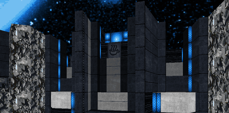
Great map, glad we get to finally play it! Big fan of going the full custom palette route rather than only recoloring textures - it makes the non-grayscale details stand out even more and gives the whole thing a striking look. Difficulty and length are just right for me as well, had a lot of fun both on my blind run and on replays.
-

Single-map wad recommendations thread - share your favourite hidden gems!
uber replied to Omniarch's topic in Doom General
It's a very recent release so most people might already be aware of it, but I haven't seen AD's Terminal Stages of Nostalgia posted here yet. The fact that it manages to stand on its own as a single map is a testament to how memorable and well executed the main concept is - and I also can't say no to a map with that many barrels. -
7p! props to all logged on sleepyheads Congratulations on getting this out - beautiful map, and massively enjoyable to play through.
-
I play on software.





.thumb.gif.b10e751543a24a0db40edc623dde3392.gif)
