-
Posts
59 -
Joined
-
Last visited
About eirc
-
Rank
Mini-Member

Recent Profile Visitors
880 profile views
-
Sunder for me, map02 is a bit meh but everything else is *chef's kiss*
-

Post your Doom video! [but don't quote video]
eirc replied to DuckReconMajor's topic in Doom General
I once punched 100 imps -
Maybe GZDoom could have a few presets for graphical settings so new players could easily get an idea of what's possible without needing to go deep into the myriad of options. Some of those could be: pure vanilla basically everything as close to original as possible, 320x200, 35fps, original palette and lighting etc modern vanilla what I assume most ppl play with and I what see most youtubers/streamers use in dsda/prboom (so I would personally put this as the default). the original pixelated look but with max resolution, widescreen, hardware rendering full modern brightmaps, dynamic lights, texture resize, filtering, bloom, ambient occulsion, basically flex on what the engine can do And if all of those had a description of what settings they changed it would be easier to get ppl to understand the settings too and create their own favourite set
-
Is this a powerwash simulator mod???
-
Phrasing it so general is a bad rule imho. If anything it makes it gatekeepy if a bad player wants to make a hard map. A more reasonable rule of thumb would be to make sure encounters are beatable without excessive savescuming, when coming out from previous parts of the map not fully stocked and not full health and without finding any secrets. If you wanna make something super difficult and above your skill level then it's a good idea (but still not a rule) to get it playtested by ppl that can beat it.
-

Do you think GZDoom should have texture filtering on by default?
eirc replied to BeachThunder's topic in Source Ports
I also feel the defaults look like crap, I personally do use it but it's only good since I also use the xBRZ texture resizing along with it. So if GZ wants to show off the graphical improvements I'd go for enabling both in their lowest good looking settings for best performance on old PCs. A couple more defaults I'd also change would be mouselook and jumping off, and a bigger hud scale. -
I have an ultrawide monitor and an AMD graphics card and I want to have dsdadoom render at 1920x1080 resolution and center that in the screen with black columns on the left and right. If I select the 1920 resolution in dsda doom it will display it properly without any stretching but align it on the left of the screen with one fat bar on the right. Given I have an AMD graphics card I have previously used the GPU scaling setting to do exactly that on StarCraft 2. That one cannot render ultrawide at all so I have it render 1920 which normally stretches on the monitor but with GPU scaling on the GPU will unstretch it and display it properly in the center. Can I achieve that with DSDA doom somehow?
-
Thank you very much :D Most of the work went into tweaking note velocity and volume. That's what makes a midi come alive and feel much more natural imho. That being said it's a ton of work, spent on that like 4 times the amount of time I did to make out and transcribe the notes themselves.
-
Love this little song so much so I made a MIDI for it, hope to see it in your maps :) MIDI download: https://www.dropbox.com/s/kuab2k2wtmeeykf/The Flintstones SNES - Unused Song 2.mid?dl=0 MIDI rendered as OGG download: https://www.dropbox.com/s/604ehwpxybuuk0c/The Flintstones SNES - Unused Song 2.ogg?dl=0 Preview on YouTube: https://www.youtube.com/watch?v=0fQhn8vQgg0 Original: https://www.youtube.com/watch?v=WRF_7xsu10c If the tune rings a bell, Karl Jobst uses it often in his YouTube videos, usually in ending recaps. That's where I found it from anyway.
-
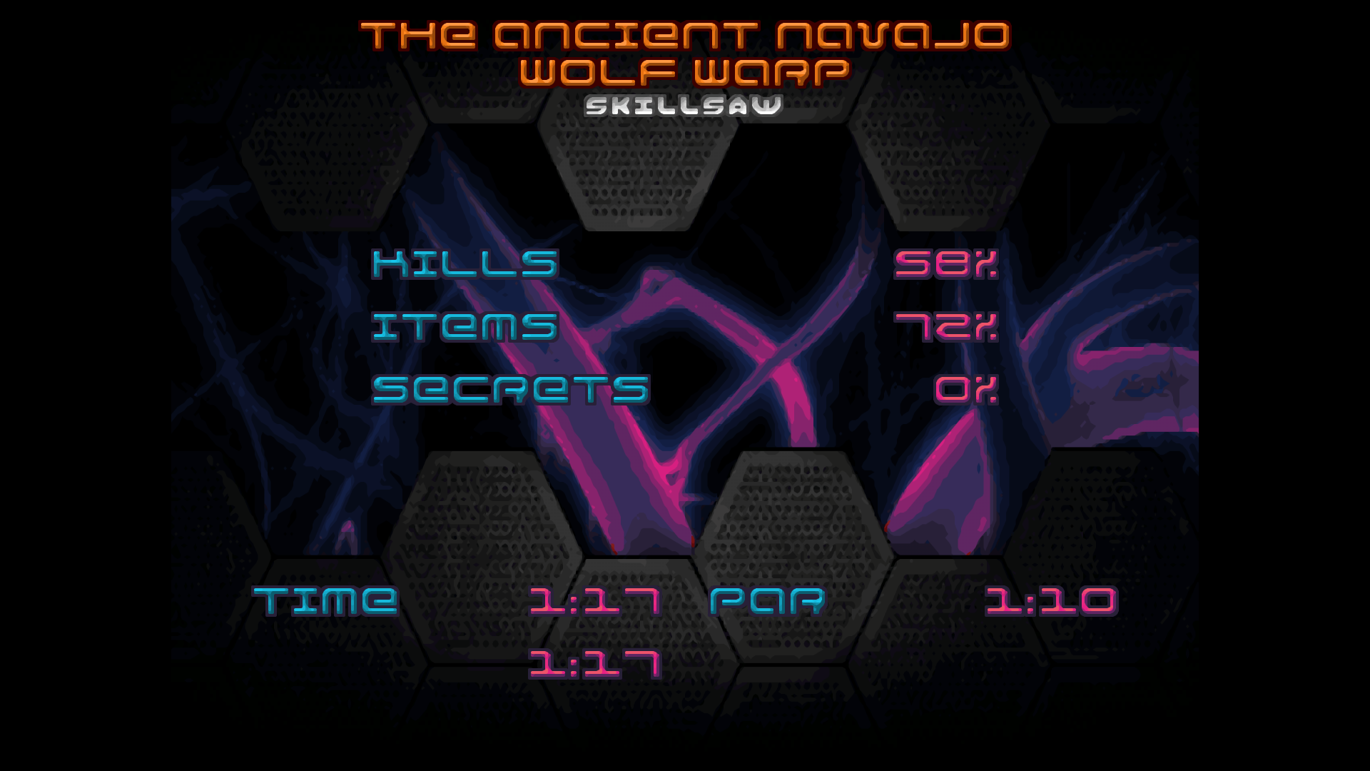
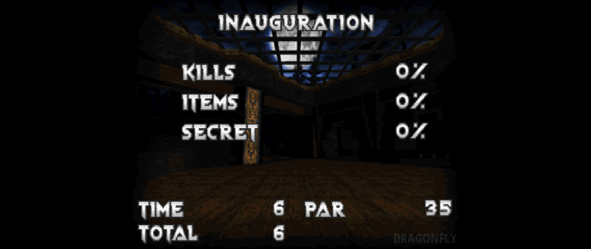
Ok I was about to post that I've only seen this in eviternity but then I thought to test a bit more with other wads that would use advanced stuff and boom: I also found the gzdoom setting "Classic ZDoom scaling on summary screen". Turning that on I assume basically disables this new feature and fixes the summary screens (it was a bit difficult to find since it won't the change the screen live, you have to get a new one to see it change). Though the text appears a bit too overcorrected with it I think? Not sure. Here you go :) One more small thing to note is that while on AA this appears to fix it fine, on Eviternity this fixes the text but also smushes the background pic a bit. I attach some screenshots just FYI. I'll also link this post to the zdoom forums in case they're interested in fixing it. Eviternity GZDoom new scaling Eviternity GZDoom classic scaling Eviternity PrBoom reference Ancient Aliens GZDoom new scaling Ancient Aliens GZDoom classic scaling Ancient Aliens PrBoom reference EDIT: Opened a bug on zdoom forums but it was a duplicate as this has been reported for Resurgence earlier. Here's a link for reference: https://forum.zdoom.org/viewtopic.php?f=2&t=70700
-
Yup, was thinking the exact same thing and is why I initially expected to google myself to a fix. I'll try fiddling more with GZDoom settings then. EDIT: It's so freaking weird tho, I get the exact same thing on both a Windows PC AND a Mac laptop. Both with my settings and the gzdoom defaults. EDIT2: Ok I got some progress here, it only happens in the latest 4.5.0 gzdoom. 4.4.2 is fine and in fact the whole endscreen has a lot more give on the bottom there. EDIT3: From gzdoom 4.5.0 release notes at https://forum.zdoom.org/viewtopic.php?t=70459: "Menu and intermission screen now scale to the original Doom.exe's layout by default." probably related?
-
I play in 1920x1080. I tried different resolutions and the only one that makes a difference is again the 5:4 one (1280x1024) that fixes it and doesn't squish everything but well I now have half my screen black lol. All others cut it off at that same point. So from what I gather there's no fix for this?
-
Hello, I'm sorry if this has been mentioned before but I cannot find anythign... I have this issue in GZDoom where in the level end-screen, the total time is cut at the bottom of the screen: Any ideas on any settings that may be affecting this? The only one I found was force aspect ratio and only 5:4 makes a change actually fixing this, but it also squishes everything else...
-

My second release! REVTECH.WAD [BETA] - UPDATED
eirc replied to Sheckly's topic in WAD Releases & Development
Hey, played your map and I basically have the same feeling everyone and you mention, the start's too big and empty. The only way to fill this big a space up would be with hundreds of monsters and basically make a slaughtermap (or just make it smaller hehe). I do get what you were going for layout wise though and if tighter it would be fine. The progression in rest of the map is a bit too linear, ie room after room of fights. Some of the fights were very nice though so it's ok. I especially liked that final room with the window and the big monster soup and the viles afterwards. Also I appreciated how even if the SSG comes in a bit "late" you did not overdo tanky enemies and I did not get bored with the normal shotgun - which happens often for me. A thing that I got reminded of playing this was this article about "the door problem" in fps map design: https://www.gamasutra.com/blogs/AndrewYoder/20190808/348237/The_Door_Problem_of_Combat_Design.php. Many of the rooms push you to just camp the door and pump lead until everything is dead. This is of course no trivial problem to solve but I think you can improve on that. Also another random thought is to try and make things less symetrical. It helps players navigate and makes fights more interesting so it's a win-win Here's a youtube of my playthrough (no commentary there), beat the whole thing first try so I'm proud of that :D https://www.youtube.com/watch?v=MZ9GUS8leyc -

Arrowhead12's WADs - ***ACE-1.wad - NOW ON IDGAMES***
eirc replied to Arrowhead's topic in WAD Releases & Development
Hey I played both maps and I had much fun in doing so, so thank you! My favourite part was the hot start in Rough n' Ready. It was pretty rough (heh) but the monster variety lends itself to very exciting gameplay. The rest of the map was much easier so that felt very fair and I did not get annoyed for a single second spamming attempts to get out of the first room - played the map twice to get all secrets and kills since I did not realise the exit was an exit lol and I really wanted to play the start again. The vile placement as others say was very cool and the rest of the fodder in general felt satisfying to wreck with the SSG. The secrets felt a bit off, the medkits at the start are not really that secret tbh and the berserk at the end doesn't feel like it has much use besides as a health pickup. Overall looks very nice too. In Deep Keep I liked the whole first area until the red door a lot. It was a very simple but still interesting layout and I liked the texturing style a lot. The lift maybe could be moved a tad to not go lower than the step it's on, that looks a bit weird. After the red door the map felt a bit empty and rushed though. I uploaded my playthoughs on youtube, no commentary, just demon slaying: Rough n' Ready: https://www.youtube.com/watch?v=wwWWxmX-VVU Deep Keep: https://www.youtube.com/watch?v=S9O_0FhRyEs
