
Polonium
-
Posts
7 -
Joined
-
Last visited
About Polonium
-
Rank
New Member
")
-
 Hmm this must be why Doomguy looks high: So it was just the limited Mega Drive colours all along :/ .... Or was it?
 -
I didn't need the 32X font, thank fuck. It's an unusable mess. Instead i used the DOS Doom font as a reference and redrew it to better work with the 32X and CRT TV's. Here's the new font and more details. For the image in my first post i just cut out the 32X font from screenshots, taken via emulation. It would be time consuming but you could rip the entire 32X font this way - Take screenshots of all the screens with text and resize them to 320x224 (the games resolution) using nearest neighbour scaling in something like Photoshop. Just make sure that any kind of aspect ratio correction isn't enabled in the emulator (like 4:3). You'll then get a 1:1 pixel perfect match, ready to be cut out. I doubt the 32X port contains every letter though, and it's the same for all the original DOS Dooms, which store entire words as graphics. For example, all the words in Doom don't contain a large X so there's no large X anywhere in the game or WAD. Looks like 32X Doom is similar. Lol yeah just like the port... I bought that shit on release and it's still one of the worst games i've ever paid for. Saturn uses the same two Hitachi SH-2 CPU's as the 32X as well, but clocked 25% higher at 28.6MHz, then you also have the extra VDP1 and VDP2 accelerator chips, CD media, and tons more RAM which can be further extended via RAM carts. So if you look at how great D32XR runs in the latest update on 32X hardware, locked at 30fps 99% of the time, now imagine what the Saturn could have done with an actual good port... That's "American English". In real English it's called an exclamation mark :p
-
I was too busy (or lazy) to post this last week when v1.5 was released, but here's the entire Doom font that i created for this latest update: When making this is noticed that the original Doom font contains a ton of mistakes, and it's even worse with the the 32X/Jaguar ports. I've detailed these errors over here. All of them were fixed for the new D32XR font. And obviously this font is based on the original Doom font and looks very similar, but there's two changes - The outline is now darker so that text is more readable on real hardware, like a CRT TV over composite (Vic helped test this :) ), and all the characters have smoother red colour shading which again helps with visibility (and better shows off the 32X's colour capabilities). And as some of you probably already know, it turns out that the original Doom games don't actually contain every letter of the alphabet, so some letters here are new. There's also new 'DOOM' logos in v1.5. For comparison, here's the original logos: And here's the new logos: As with the original logos the new ones are also based on the DOOM logo that's shown on the box art. It's obviously impossible to get things looking 100% accurate to the box art with Dooms limited 256 colour palette, but it's now much closer: The most obvious difference above is the new logo looks wider, but it's been designed for D32XR's 320x224 resolution when squished in to a CRT TV's 4:3 aspect ratio, so on real hardware it will look narrower and match the box art logo proportions (the same applies when using 4:3 on an emulator). DOS Doom used this trick as well, but all the ports, including Saturn and PSX Doom, fucked this up so all the DOOM logos are stretched (each consoles different resolution meant that each logo would have to be redrawn for that specific resolution, like i've done here). The key items on the status bar now look more similar to the keys that you pick up and use the same colour palettes: And the yellow skull key is now actually yellow, not orange. Maybe this will finally stop newcomers to Doom from looking for the "orange door"? Btw, no i've not cut off the left side of the Jaguar skull keys - They're actually missing the black outline on the left side. Lastly, the slider bar for the audio/video option settings now resembles the original Doom. But it's larger for better visibility. Thanks to Wavy and Vic for helping me out! I'm sure all my questions were a fucking pain :D
-
Thought i'd post some of the stuff that i noticed while remaking the "Doom font" for version 1.5 of Doom 32X Resurrection. The font that is used in the original DOS Doom, Ultimate Doom, Doom II, and Final Doom contains dozens of mistakes. Here's one of them: ... Yep, Doom is officially ruined. 0/10. Time to shut down the forum! And there's way more font mistakes, including the different fonts for the Sega 32X and Atari Jaguar ports. There's so many that i can't remember them all, but highlighted below are most of the mistakes: Several Jaguar letters that are not shown here are also narrower (like the letter K, which i've only included above as an example), but this was probably done on purpose to either save ROM space or for performance reasons, which is why i didn't include them all. And if you're wondering why the Jaguar font is even here when what i was doing is related to the 32X, it's because up until D32XR v1.4 it was using this font so i'm familiar with it. The 3DO port also uses the Jag font with the same errors. The font used for the 32X port is an absolute mess. But the colours are also so awful that it looks like something you'd see from a standard Mega Drive game (limited to 64 on-screen colours) instead of something running on a 32X, which typically displays up to 256 on-screen colours (it can technically do more on-screen colours but i'm not aware of any games that do this). And for some reason the Doom 32X WAD does not contain any font characters, so they must be stored elsewhere inside the ROM. And have you ever noticed that the exclamation mark at the end of "Nightmare!" contains a skull? For comparison, here's the standard exclamation mark: By the way i've no idea if these font errors have been mentioned on this forum before, but i'm new here and couldn't find any similar posts.
-
The speed of the original 32X port is inaccurate, which is why some things are faster, like the weapon firing speed. I can confirm that weapon speed in D32XR is literally identical to the original DOS Doom on real hardware (or when using the DOSBox emulator when setup correctly). So i suppose Vic could add this to the list of improvements ;D
-
Cool! But where can i get the D32XR IWAD? I could probably use a hex editor to extract the IWAD from the D32XR ROM but i can't find the address line that it starts at. From what i can see, Jag Doom uses a different Jaguar data format to the standard Doom data format, which SLADE can't convert graphics to, so it looks like i'll need the D32XR IWAD. I've never used SLADE before though so maybe i'm missing something simple.
-
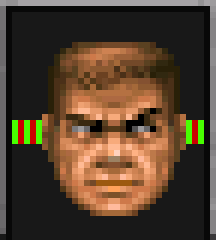
I only joined this forum to say that this is fucking quality work Vic, and everyone else involved. It's also great to see this still being improved. Would it be possible to change the red font that's used for the menus and status bar to match the original DOS version? Because it's an iconic font. The Jaguar font is different (much darker red with a black outline). Doom Delta has a more accurate font but it's missing colours and is a smaller size on the menus. I'm a graphic designer, so if it helps i can create images of all the font characters in whatever file format and colour palette that is needed. The DOS font/text resolution is already identical to what you're using in Resurrection. Btw, doomguys head is slightly misaligned in the status bar (see below). Moving it 1 pixel to the left will fix it.