
Lina
-
Posts
54 -
Joined
-
Last visited
4 Followers


.thumb.gif.b10e751543a24a0db40edc623dde3392.gif)
About Lina
-
Rank
Garden variety Sunder fanboy
")
-
 Ahh, I must've missed it. Apologies, all good.
 -
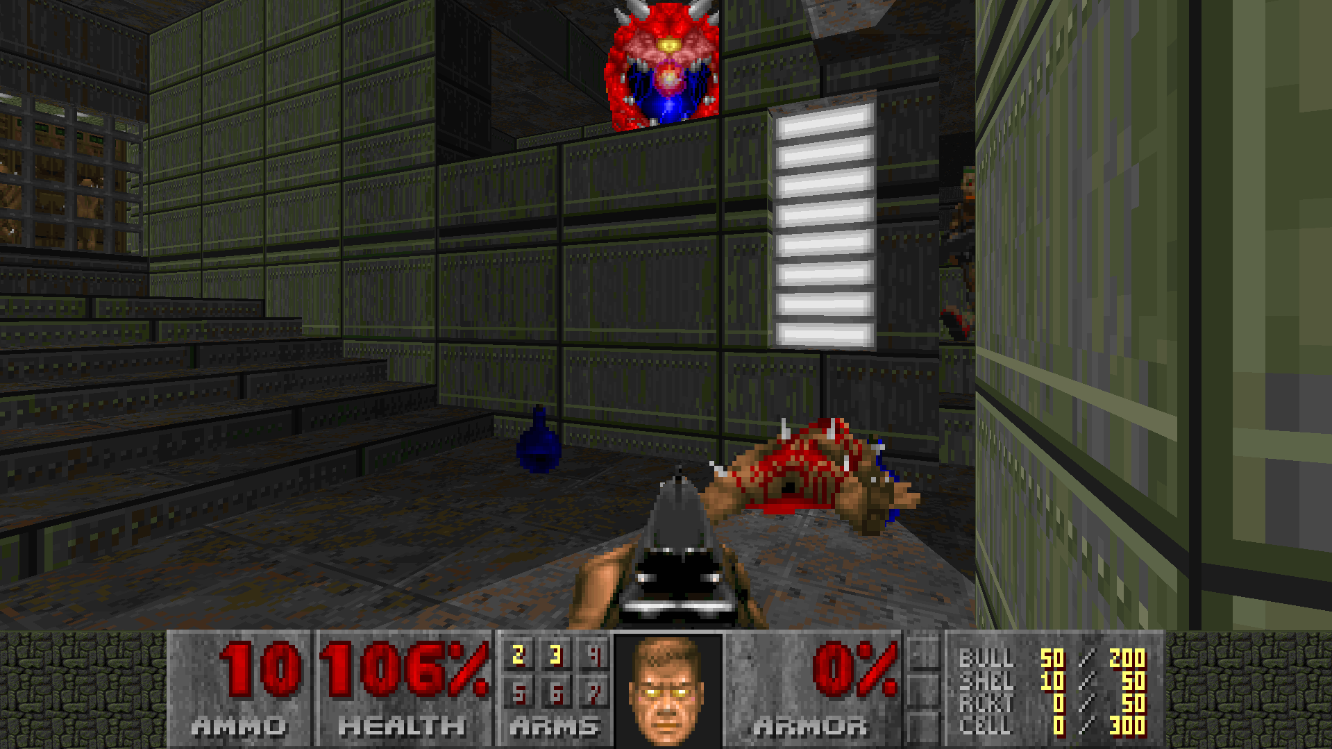
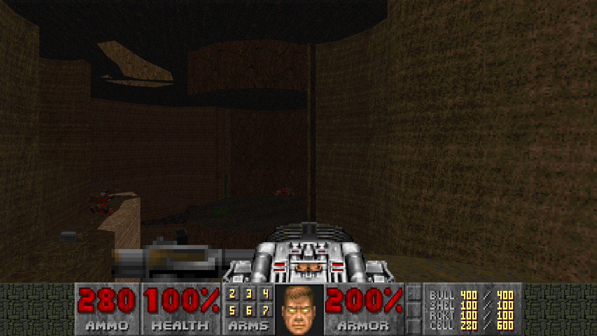
Oh, playing through the map04 section, something must've gotten disconnected in the process. The secret switch is supposed to open the shotgunner segment in both directions, so the player can use secrets to pass NE -> SW or SW -> NE whichever way they reach the segment, but it currently only opens the doors in the back.
-
You can get from bottom left to top right through the other secret.
-
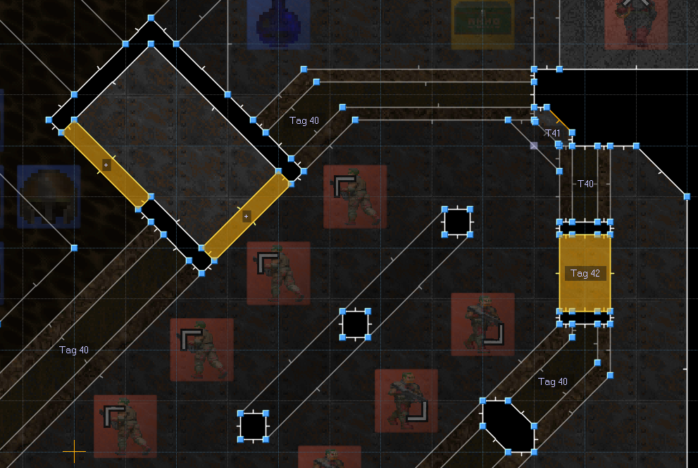
A connective tissue segment, it's separated into north/east and south/west. There's two secrets that connect the halves from either side. The player needs to walk over a tag 40 linedef to start crushers, so I expanded the entrances a bit for testing purpouses. EDIT: Forgot to tag secret sectors. Re-uploaded the file. https://www.mediafire.com/file/20fkoig3ku5dg89/Narrower_Focus_R1.wad/file
-
Splitting discussion on the megawad between here and a discord that not everybody's in isn't ideal. I just want to see this project finished and released in whatever form it takes. Moving 33/34 into the secret slots would bring us two maps closer to 32, and I hadn't thought about whether there would be any issues with that. 33, as far as I'm concerned, can go into an open regular map slot if we have one.
-
Interception III [MBF21 Community Project]
Lina replied to Moustachio's topic in WAD Releases & Development
Made some edits to the sniper slugger sprites, it was bothering me that it wasn't moving much in the original. -96/-67 centers them. Edit: I feel like this thing would be balanced at two shells per shot, it's a beast. Also, some more progress:

-
Interception III [MBF21 Community Project]
Lina replied to Moustachio's topic in WAD Releases & Development
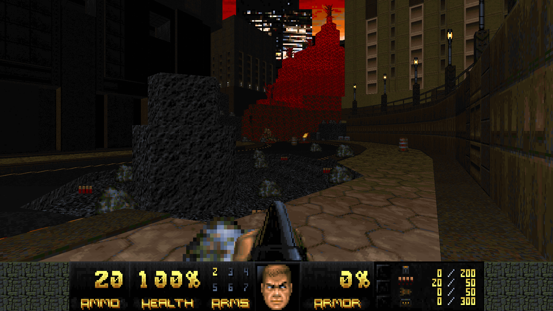
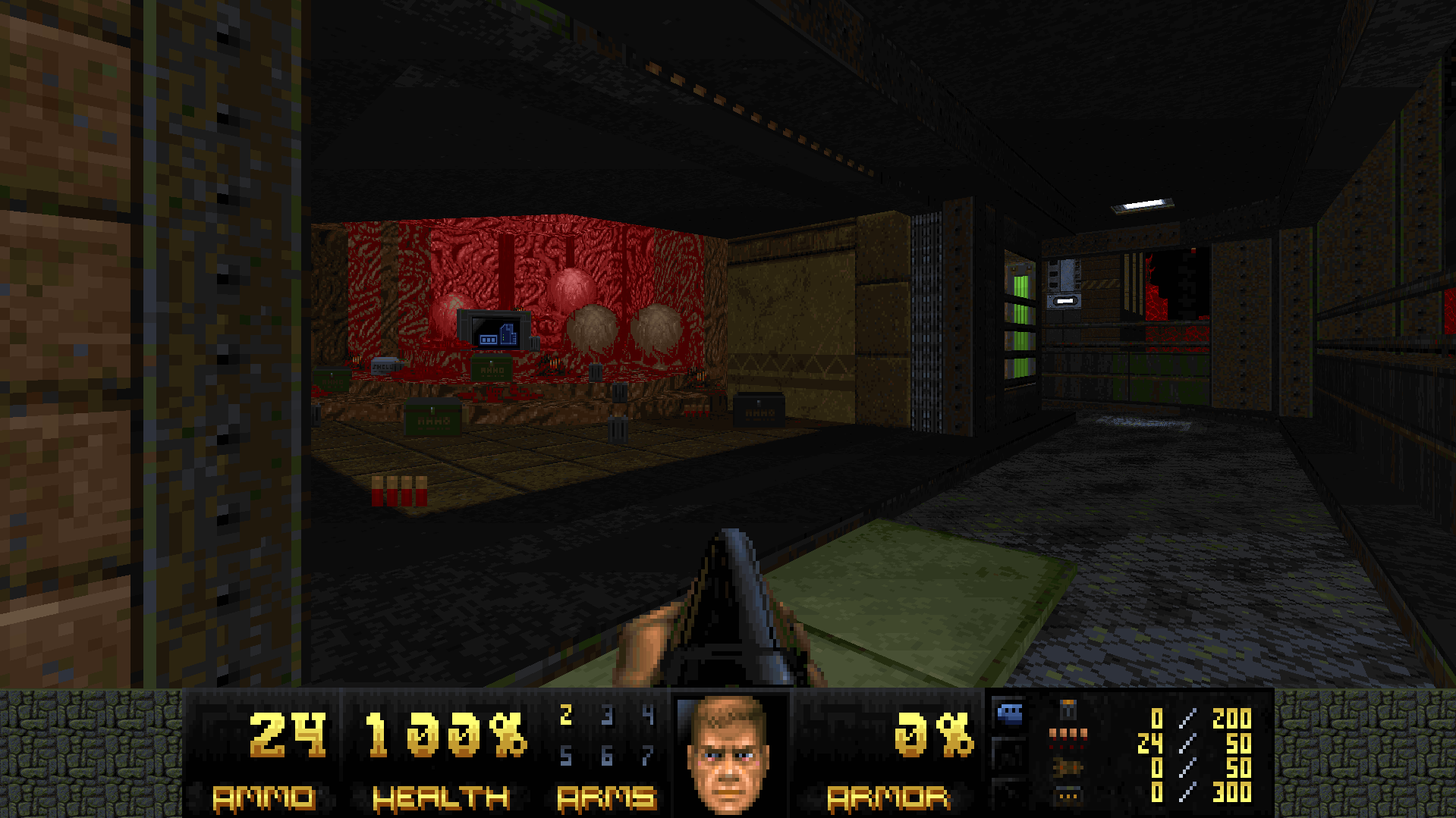
Making a sprawling city map for episode 1. First room's finished.
-
Interception III [MBF21 Community Project]
Lina replied to Moustachio's topic in WAD Releases & Development
Hell yeah, I'm gonna pitch in. Looking through the weapons though, given the lever-action's rate of fire, it and the sawed-off don't really feel distinguished enough in terms of use cases. I'd suggest changing one of them to fire a single slug, something like 100 damage for the lever action or 500 for something to replace the SSG. Since all of the weapons have very efficient damage distribution (pellets/bullets won't overkill, multiple aoe projectiles is a big step up from rockets for crowd control even if the damage is the same), a weapon like that would round out the weapon roster I think. -
Embryo: where each map is smaller than the last
Lina replied to Moustachio's topic in WAD Releases & Development
Continuing my playthrough; I'll finish going through the resource pack before playing map updates. A World of Ichor @Windy Sharply drawn and well-calibrated combat puzzle map, the layering of the visuals is particularly effective. The only issues I've run into are the rocket boxes in the HK/imp fight that don't seem to be accessible in any way, and that the last fight can be subject to RNG; I've had lost souls sneak through the opening while I'm firing rockets, not get hit by imp/HK projectiles, and then make me face rocket myself to death. It might just be a skill issue, though. Because All That You Are Is That What You Are Not @signaturereverie Creative, got a good atmosphere going, flows well. I liked the constantly reshaping arena. The only issues I had were at the SSG platform. If you fall off before reaching the next section, it seems to be a softlock. After the SSG fight is done, the elevator platform keeps moving, which can stick out as a bit goofy given the atmosphere of the map. Ain't Big Enough @EagerBeaver I think this map works particularly well for where it is in the megawad. It's not too out there, it's not very hard (though the cyberdemon can be nasty), it's an anchor and a palate cleanser. An enjoyable romp. The Wailing Fields @Tangra Good, solid map. I don't think anything particularly stood out to me as an issue beyond the fight that teleports archviles on both pillars. I haven't found a good way to avoid both getting zapped and eating a revenant rocket, but then again I'm not the best doom player. Deluge @whybmonotacrab Plays like a kick to the teeth. Tightly wound, just enough ammo, demands situational awareness, cathartic fight that looks harder than it is at the end, it's as up my alley as a genre of map gets. I made sure to finish it saveless. The only issue is infighting and targeting RNG. The first archvile and arachnotron in particular made a pretty big difference; archie targeting you before stuff's started infighting or the arachnotron not getting distracted can both screw a run. Cybie also sometimes threads the needle. Thankfully the more impactful ones are at the start of the map and it's a short one; this kind of map is worth going for regardless. Great choice of midi. Hell Can't Wait @Mario2560 Nicely lit and textured, though it could use some height variation in the floor and ceiling. The main issue with the map is that it's all doors and hallways; this means combat reduces to enemies having to single-file walk toward a chokepoint, where only a few of them can attack the player at a time, all from the same direction. The type of fight like the one with the archvile plays out better (if the player doesn't walk back out the door); their attention is split between chaff enemies and the archvile, and they have to prioritise which monsters to go for while dodging attacks from both. Gutmachine After going through Ichor and Deluge, I think this could stand to be tighter on health and cells. I'll upload a rev 4. Cruel Sea @ViolentBeetle The first fight is the meanest, until the player gets comfortable with walking on fire. I died at the start a few times, but after that I cleared the map without dying; though I've played the map before, and generally knew what to expect. Whether or not you'd like to make the map harder is your call; if so, I think some more monsters outside the playable area in the later fights would be the way to go. The sea of lava stretching outward is a good look, though I think some terrain poking out to break up the horizon might work better with how Doom's terrain is. Empty Machine @SCF It looks as ominous as it should. I think this is the most effective use of shotgunners in the wad (that I've gotten to. I'm nervously glancing at Sargentia). Forcing the player to lean on rockets in a map this tight is devious. My only gripes are that the shotgunner teleporters can randomly sputter one of them out significantly later and pop the player for 3x3d5 damage; and that the arachnotrons/barons in the last fight are a bit much. Though that too might be a skill issue. -
Embryo: where each map is smaller than the last
Lina replied to Moustachio's topic in WAD Releases & Development
On checking, both of the times I got stuck were in the same area. The first was here. The passage is essentially brown on brown and easy to miss. I went off to the SSG fight, and then it didn't grab my eye until I started really combing through the area. Lighting differences would help, either around the passage or on the opposite side. The second was here. The floor lowers quickly and gets masked by the switch press sound (for reference, I heard the one at the start of the map right away on my first playthrough, so it wasn't a volume issue on my end), and doesn't obviously look lowered from the switch platform, especially since the player might grab the rocket launcher and turn around. I went around the entire map a couple of times until I got onto the opposite ledge again, from where it was clear I could now jump across. Making it go down slower, having it reveal something bright behind it, or splitting the ledge into a raised and lower section to make it clear there was a change could all help. In terms of the unevenness, if it's intentional, disregard what I said. I figured it was on purpouse but wasn't sure. Any suggestions I'd give would just make the design more rigid. The idea is good, the issue is just that it's all pinkies and fireballers in a continuous area, which means that the player deals with all of them in pretty much the same way; the couple of imps on a far away platform don't really affect the fight much, since they don't have a view of the whole fight and their projectiles are very slow. Breaking up the roles monsters have in a fight becomes more important the bigger it is. More small encounters in the citadel will be good for the pacing, I'm looking forward to replaying it. It's those two that I was thinking of, yeah. Map01 is very open and traversible, so the contrast with that amplified the feeling of being cornered by hitscan. Map01 also uses an archvile turret, almost as a statement on how non-threatening it is given the right room shape, availability of cover and freedom of player movement. It's a suggestion, but it might not be the best one in retrospect. The archies in the last fight work well, it's a big enough arena with prominent cover that they aren't really threatening by themselves, and they only have imps (and jumbo imps), and maybe some revenants to resurrect.
-
Embryo: where each map is smaller than the last
Lina replied to Moustachio's topic in WAD Releases & Development
Playing in DSDA-Doom 0.25.6, on UV with saves, I don't consider myself a particularly good Doom player. Version I'm going through is the April 22 version of the resource pack. Moment of Conception On this go-around, I'm appreciating that the map introduces almost the entire roster, defanged by the wide open playground of a layout. The midi and mix of indoor and outdoor areas make it pleasant to inhabit, which I'm sure I've already mentioned, but bears repeating. The platform with 4 medikits not triggering an ambush of some kind was the only thing that felt a bit odd. Looking back, pain elementals would introduce too much urgency in a map that's otherwise a fine-tuned opener. Getting Smaller The technical stuff has been mentioned, so I'll stick to gameplay. The deadliest things in this map are the hitscan ambushes, particularly the two chaingunner ambush at the start. Hitscanner galleries will deny any space they have line of sight to, which means in the fights that had them I felt boxed into corners, or running back and forth clearing out the hitscan while hoping I don't get chipped too much. The heavier demons spawn in infighting pairs, which makes them easy to deal with. Feeling like the map's boxing you into a corner of a big area makes it feel stretched out, rather than large. I'd suggest replacing a good chunk of the hitscanners with projectile monsters, or giving the player more cover to work with. Turret arch-viles with pockets of cover the player can run through also work well as area denial without feeling constricting, since running between cover won't get you shot. I'd also suggest using pinkies, lost souls or revenants to flush the player out of cover, especially in the fight after the elevator lowers. The Fallen Citadel The first fight kind of boils down to herding and SSGing down a clump of monsters. Breaking it up into smaller fights or leaning more on turret enemies would help. The map progression feels like it could use 2-3 more small fights, maybe ones that repopulate an area, like the arachno/manc one. I liked the map, and the vanilla citadel looks smashing. Cesspit This definitely feels like Chasm. I'm rather ambivalent on that map, so that's neither here nor there. My main takeaways are that while there's a lack of signposting, and playing it felt a bit uneven, I liked it overall. Varying up the ceiling and lighting levels more would go a long way aesthetically and for not getting the player lost, though I'm also a scatterbrain. I liked the indoor areas other than the red key one, but I'm just not a fan of mazes. The yellow key and ending are good setpiece fights, but felt a bit out of tune with how the blue and red keys go down. It needs some tightening up I think, but this is solid stuff. Silvershine Station The silver and compblu visuals are slick and the midi is fresh. I'll admit to shameless bias toward run and gun, but if the combat were more free-associative - removing doors, ambushes directly pushing the player into more ambushes, tweaking the layout so there's no good place to stand your ground - it'd be a ripper, I think. Ammo felt a little tight, but I'd attribute that to how I played. Grounded Cozy map. Ammo still felt a little tight, even when using the turret monsters to clear chaff. Derelict Compound Knockout, no notes -
Status bar and block typeface. Gonna need some polish and adjustment but they're mostly done.

-
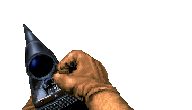
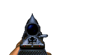
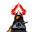
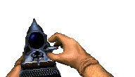
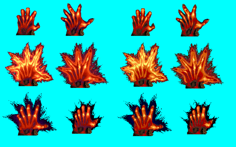
Fiery hand meant as a rocket launcher replacement, with @BluePineapple72 as hand model. Left is in its intended playpal, right is stock.
-
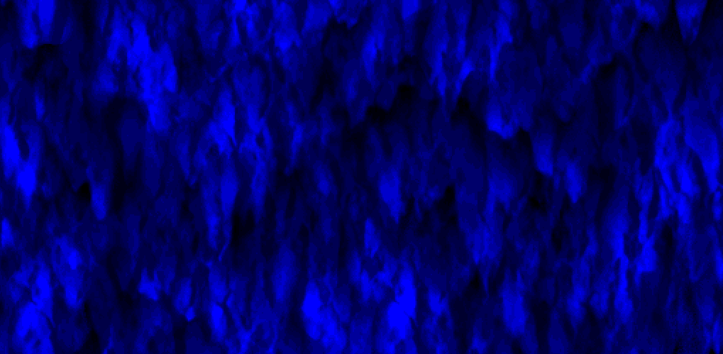
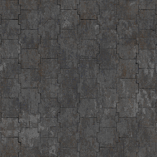
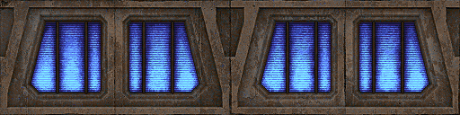
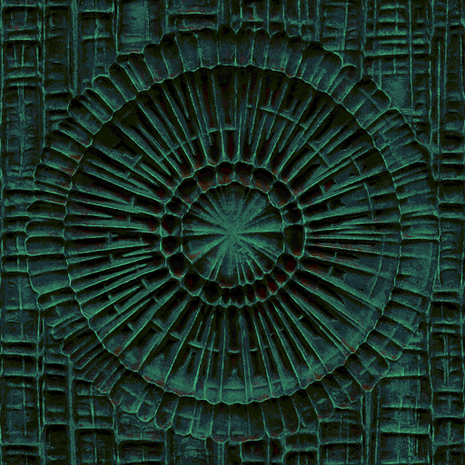
Re-did the 512x256 waterfall to make it crisper, it was overdefined in dark values and too smushed in light ones. Feel free to use with credit. https://www.mediafire.com/file/w3mxjz3g5ue89pn/Crisiper_fall.wad/file Also, here are some samples of a near-comprehensive Makkon re-paletting and editing I've been chipping away at. They're meant for a custom palette, but you can use them if you'd like.