-
Posts
32 -
Joined
-
Last visited
About Raspoza
-
Rank
I never get to finish anything I start

Recent Profile Visitors
414 profile views
-
There will be more obvious Master Levels homages in future levels, this is only the first introductory level (that is still loosely based on Tim Willits's tech bases, so)
-
Jeez dude, it's only one map lol
-
Oooo ooh! This is such a nice demo! Really chaotic, I love it. Even seems like your first attempt(?), if so, congrats! It is such a tough level. Yeah, I agree, it is kinda tough but, hey, it's meant for masters! :D And yeah I kinda agree that there really is a lack of BFG, I made the level with "no BFG" in mind, to keep things more panicky, in a way - though now that I see someone playing it I feel like I really should place one somewhere. I'll try to come up with an obscure secret to place one :) Thanks a lot for playing it! >< I glad you like it!
-
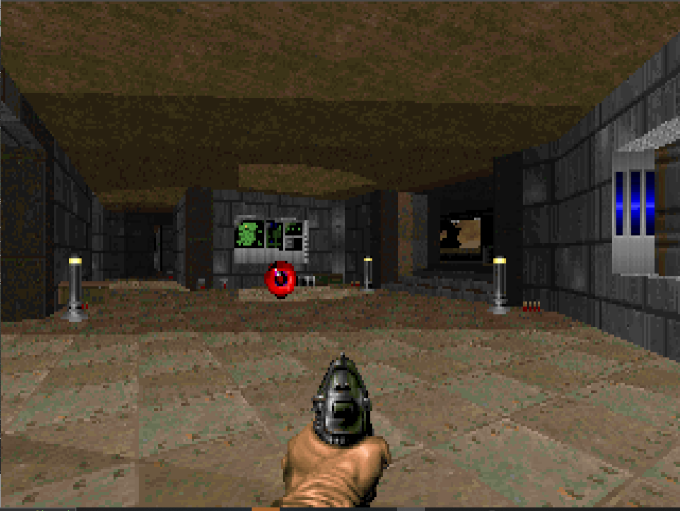
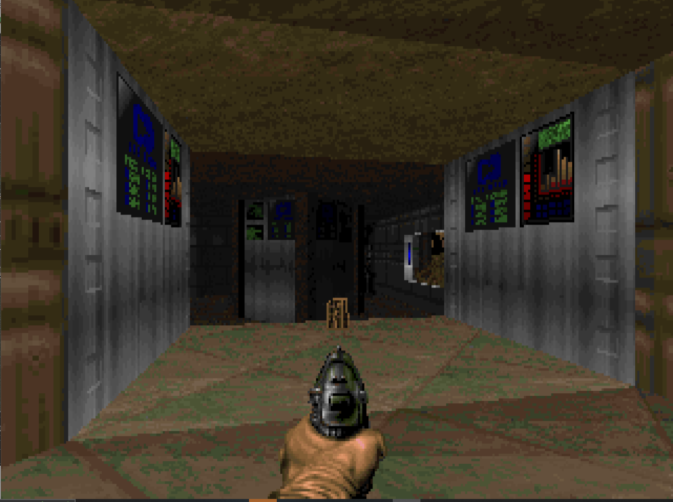
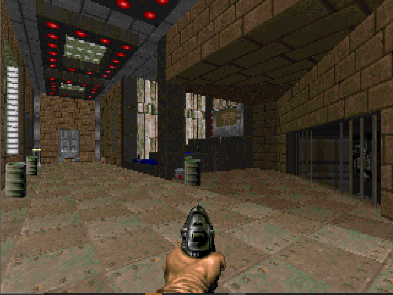
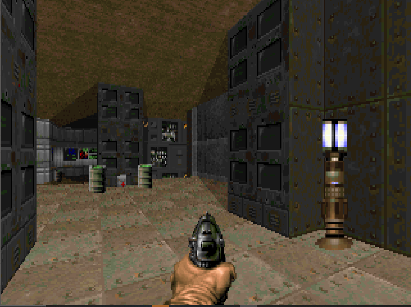
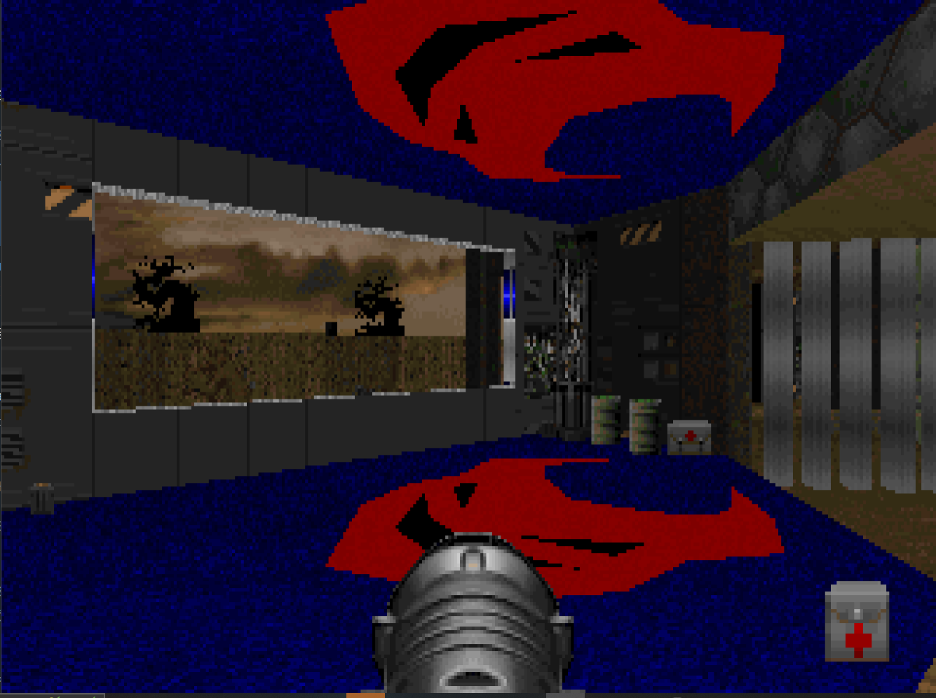
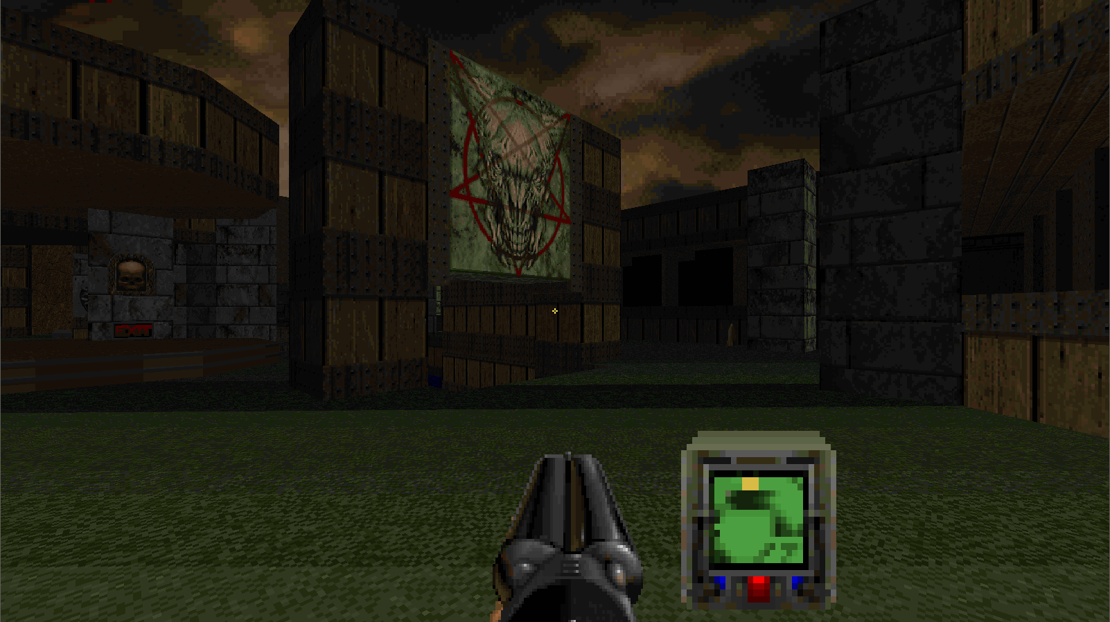
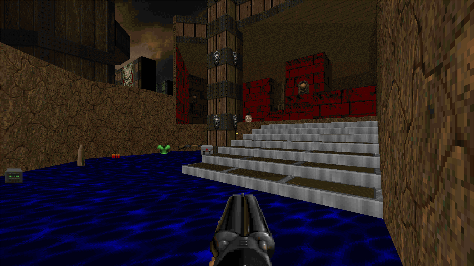
The Master Levels II is a small project of mine that attempts to recreate the same overall feeling of the original Master Levels (albeit with slight more quality in terms of gameplay and visuals). It is a (planned) 11 vanilla-compatible mapset, designed to have small action-packed difficult levels. The visuals are meant to be on par with what you'd see in the official IWADS, so nothing fancy but also nothing ugly. So far, only the first map has been completed, and it is in an untested state, so any feedback is welcome! This small map features all difficulty settings, COOP and DM support (it has its own DM arena - that is just a copy of the map with modifications to fit deathmatch). IWAD: DOOM II Here are some screenshots of the Demo map: Download the file here (wad + dehacked patch): ML2Demo.zip
- 8 replies
-
16
-
I will go on a massive rant here, so excuse me. Thy Flesh Consumed is probably the best Ultimate Doom episode out of the four. Sure, it can not and never will beat the feeling of playing Knee-Deep In The Dead for the first time and falling in love with the seemingly vast 3d world made out of simple drawn 2d shapes, however, if you would take the rose-tinted glasses with me you will notice how overall superior are Thy Flesh Consumed's design choice compared to the original Trilogy, including the so-beloved Romero tech-bases. Let's start with the first impresions: The aesthetics. Thy Flesh Consumed is probably the most unique commercial Doom map-pack in terms of its visuals; a green marble world being held together by metal supports and wood structures, and my God, the skybox; the polluted orange clouds that make you feel like you're in the end of the world - with nothing more than demonic destruction arond you, all of this contributes to one of the most visually pleasing maps you will ever see out of commercial Doom. The level of detail in the geometry, the color schemes, the choice of texture palette, Thy Flesh Consumed seems like it was specifically crafted to be beautiful, and IMO it absolutely SUCCEEDS. Gameplay-wise Thy Flesh Consumed can be a little back breaking at first, the difficulty curve from Inferno absolutely shows - especially on Ultra-Violence, however, being an expansion pack and a sort of final chapter to Ultimate Doom, it is excusable why they would go for such a difficulty step-up, I imagine the designers - going from the expanded enemy roster of Doom II to the limited and kind of bare-bones roster of Doom I - kinda felt the need to spice thing up a little. However, difficulty doesn't really hurt TFC's gameplay as it's possibly the most varied and fun episode of Doom, TFC has incredibly huge amounts of verticality, non-linear design and action-packed fights - The design philosophy similar of that of The Plutonia Experiment of making compact but punchy maps absolutely goes well with the Doom I enemy and weapon roster. Of course, Thy Flesh Consumed is not perfect, as I feel exploration is kind of neglected, however, maybe it's best to have smaller maps that are easy to learn rather than big confusing maps that feel like are crafted specifically to make you rage. Story-wise I'd say TFC leaves it to the player's imagination the most, which isn't necessarily bad, but in the case of this episode makes it feel kind of out-of-place if you as a player was genuinely invested on Doom's story and keeping track of everything that ocurred between Doom I and II. But again, it doesn't really hurt the overall quality of this small action-packed expansion. TFC will always have a place in my heart, it is probably the reason why I love Doom I so much and kind of prefer it over Doom II (without considering Final Doom and user-made maps, of course).
-
I will leave the project, I don't think I'm at the skill level to make a map for a CP yet, I want to focus on personal projects before any of that. Sorry for wasting your time.
-
Add support for custom intermission maps ala Ultimate Doom (custom animation/"you're here!" offsets). Would be cool. Colored lighting would be awesome too if possible. Edit: While I'm at it, I think split doors like the ones in D64 would be nice too, I like those, better than using fast doors + lifts.
-
Played Doom 64 on a N64 emulator on my phone, after that I emulated GBA Doom. Not the best ways to play Doom but, oh well, it was fun and I had a good time with both games. I still get a bit ""nostalgic"" with Doom 64 even though I was introduced to it, like, what, 2 years ago?
-
Can I take 32?
-
Did you make sure the Hell Knight had an attack sound? SkullAttack requires it
-

Recreate Plutonia from Memory! (CP) (Completed)
Raspoza replied to Engired's topic in WAD Releases & Development
oh sorry, glanced over it lol -

Recreate Plutonia from Memory! (CP) (Completed)
Raspoza replied to Engired's topic in WAD Releases & Development
Can I get map 27? -
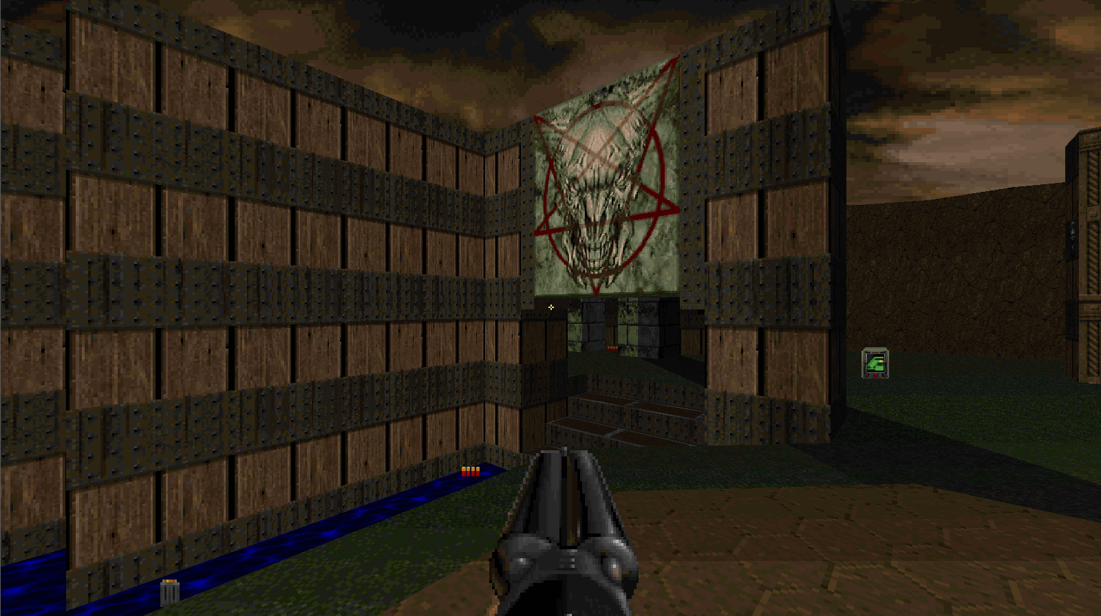
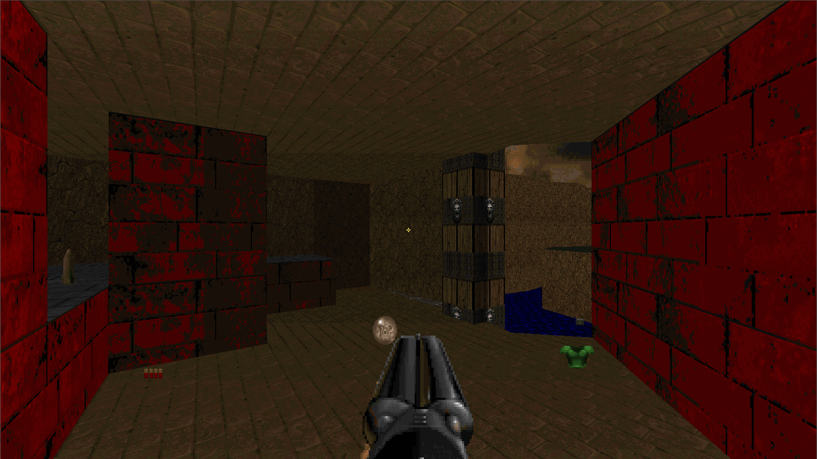
Here's a small deathmatch map I made purely for fun. My first uploaded map, looking for feedback. Download: ruins.rar Compatibility: Vanilla (No VPOs that I know of) Tested with: Chocolate DOOM, DSDA-DOOM Screenshots:
