Pickles
Members-
Posts
30 -
Joined
-
Last visited
About Pickles
-
Rank
Green Marine

Recent Profile Visitors
The recent visitors block is disabled and is not being shown to other users.
-
Helion - C# (0.9.3.0 6/24 - Goodbye BSP tree rendering)
Pickles replied to hobomaster22's topic in Source Ports
My tests were done flying above the main area after having shot, to try to cause as much strain as possible. Did this on a GTX 1070 for those curious. -
Helion - C# (0.9.3.0 6/24 - Goodbye BSP tree rendering)
Pickles replied to hobomaster22's topic in Source Ports
Ran a test on SoS Map 32 on my own PC. PRBoom and GZDoom? less than 30FPS Helion? 250FPS Hooly crap, this port is not messing around. Good shit. -
Ah. Goes to show what I know about ports.
-
I'm more wondering if it's possible to have the game render at a lower resolution than the window. Like have the game render at something like 480p in fullscreen, but the actual game window is 1080p so my monitor doesn't have to change resolution whenever I tab out.
-
I've been using this as my main port driver for a bit. It's really nice. The console is a dream come true for a PRBoom port. That being said, there are a couple of requests I'd have to make my own enjoyment better, and possibly others' as well. -The tag finder is brilliant and a lifesaver when looking around for the last couple secrets, but I'd like for it to activate while using IDDT as well as having Allmap. -I'd also particularly like to have an internal resolution setting, so I can have my window be in 1080p while still giving the game a crispier look. Currently I have to choose between fullscreen, fullscreen with crispy but life becomes difficult if you want to tab out, or windowed in which it's either fullscreen with input delay, or the screen is tiny, and there's probably still input delay. Excellent work on this port either way. I'm going to continue to use it whether or not either of these are submitted.
-
Smolderground - "first" map, feedback appreciated
Pickles replied to solidago's topic in WAD Releases & Development
Looks like a promising map, though I'm worried that the encounters are going to match the architecture. I forsee myself having difficulties with this one. Edit: Yeah, I was right. Definitely having some serious troubles with this level. It feels like Plutonia mixed with nerve.wad -
Everyone's calling for something like zdl, and they're right. They have support for ports that aren't even ZDoom-derived and allow you to compile as many wads as you want in any order before executing anything.
-
Pretty sure you can bring up a keyboard in DT. In that case I'd just bring it up and hit enter.
-
I have no help to offer, but having Doom on Archipelago sounds hilarious. I hope you manage to find a working solution.
-
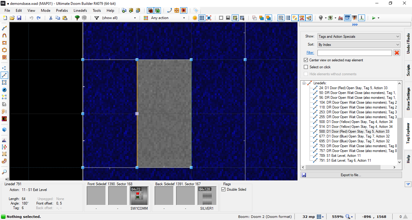
Oh hey, I remember your previous map, Height Fight. I remember it being pretty easy with some flat lighting and a ultra map-breaking secret. I remember also liking the layout and details you put into it. Looking forward to see how you've progressed. I'll edit this post later with a review. Edit: Alright, I'm back, and I have footage. This recording was on GZDoom, but I also played on PRBoom+ with -complevel 9 First thing I'm gonna say: Your detail work is still pretty good. The yellow key room, while a bit too big for the fight imo, felt very nice as a place and gave me some serious TNT Evilution vibes. The little computers and platforms strewn about also give some nice life to the map. The map's still pretty easy, but there's more challenge than in your previous map. The room with the cacos and imps actually did kill me, even though it was an insta kill from a barrel placed behind me. I was also confused on why you placed a blue door if you were just going to put the key feet away with nothing in between them. It would have made more sense for there to just be a door there. Weirdly enough, the placement of the ammo feels very unnatural. This was also present in your previous map, but it wasn't really that big of an issue. Almost all of your ammunition has been placed on some form of pedestal as if you're offering it to the player. I feel like putting the ammo around the arenas for players to incidentally pick up would help with this. Something more akin to your arachnotron room. I noticed that the lighting method in this level is still the same i.e.: All 1 flat light level throughout the whole level. I hope that a change you make in later levels is including differences in lighting. It would really help in setting the mood for the level. Lastly, while you did add a secret, there are some problems with it that led me into looking through your map with Doom Builder. This was spurred on because I was having immense difficulty finding the 2 secrets in the map. Turns out that 1: The 2 secrets are actually 1 secret with 2 secret sectors in it. And 2: The secret was totally unreachable Nothing in either of these 2 screenshots above lowers or opens, and there are no teleporters. With the default controls of Doom, this secret literally cannot be accessed. But while looking for how to open that, I came across another couple of harmless technical issues: These 2 sectors are also tagged as part of the Red Key door. And This line puts a switch on the inside of the block that ends the level. Other than that, there are a couple texture misalignments that aren't too huge of a deal. Final Verdict: Mostly pleasant-looking map with some very laid back combat and a broken secret. 4/10
-
So it's just ... Revenant Bus ... without the Revenants?
-
Played on PRBoom+ Your map seems to suffer from "I know everything about the map so I'm going to create parts of the map based off knowledge that players might not have" syndrome a bit. Especially with the Rocket Launcher. That fight at the blue key can be on two totally different levels of difficulty based on if you found the secret rocket launcher earlier in the map. As you can see from my gameplay, I did not and paid for it from the midpoint onwards. Moving on: This map looks really nice visually. You really realized some locales here, even if the likelihood that an area like this could possibly exist with so many extreme style shifts is dubious at best. The caves feel almost comfortable as if I've been in them before. More specifically, it reminds me of the caves you'd usually find in TNT Evilution. Rooms are decorated with shrines or computer desks, really anything. You did a nice job in making sure each room had just enough clutter lying around to make sure nobody started just thinking they were walking from box to box. I especially liked the wires you ran in the Blue Key room. About the combat: The aforementioned syndrome effects the combat of this level quite a bit. I ended up beating the map without the Rocket Launcher because I couldn't find it naturally. I ended up needing to use IDDT to locate it on another run. Each encounter has been carefully structured to apply constant pressure to the player in a variety of ways. Actually, each encounter taken on their own are pretty good. Rooms aren't too big to properly accommodate the fights, nor are they crushing you with claustrophobia. If the RL weren't in a secret, I'd say this map feels perfect difficullty-wise from a player's point-of-view. My last major not is there is NOT enough non-secret HP in the map. Without the secret supercharge, this map feels particularly difficult to overcome, probably more that was intended. Once again it feels like fights in the later parts of the level were designed with the idea that you would have that extra 100HP in mind. Final Verdict: This is a decently fun, good looking map. The secrets are a little too close to mandatory for comfort, and the map itself is a bit eclectic in places, but I can honestly say I came out of this map with a generally positive experience. 6/10
-
Ooh, Dynamic Lighting really helps the mood for this map. I'll edit my post later to show a playthrough and give a review of the map. EDIT: For reviewing purposes, I played on PRBoom+ Unfortunately, the dynamic lighting seems to have done most of the heavy lifting in regards to how this map looks. This map's lighting is flat AF once you take it out. As for the map itself: It's somewhat basic in areas, but you seem to possess an eye for detail in maps. You seem to have put a lot of care into creating rooms that feel naturally populated with obstacles. Honestly, it's hard to do. I myself struggle greatly with that particular issue. I'd say the main issue is that the map doesn't seem to mesh well with the combat you've placed in it. Encounters are mainly small monsters, no more than 5, in a rather overly large room with the exceptions of the fight in the room in your 4th screenshot and the fight just before you collect the key. I tend to follow a rule with my maps: Only make a room as big as you want the fight to be. A good example is actually the room from your 4th screenshot. I'd say it's probably the best example of a fight in this map. You have a small room with some light cover, and on the other side of the room are some nearby enemies that you have to take out. At no point in the fight do I feel like I'm in a massive arena with only like 2 enemies, nor do I feel claustrophobic from a lack of room. (Personally, it's also the best looking room in the map.) I'd recommend looking at each of your fights and deciding whether you want the fight to take up more of the room, or if you want less room encompassing your fight. It generally does wonders for balancing and fine-tuning your map. There is the elephant in the room which is the map's one secret. It's far too easy to find and access, especially for how disproportionally powerful you end up becoming after finding it. I messed around on my first run and used it a bunch, but I made sure to avoid the secret entirely on the second run just to test the balance of the intended route. When creating a serious map, it's generally advisable to not add in a massively overpowered secret like that in order to not nullify all of the map design. However, you could go the opposite direction and create a map around a massively overpowered secret like that in order to create a power fantasy that allows players to let off steam. Though, in a situation like that, it would likely be a better idea to just make the secret a required part of the map and just create the whole level off of the idea that you have the items you would have had in the secret, but I digress. Final Verdict: It's a fine map. Something I could see as the first map in someone's first ever wad. On the extreme easy side, and trivial if you pick up the BFG secret, it's still not an unpleasant cruise through a chill map. 6/10
-
I'd like to mention that this map seems to only work on GZDoom. Or at least i tried many different complevel settings on PRBoom+ and came up with ... well: Though since I managed to actually play through the map properly on GZDoom after recording, I'll just comment on the map itself and not my self-inflicted softlock: This map is very much underbaked. You seem to have a flow you want of the general map, and you do have spots for encounters, but there's very little actual substance featured here. Rooms are almost exclusively large, mostly featureless cubes with 1-2 enemies in them and zero cover from fire. With the exception of the first and last rooms, there's basically nothing to note. Even the damaging pits you placed in the room didn't even slow me down really because they were too small to provide a navigational issue, and the combat wasn't difficult enough for me to need that particular spot of the floors. Speaking of combat, the combat seen here needs some serious reconsidering. Playing on UV, I didn't even really notice the majority of the enemies on the map. Everything except for the first shotgunner and the final specter were dead before I really processed they were there, I immediately fired once I turned the corner and suddenly every threat was just ... gone. Actually I literally didn't notice the zombieman that was in the first room until I replayed the map on GZDoom and looked around to figure out where a zombie was sneaking up behind me from. I would only notice it was there when I went back for the SSG secret when enough time had passed that it managed to get directly in front of my face. It still didn't make a difference though since I had a shotgun and 40+ shells. Even with the extreme health drought in this level's design isn't noticed because there just aren't fights to whittle down your HP. A couple miscellaneous gripes to make before wrapping up: Your doors are too big and you end up just getting a tiled door texture that moves up and down, it's not super nice to look at. Maybe make door-sized doors. And on the subject of doors; all your locked doors are simultaneously unmarked and totally useless since you always find the key before the door. Either put some obstacles in between the player and the key, or just don't lock the door to begin with. I'm not going to comment on the texture work. Visual design, in my opinion, is where an Artist gets to share their unrestrained vision with players. It allows you to put 100% into a map, but not overwhelm the player with the game itself. I will say that I don't think there's quite enough of the map for me to fully understand your vision yet. I hope this helps. Please don't get discouraged that I have so many negative things to say about your map. Creating maps is a careful, difficult process which has a steep learning curve at the beginning, and an unfathomably high skill ceiling. The fact that you created a map that can be completed means you've already done far more than the average person that says "I want to make a Doom map." I'm sure if you put more time into mapping, you'll come into your own style and start creating masterpieces of your own.
-
How Do I Insert textures from afterglow into Doom builder
Pickles replied to PhoenixCyanFire2's question in Editing Questions
I'm not sure how you're getting an error in SLADE, but I just dragged the texture wad into the "open archives" box on the left side of the screen. Otherwise, read this page very closely: https://doomwiki.org/wiki/Adding_custom_textures


