-
Posts
120 -
Joined
-
Last visited
-
It looks like a Doom adaptation of Super Mario 64's Rainbow Ride course. I find it God-awful but that's just my opinion.
-
How about you get on it. I doubt anyone would exert energy into trying to make an ugly MEGAWAD full of bright rainbow themed textures. This isn't a dunk on gays, either, but a WAD solely based off of bright pride flag colors would just be eye cancer.
-

What is your favorite types of Maps ?
Baron T. Mueriach replied to LamaRoux34's topic in Doom General
Large UltDoom techbases. It might sound bland but it never gets old for me. -
This thread is fucking sad. I feel more isolated than I do depressed, I’ve never been depressed in my life as far as I’m concerned.
-
Well, if you'll look closely you'll observe the error message "out of host memory". You are the host, you don't have enough available memory to run Brutal Doom + the other mods. There are multiple (potential) fixes to this, but in the long run they'll be a band-aid on a bullet wound. Maybe run GZDoom as an administrator, sometimes giving certain programs administrator settings helps with memory allocation. You could try cutting down on certain graphic settings to minimize the amount of things happening, updating your drivers, modifying config files, etc. but my best advice is to buy some new memory sticks. Sorry.
-

How to change the Icon of Sin's Enemy drops and Rates.
Baron T. Mueriach replied to fdai's topic in Doom Editing
This also, and add a space between the : in ICantBelieveItsNotBossEye: BossEye So, ICantBelieveItsNotBossEye : BossEye -

How to change the Icon of Sin's Enemy drops and Rates.
Baron T. Mueriach replied to fdai's topic in Doom Editing
It's imperative to look at root issues that may seem simple, but just double-check if sprites you're using are correctly defined in the WAD. Maybe try removing the class keyword because in DECORATE, actors are defined using the actor keyword, not class. -
Baron T. Mueriach changed their profile photo
-
I like it to start out in a smaller room, with multiple visible pathways you could go, to me it signifies fluidity and encourages me to see more. Hot starts can be fun or sometimes necessary if the point of the map is to get players moving quick because the map is large and requires constant progression. Hot starts are more of a Doom II thing, whereas the slower, more ambient starts are a Doom I thing. That can be interchanged of course, but enemies like Mancubi and Archviles are the leading cause of running around like a headless chicken scrambling to find cover.
-

Your guys' mapping techniques
Baron T. Mueriach replied to Baron T. Mueriach's topic in Doom General
I absolutely love maps like this. Nonlinear maps are far better than linear maps in my opinion, it feels more free rather than just a straightforward progression. -

Your guys' mapping techniques
Baron T. Mueriach replied to Baron T. Mueriach's topic in Doom General
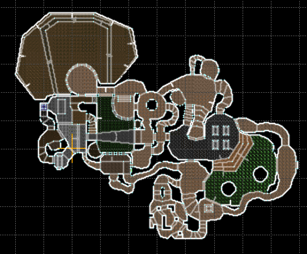
Wow, I can certainly see how the shape of the original map was pertained in the remade one, it's very good! I certainly like that style a lot too, it's very compact and doesn't require long stretches of walking in order to get from one place to another. -
It's a beta screenshot of Doom 64 displaying a Mesoamerican style step pyramid but it doesn't appear in the final game. I'm pretty sure it's also a map in Doom 64 Retribution.
-

Your guys' mapping techniques
Baron T. Mueriach replied to Baron T. Mueriach's topic in Doom General
Yes, the spawning vats remake definitely has that. The overall goal was to make an annoying puzzle maze like map with ugly textures, much like the original spawning vats. I definitely try to take the "not too interconnected" approach, I think I may have gotten that down, I also have been able to round up a few playtesters. Finished the layout of the level, too. Thank you for the advice. -

Your guys' mapping techniques
Baron T. Mueriach replied to Baron T. Mueriach's topic in Doom General
Thanks I appreciate it! It's funny, your video on mapping basics was the first video on Doom mapping I ever watched when I started getting back into it. -

Your guys' mapping techniques
Baron T. Mueriach replied to Baron T. Mueriach's topic in Doom General
Thanks! Glad to hear it.


