

t.v.
-
Posts
365 -
Joined
-
Last visited


About t.v.
-
Rank
Member
")
-
Thanks for including Plutonia 2's final boss! Its official name is "The Gatewatcher". It was named so, to match the first Plutonia's "The Gatekeeper" :-)
-
No problem. I am glad it is solved :-)
-
That is strange. It works fine for me. I have tested it in both GZDoom version 4.11.0 and 4.12.1 - What version of GZDoom are you using? - Did you load it with any other additional files? - It sounds like somehow the Dehacked isn't loaded correctly in your setup. Do the other monsters/ weapons behave correctly?
-
 I am bumping this thread for 2 reasons: 1: To ask for an update. How are you doing Doomkid? 2: to introduce some stuff, no-one asked for: I have attached a zip to this post. It includes: - a Deathmatch map I made (stored in slot 02, for no real reason). The map is called 'Witch hunt'. - a small Dehacked with turns all pick-up items and Player sprites Full Bright. A small change, but it significantly helps in Deathmatch. Once you tried it, you don't want to go back :-) - the 'blud' sprites I made for Scientist. More (full bright) blood and it lays on the ground a few seconds. - for GZDoom (including Zandronum): custom startup-title & colors, and custom cursor. tv-Dwango30-2024-03-07-map02.zip
 -
I'm the DM in a Dungeons and Dragons campaign. Occasionally I make illustrations of scenes and characters. Our latest D&D session contained Doom references :-) The story is very convoluted, but in short: The Johns wanted to sacrifice souls to an Astral Dreadnought to get a Wish. The players managed to stop them. Here is a drawing of the scene: [Edit: it should work now]
-
'Animation': The screen is divided into cells. Each cell has a solid background (with 8 possible colors) and a foreground which can contain a character. The foreground of a cell can be set to 'blink'. So it switches between being displayed and not displayed. The 'animation' has 2 frames and is pretty basic.
-
What I meant to say was: An ANSI screen usually has a resolution of 640400 pixels. Back in the 90ties this would fill the entire screen. But on modern screens 640x400 is only a part of the screen. Technically it is not 'scaled down', but it is displayed smaller. It is kinda like a blurry photograph. If you put it on full screen, it is clearly blurry. But if you put it in a small window it looks sharp. So the best way to 'judge' ANSI art is to put it on full screen. The 'extended special characters' look good when the image is displayed small, but look distracting in full screen. But that is just my opinion :-)
-
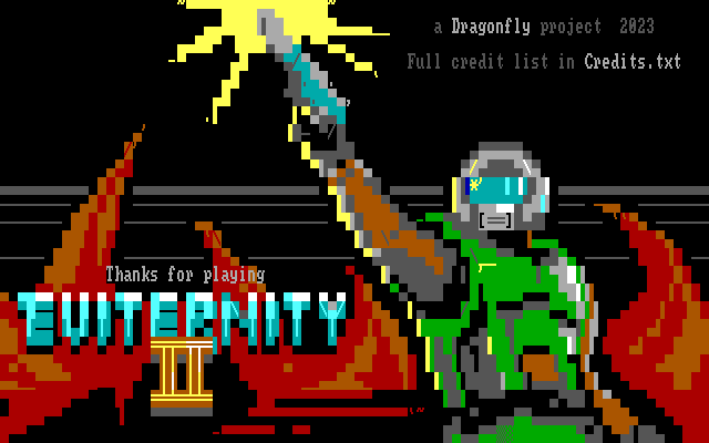
My latest creation is now included in Eviternity II RC5 :-)
-
Is it possible to make something like 'id Vault' in GZDoom?
t.v. replied to t.v.'s topic in Source Ports
Thanks. The Space Cats gallery is accessible from main menu, like I want. It is an expansion on the original Read me screen. It is clever but also very limited. The Codex in Metadoom is way more complex then I need and not accessible from main menu. But it has useful features. I will try to 'have the best of both worlds' and find a way to simplify and connect it to main menu. -
Is it possible to make something like 'id Vault' in GZDoom?
t.v. replied to t.v.'s topic in Source Ports
Thanks, the MetaDoom Codex looks great, but could it be made accessible from the main menu [instead of pressing 'n' while in game]? That would be perfect. I couldn't find what you were referring to in Shades of Doom. Where do I find these credits? -
I never used MBF, but I'll give it a try once I have some more free time :-)
-
In the 2023 re-release of Quake 2 there is an extra option in the main menu: 'id Vault'. It leads to a gallery of concept art etc. I think it is an awesome way to archive artwork and extra information within the game. Is it possible to make such a gallery/menu in GZDoom? Are there examples?
-
Plutonia and Evilution are also from 1996 ;-)
-
You can get it by pasting an image in EndEdit with "Use extended special character". In my opinion, it is a cool effect and it looks good when the image is scaled down, however: in full screen it looks confusing because it breaks up the overall shape of things.
-
I never played this before (I heard the name before though). Indeed it feels like a great classic! The Sky texture looks amazing! The Titlepic and statusbar could have used an update, but I guess this is more OG. It's also nice to read about how other people were struggling with editors back in the 90ties :-)