-
The history of ZDoom mapping is rich and varied, and we’re certainly not done with it yet. The port family’s features allow mappers to go so far off the beaten path that many releases are simply unclassifiable—how could something like ZanZan, Urban Brawl, Reelism, or Lilith ever be lumped into a school of mapping? Their influences come from entirely outside of the Doom community or sui generis from within the author’s deranged mind, and they bear no resemblance whatsoever to the experience of playing Doom itself. Mapping for the Z-ports offers enough flexibility to make projects like this possible.
ZDoom and GZDoom have continually grown more advanced for as long as they’ve been around, offering new features and mapping aids every year. Over time, the community seems to pick and choose the best features, or those that are the most functional for most projects. Slopes, deep water, and fog have remained ever popular, while particle fountains and colored sector lighting have fallen out of favor. Decorate (now ZScript) is a fantastic toolkit with lots of neat properties for monsters and other actors, but Centaur-style shield blocking and stealth monsters are frowned upon. ACS scripting (also recently replaced with ZScript) allows for very flexible mapping, but the mapping community tends to acknowledge that cutscenes rarely have the desired effect and has mostly ceased to use them. Because the whole feature set is so experimental and so easy to get carried away with, ZDoom mapping on the whole has often been sneered at by classically minded mappers who see it as excessive, valuing flash over substance. And while there’s often some truth to these criticisms, they sort of miss the point. The more features you have to wrangle, the more skills you have to learn, and the more unique your design goals are, the more difficult it is to work something pure and polished out of them. So the course of ZDoom mapping has been one of gradual refinement, of coming to understand the breadth of what is available and how to use it to bring ideas to fruition—and in the meantime, classic mappers continue to work with the simple core gameplay that’s already been refined by a great many people who came before.
The course of ZDoom mapping has been one of gradual refinement, of coming to understand the breadth of what is available and how to use it to bring ideas to fruition
But the school of mapping that many people consider synonymous with ZDoom, the one that was most popular in the 2000s and early 2010s, was all about going whole hog with features. These mappers envisioned Doom as a more advanced version of itself—a more modern first-person shooter with amped-up arcade action and the cheesy, over-the-top appeal of the Build engine games. Later mappers would continue to reflect the evolution of FPS games as a whole—Quake, Unreal, Half-Life, it was all fair game. But even though they incorporated ideas from so many other games, they remained a very Doom-oriented subcommunity with their own tropes and distinct voices, drawing from their love of Doom first and foremost.
-
 Action Doom - Scuba Steve et al. (2004)
The Power of Cheese
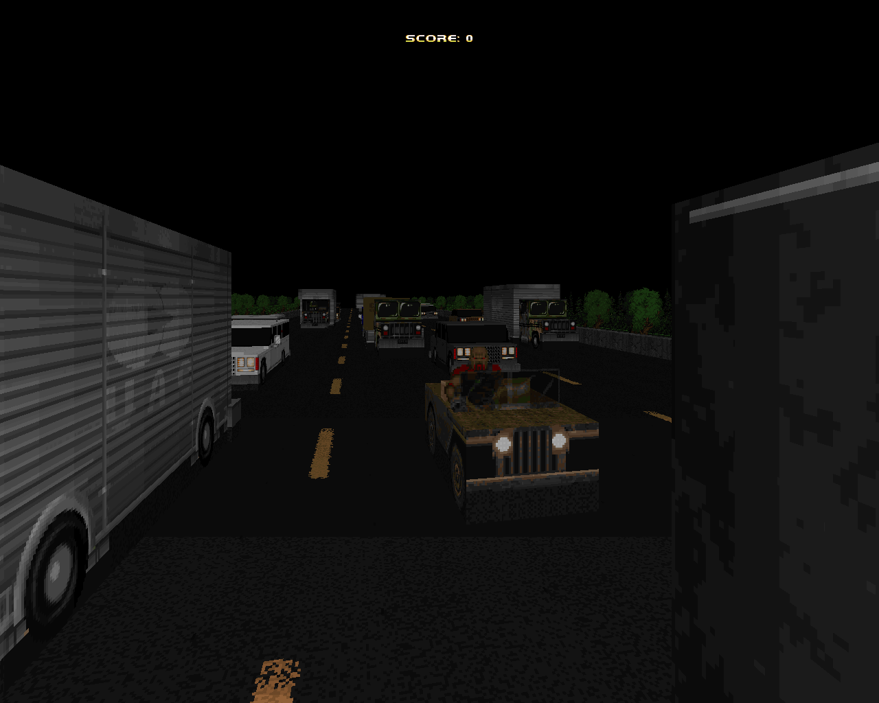
Action Doom was the first release to take ZDoom mapping over the top; it was goofy and ridiculous and packed full of the advanced features that were available at the time, and it was proud of it. Emulating both the gameplay and the tone of side-scrolling console shooters like Contra, it delivers nonstop action and faux-unintended comedy. In short, it never lets you forget that you’re playing a video game, and taking yourself seriously is something that you do at your own peril.
To achieve this, the team really had to go in with no holds barred, and that’s where ZDoom comes in. The game world is literally bursting at the seams with explosions, flying debris, and other effects that make it feel consistently pumped up. True to the game’s console shooter stylings, your health is cut down to almost nothing so that a single hit is lethal, giving an even greater meaning to “run and gun.”
There was nothing subtle about any of it, but the absurdity was the whole point
But what really stands out about the production is the unique action sequences in every level. The boss battles are huge and elaborately scripted, complete with boss health bars. Trees fly by you at breakneck speed as you leap from one vehicle to another in a deadly highway chase—assuming you didn’t pick the boat chase instead. A building explodes around you as you race to make it onto a helicopter, which is then grabbed by the final boss in its death throes. The Action Doom team got so into it that they launched a marketing campaign with physical merchandise, itself inspired by cheesy ‘90s advertising. There was nothing subtle about any of it, but the absurdity was the whole point, and in its own way it was as retro as any vanilla mapset—it appealed to people’s nostalgia for what they saw as a golden era of video gaming.
-
 Simplicity - Agent Spork (2005)
The Future Is Shiny
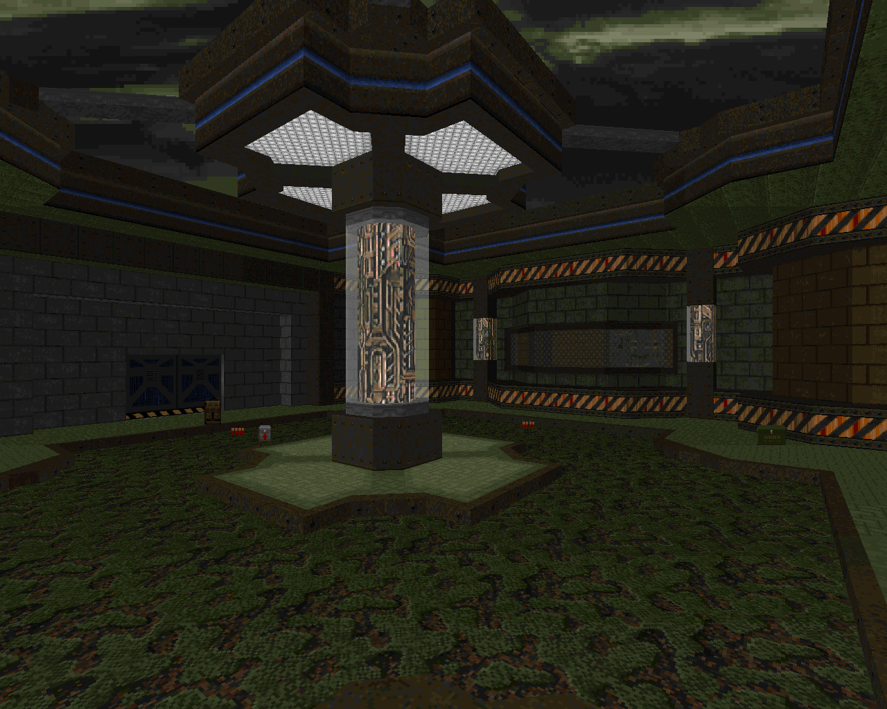
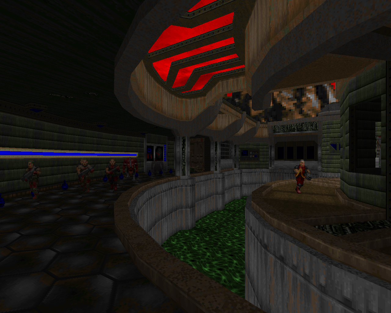
As the name implies, Simplicity is a bit of a rebellion against some of the complex, highly experimental ZDoom releases that came before it—but only a little bit. The point isn’t that it cuts back on the port features—it uses them pretty extensively in many maps. The point is that it uses them subtly, not bombastically like Action Doom and not in an effort to transform Doom into a different game, but woven seamlessly into its very Doom-like gameplay. Transparency, slopes, and 3D structures serve as highlights for conventional architecture; scripted events support the simple flow of the combat, throwing in a bit of variety but never lasting very long; a small selection of custom monsters appear alongside Doom’s stock bestiary, but they don’t do anything too fancy.
The most ZDoomy thing is probably the boss battles, for which Agent Spork couldn’t quite resist adding some more complex move combos and scripts that give them a more SNES-like feel. The result of all this is that Simplicity feels like it’s halfway between a classic fast-paced mapset like Scythe and a “big budget” ZDoom project like Action Doom. If you learn one thing from looking at the history of Doom mapping, it’s that people are always reacting against other mapping styles, often revising them to create cool hybrids.
Simplicity focuses on the arcade-like aspect of Doom’s gameplay, using its features to supplement the fast-paced action and make it feel even faster
But like Action Doom, Simplicity really focuses on the arcade-like aspect of Doom’s gameplay, using its features to supplement the fast-paced action and make it feel even faster. Simplicity is highly streamlined and linear, at times surprisingly similar to Action Doom’s literal straight-line progression, because that’s one of the best ways to make a map move very quickly. Both the aesthetics and the combat are clean, ultra-polished, and—well hell, I guess I’m just going to use the word “streamlined” again, because that’s exactly what it is. The distinct sleekness of the megawad has inspired a fair number of mappers both inside and outside of ZDoom’s subcommunity; Scythe should be properly credited for doing it first, but Simplicity did it in its own way, and was just that little bit classier.
-
 Ultimate Torment & Torture and Knee-Deep in ZDoom - Tormentor667 et al. (2007)
The Kitchen Sink
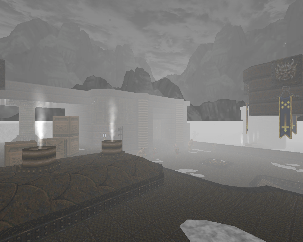
Take the flashy, over-the-top cheese of Action Doom and combine it with the sleek visuals and arcade-style gameplay of Simplicity, and you have the mapping style created and propagated by Tormentor667, who’s perhaps the most well-known, prolific, and controversial ZDoom/GZDoom mapper of all time. The defining characteristic of Tormentor’s mapping is the kitchen sink approach, which is to say that the maps are packed with advanced port features, in contrast to Agent Spork’s style. Visual features, gameplay features, storytelling features—Tormentor goes the whole nine yards with every facet of mapping in order to give his projects the production heft and glamorized look of a big Hollywood blockbuster. Although Tormentor already had noteworthy releases under his belt in the preceding years, his major breakout projects were the solo mapset Ultimate Torment & Torture, a revamp and expansion of some of his earlier work, and the team project Knee-Deep in ZDoom, for which he was the creative director and one of the primary mappers.
In UTnT and KDiZD, the aesthetics are a major part of the mapping style, a way to make the maps feel grander, more intense, more atmospheric, and of course more modern. Whereas classic Doom maps might use aesthetics as a canvas of sorts, a relatively unobtrusive backdrop for the gameplay, Tormentor is geared toward immersive environmental design. The player’s attention is turned toward the environmental details, and enjoying those details is a key part of the experience. Steam erupts from burst pipes, sparks shoot out of damaged computer consoles, and particles drift up from teleporter pads. Weather systems such as rain and fog saturate the outdoor areas with mood and tension. Falling into lava or a deep chasm is instant death, because that’s how realistic environments are supposed to work. Lava falls move more slowly than waterfalls, because they’re more viscous. But unlike RTC-3057, where the realism is hyper-tuned to create tension and inspire caution, Tormentor’s realism is more cartoony and exaggerated; the focus of the gameplay is action, and the environmental details are designed to feel badass, bringing out the dramatic flair of the action.
The maps are packed with advanced port features—Tormentor goes the whole nine yards to give his projects the production heft and glamorized look of a big Hollywood blockbuster
Tormentor uses a lot of conventional detailing alongside the port features, which makes his maps feel very visually dense – again, because it’s dramatic to look at. This visual density tends to make the environments feel like more extreme versions of themselves, regardless of the setting. In the fiery gothic maps that make of most of UTnT, it makes them that much more sinister and hellish. In KDiZD, it plays up the high-tech feel of the techbases, which reflects the idea that the maps are more modern, aesthetically impressive versions of the original IWAD maps. Both the standard architectural detailing and the ZDoom features tend to build up a sense of homogeneity within a map—Every single light casts a similar downward lighting effect, every outdoor area is permeated with a similar fog, inset details and trim repeat realistically across entire architectural complexes, and so on. Classic Doomers have sometimes criticized this style of detailing as “copy-paste”—which is perhaps a bit ironic, given that modern limit-removing and Boom maps tend to have their own set of homogeneity tropes. Regardless of what port you’re mapping for, this type of detailing gives a certain unity to a map, which can be valuable in the right context; in Tormentor’s case, it’s an aid to the environmental design.
UTnT and KDiZD are just as liberal in their use of custom monsters as they are with visual features. A typical Doom mapper’s philosophy would fall in line with the original Doom games, which is to say that each monster should occupy a distinct combat niche so that the player has to respond to each one differently, allowing for intuitive skill-building and dynamic combat scenarios. Tormentor doesn’t follow this philosophy at all, because his level design isn’t about moderation and his combat isn’t about dynamic pressure. A Tormentor map is designed as an arcadey blast-fest where the combat is more about presentation—i.e., the feeling of being an action hero, where nothing can stand against you—than it is about challenge. And so you have Imps alongside Dark Imps, which are a more powerful variant of the same thing, and Soul Harvesters, which are Imps with slightly homing projectiles, and Shadows, which are somewhat faster and sneakier Imps that shoot volleys of a few projectiles. Hell Knights fight alongside leonine counterparts with shields, and various forms of zombies with semi-automatic guns blend in with Doom’s stock undead hitscanners. Partly this is for variety, which after all is the spice of life—Tormentor’s maps are populated by a diverse array of entities to fight your way through, each of which presents you with an in-the-moment challenge to respond to on the fly, rather than a tastefully limited set of skills to gain deep knowledge of. It also adds to the sense of presentation—for instance, a Dark Imp might be placed in such a way that it appears to serve as a “captain” for a set of regular Imps, or a broader selection of zombies might add to the realistic feeling of fighting soldiers who died carrying a variety of weaponry. In other words, it adds flavor.
Meteors rain down and an operatic chorus screams out the end of days at full volume in the background. Why? Because it’s cool
Whatever individual design choices and features they may use, Tormentor’s releases—including the many group projects he’s led over the years—are all defined by a sense of grandeur and drama. There’s a sweeping, cinematic feel to every aspect of the map design, from the slow, deliberate buildup of enemy firepower to the special effects. These directorial sensibilities are perhaps the most far-reaching aspect of Tormentor’s legacy, as later years have seen many classic-styled maps (Jade Earth or Remnant, for instance) that also tend toward that same cinematic feel, albeit within the limits of vanilla or Boom format.
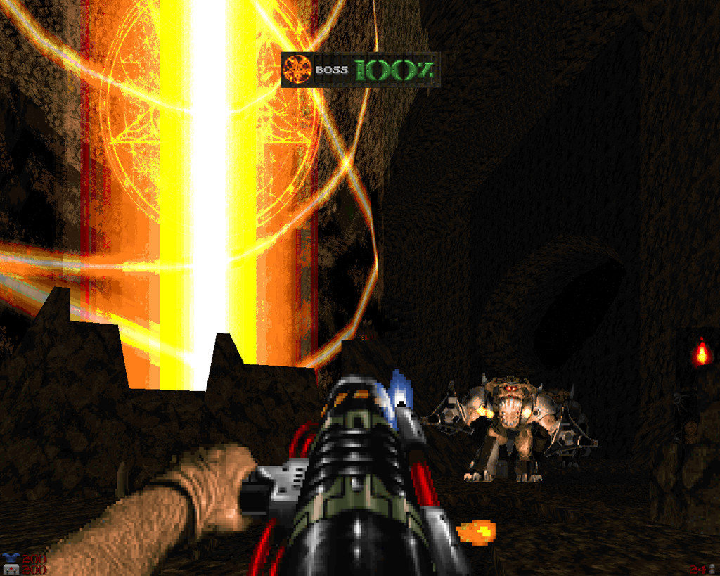
The high-drama cinematic arc is particularly apparent in UTnT, which is heavily focused on storytelling. Onscreen mission objectives give you a sense of purpose and an explicit set of sub-goals to tick off as you go, while pre-level intermission messages build up the sense of impending doom and make the hordes of Hell seem far more legion than they actually are in-game. The last episode of UTnT is particularly over-the-top, beginning with a massive battle between ally marines and demons and ending with a spiral assault up the side of a volcano in space with progressively more powerful foes at every turn. The final boss battle is as Tormentor as it gets: a prolonged, multi-stage showdown against a gigantic, godlike pillar of light and its endlessly spawning miniboss guardians, all while meteors rain down and an operatic chorus screams out the end of days at full volume in the background. Why? Because it’s cool.
“Because it’s cool” is essentially the answer to everything Tormentor does, and that’s because no matter how loud and melodramatic his maps get, it’s really all about light-hearted fun. Many of the releases that have followed in Tormentor’s footsteps, such as Thunderpeak and Winter’s Fury, have dialed back the volume a little bit for the sake of refinement, but ultimately the philosophy of these projects is the same: go big or stay home.
-
 Putrefier - Ed Cripps (2012)
Reincarnation
If many mappers see GZDoom as a way to turn Doom into a more modern FPS, and GZDoom keeps getting more advanced, then it stands to reason that the definition of “a more modern FPS” will keep evolving over time. Putrefier was, at the time, the most insanely modern thing that people had ever seen in a Z-port, making the Doom engine look more like it belonged to Quake 2 or Unreal 2. Accordingly, the atmosphere is thick and ominous, but it keeps the focus of an action-oriented shooter rather than leaning into true horror—though there’s some fantastically creepy stuff to feast your eyes on.
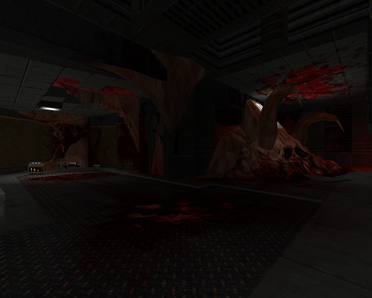
In this and other maps, Ed uses GZDoom’s more basic features (e.g., slopes) so thoroughly that they become a major focus of the architecture, rather than a supplement; the environments are complex and stunningly beautiful. Putrefier also has some incredible visual effects so advanced that they had rarely, if ever, been seen before in GZDoom maps at the time of its release. All you have to do is open the map up and look at the water in that first room to see what I mean—but of course the map’s most memorable visual feature is the moving flesh creature that juts out of the architecture in the ruins of a control room, a light fixture flickering in what passes for its forehead.
A map like this shows what GZDoom is made for
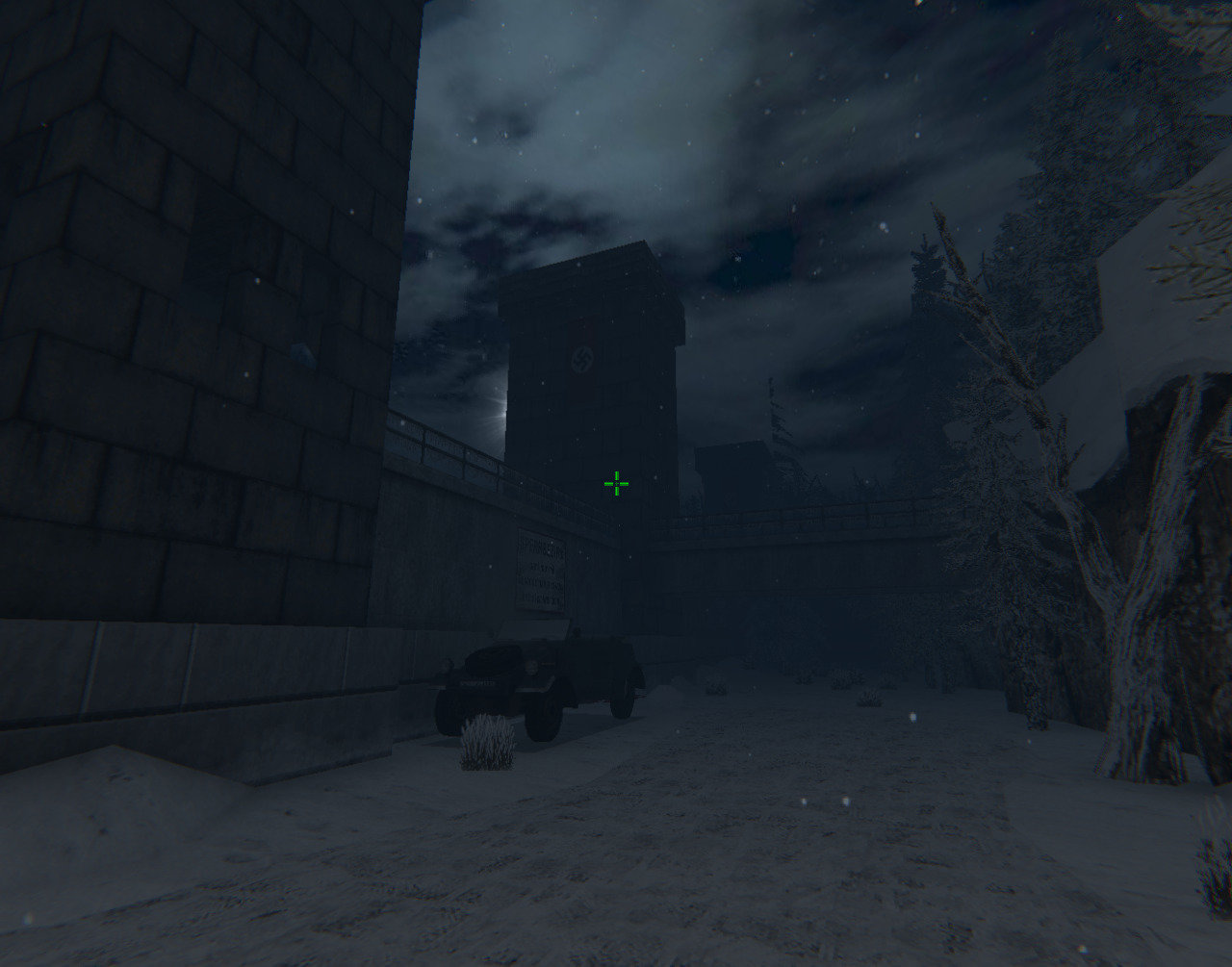
A map like this shows what GZDoom is made for; it’s about the steady march of progress, about taking Doom farther and farther from its origins and creating a more advanced game engine in which anything is possible. Some of the features that help make Putrefier such a masterpiece of environmental design couldn’t have been dreamed of when ZDoom was first created, but many GZDoom mappers are still going deeper, using even newer features like 3D models to create games that don’t look like Doom at all.
