-
Doom 2, GZDoom, 9 maps
Suppose you wanted to elevate a classic-minded Doom project to the level of a big modern release, without the modern combat and hyper-detailing? How would you even go about doing that? What element would you focus on? How about style?
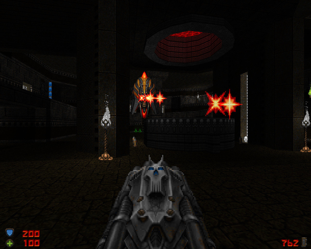
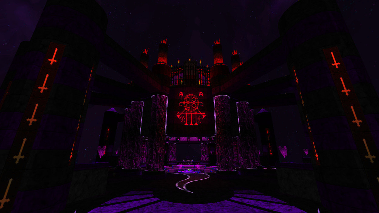
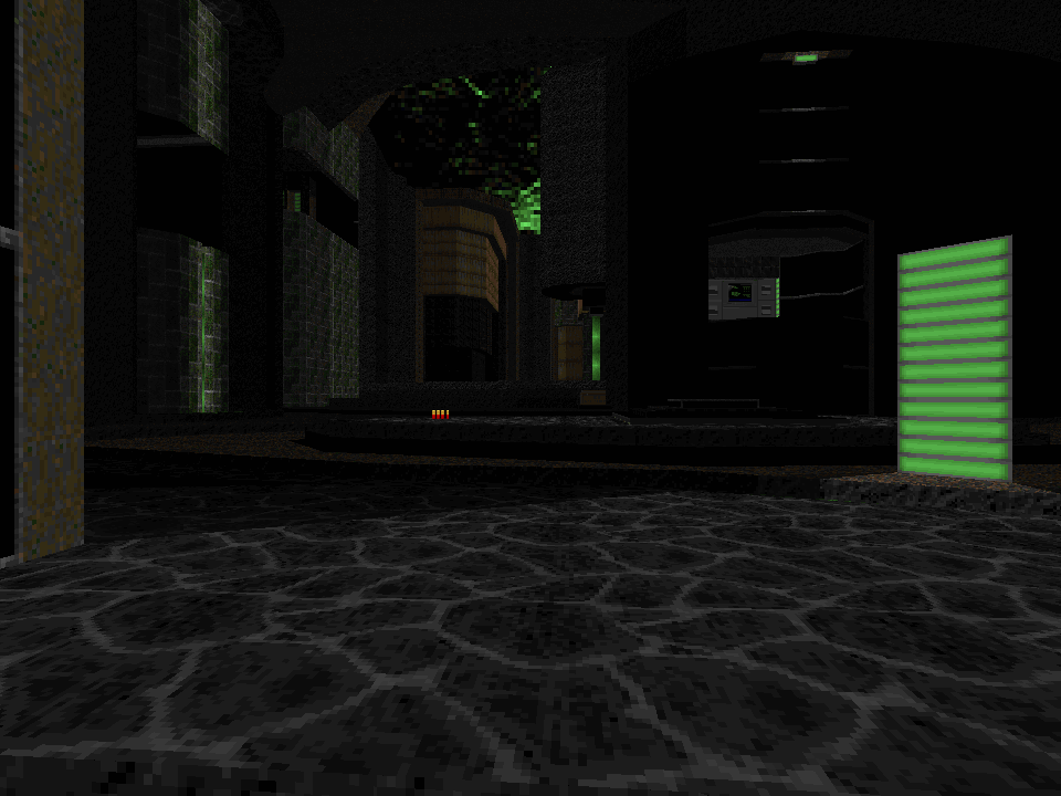
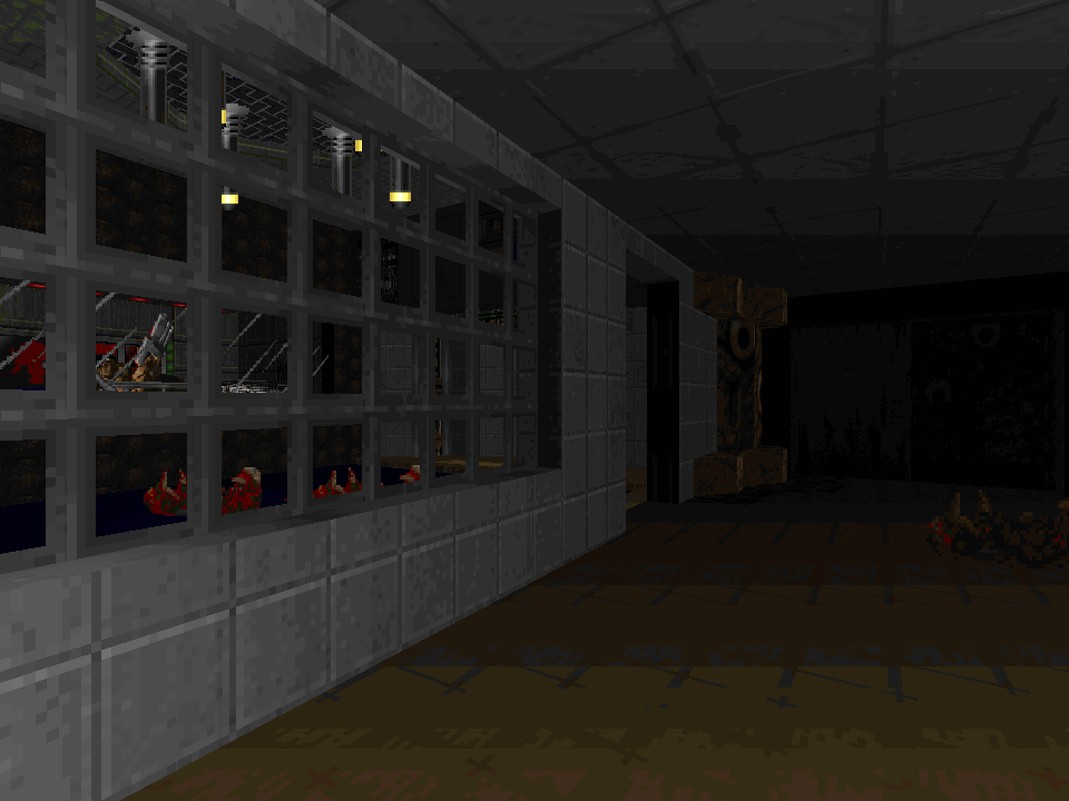
Hell-Forged, which began its life as a much older mod called Demon Eclipse, rides a tsunami of style, and maps that appear a touch underdeveloped on an initial clip-through browse turn out to be powered by such an intense, all-encompassing gamefeel that they become impossible to put down. Here is a world made of mausoleums and hellish factories, swimming in blood and fire, the dark industrial atmosphere especially palpable in the later maps. It’s a world where every detail is given weight and purpose, where you can collect whole suits of armor one piece at a time and choose whether to detonate barrels of demonblood as explosives or siphon the blood as ammunition for your rocket launcher. It’s a world filled with unique (as in, literally only appearing once) fragments of lore, such as a templar order’s relic room in the temple where you begin the game, with each surprising new stage detail helping to create the sense of a complete world. Both the lore-building and the huge amount of new interactive content (monsters, weapons, items, explosives, etc.) are made exceptional thanks to Amuscaria’s nearly peerless spriting talents. This year alone, at least four of our other top 20 picks (Eviternity, Paradise, Remnant, Alienated) use monster sprites from Hell-Forged and Demon Eclipse that Amuscaria gifted to the community years ago, and yet Hell-Forged is still packed full of brand new stuff, from towering boss enemies to beautifully rendered male and female player sprites.
With all of this attention to production value, Hell-Forged feels like a commercial game that could have come out 20 years ago at the tail end of the pixel art era—though whether that’s appealing or not is up to you. One thing that’s truly modern about it, though, is the arsenal. Each ammunition type feeds exactly two weapons, one lower-tier and one higher-tier, but even as you accumulate the better weapons, the lower-tier ones never truly lose their value; each of the 10 ranged weapons has its niche (and so does its alt-fire!). Even the melee weapons have enough range and heft to feel like a valuable part of the game instead of a last resort. To have crafted such an array of weaponry and have it all be useful and fun to use constitutes a masterwork in and of itself, and each of us who played the game found ourselves defaulting to totally different weapon strategies; I frequently charged up my Hellbolt with the Wheel of Pain’s alt-fire and rocketed the crap out of everything, backing it up with the Nailgun and Basilisk, while DotW mainly used the Hellbolt to balance ammo consumption and tag-teamed the devastating Vorpal Blade alt-fire with the Mauler and the two flame weapons. Few if any weapon sets have ever been so versatile.
Could the architecture and combat have been more polished? Sure—though then Hell-Forged might not feel so much like the long-lost final Doom engine game from 1998. I can’t say it wouldn’t be awesome to see additional, even better mapsets developed with these resources—but I’m in love with Hell-Forged and I’m glad we have it. Amuscaria has already begun work on sequels and spin-offs. If they can surpass Hell-Forged, then even another 12-year wait will be worth it.
 Finely Crafted Fetish Film - @Ribbiks
Doom 2, Boom-compatible, 7 maps
A low-key release from early this year, Ribbiks's Finely Crafted Fetish Film presents itself as an anthology of sorts, a seemingly eclectic collection of maps in disparate themes and disparate gameplay styles, with little obviously uniting them as a coherent mapset beyond being expressions of the author's particular tastes (hence the title, presumably).
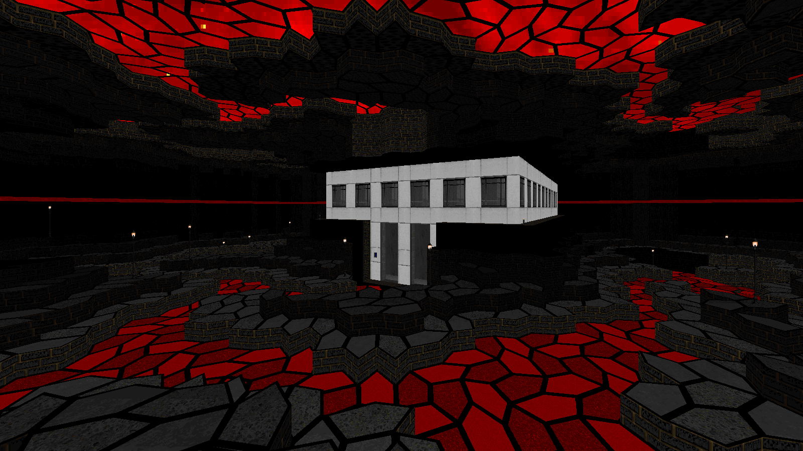
Departing from the color-driven look of previous works, here Ribbiks uses an earthlier set of "realistic" texture assets to create what are, perhaps ironically, some of his most surreal settings yet. Vaguely disquieting nocturnal studies of ghost-pallid apartment blocks and parks lit by wan streetlamps give way to more openly ominous brutalist vaults of concrete and steel, like tombs for giants contracted out to the Bechtel Group; these in turn give way to crumbling, moss-rimed old-world burrows and gardens of brownstone and mortar laid out like crop-circles, with places stranger still waiting in the wings. The real strangeness, though, isn't so much a matter of texture schemes differing markedly from map to map as it is one of thematic fluidity as a defining characteristic of the world—you might well walk from a drab parking garage into a hoary dungeonscape at any moment, and as the game proceeds into its later stages, past themes and locales begin to melt and blur together into something altogether more dreamlike, or, as the case may be, nightmarish.
Likewise, your role as the protagonist of these strange vignettes requires a range somewhat outside of the bounds of a "normal" game of Doom. The very first map is a moody noir thriller which sees you combing an eerily abandoned cityscape for armament while tangling with small but sardonically-arranged enemy ambushes, yes, but in addition to killing to survive it also tasks you, among other things, with remotely completing a game of checkers, and with figuring out an improvised way of temporarily jamming a lift in a remote outbuilding in order to reach a keycard stuck between levels. The second map, by contrast, trades in sheer brooding isolation and functions as a pure puzzler, featuring gates controlled by some inscrutable hidden machinery operated via an odd pegboard UI, to say nothing of its hidden netherealm, where your spatial awareness and agility are put to the test.
And so the Film proceeds, bursts of intimately brutal violence alternating with reflective periods given over entirely to ambience and quiet puzzling, with you a lone figure trying to singlehandedly wrangle the machinery of a dead world. While early on these scenes are cut together such that there's a distinct alternation between bloodshed and brainbending, as the game proceeds the lines between these nominally "separate" types of play experience at first blur and then outright collapse, the monsters insinuating themselves as key objects both in and of the puzzles, which for their part take on an increasingly monstrous skew away from polite brainteasers and towards gleefully saturnine subversions of core game rules. All this culminates in the rather glibly named "Mechanical Embrace," perhaps the author's most ambitious and conceptually complex creation to date. Something like 75% of this massive opus is hidden down a deep, dark rabbithole of secrets, an unforgettable mobius-reel of elaborate spatial riddles to make a Flynn or an Evans blush, dovetailing seamlessly into cathartic megaslaughters and back again.
This is the beauty of FCFF, and the reason Ribbiks's name has once again been called in these pages. Just as a morbid frame narrative begins to emerge from what at first appears to be simply a disassociated collection of challenge-maps, the author has here woven several decidedly "niche" strains of Doom gameplay, all too easy to view as diametric opposites on their own, into a single meticulously designed and masterfully paced experience, with a captivating, unusual atmosphere to boot.
So....when's the sequel?
 Hocus Pocus Doom - Jason "@rf`" Allison
Doom 2, GZDoom, 40 maps
Apologies to our younger readers, but allow me to wax-poetic about the days of DOS gaming. There was something magical about playing PC games in the early 90s. At the time, home computers were vastly inferior to video game consoles, but a technological revolution in CPU horsepower and new hardware was rapidly changing that dynamic. In a few short years we went from CGA games with a maximum of 16 colors—mind you, 16 of the ugliest colors imaginable—to full 256 color VGA. Internal beeps of the PC speaker became real noises with the availability of dedicated sound cards. For comparison, recall that Duke Nukem 1 and Super Mario World were released the same year and yet, two years later, the Super Nintendo was struggling to play our PC masterpiece, Doom.
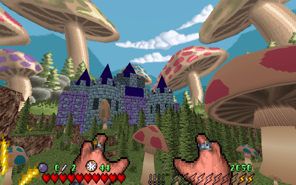
Doom was very much a product of the early nineties; a low resolution, DOS-based, VGA game that ran on 8 megabytes of RAM. But suppose Doom wasn’t the gritty, satanic first-person shooter we all came to know and love? Ravage’s Hocus Pocus Doom is a love letter to DOS gaming nostalgia that superbly translates the iconic Apogee game into the third dimension. In the time-honored tradition of turning Doom into things it isn’t, this mod is less a Doom TC than it is a full-fledged 3D reimagining of the original namesake. Hocus Pocus Doom captures the adorable charm of the original yet manages to avoid becoming monotonous despite four episodes worth of content built entirely around the simple mechanics of a dated sidescroller.
The secret is both the beauty and exploration found in every map. While each one is thematically inspired by the original game, great care was taken so they play to the strengths of Doom’s first-person gameplay. Jumping and air movement have been completely overhauled, new weapons and abilities added to keep things fresh, and more hidden secrets than you’ll likely ever find. Using every last trick in the GZDoom playbook, Hocus Pocus Doom’s maps have a surprising sense of verticality with the addition of 3D floors, which I feel is absolutely necessary in capturing the feel of the original platformer. The use of 3D models is pervasive, but their low polygon simplicity feels completely at home in a game attempting to capture the feel of a game produced in 1993. Every art asset is flawlessly incorporated into the maps and never once feels out of place.
As if that weren’t enough, every episode features a completely unique homage to another lost relic of early PC gaming. I won’t spoil the reveal, but these four maps alone are worth the price of admission. Hocus Pocus Doom is decidedly not Doom, but the idea of combining our beloved shooter with another classic '90s DOS game is simply delightful and wonderfully nostalgic, especially for gamers of a certain age. 25 years ago, I would have gladly mailed $39.99 to Software Etc. for a copy of Hocus Pocus 3D… fortunately for me, the entire project is shareware.
Doom 2, Boom-compatible, 9 maps
Shotgun Symphony has one hell of a long, rocky history; Steve started making this E1 replacement as far back as 1997 and completed the episode in numerous stages, finally releasing the finished product at the beginning of this year. And here’s where I admit I’m a bit confused. A mapset that takes 22 years to finish is supposed to be awkward, dramatically uneven in quality, bashfully ignorant of key events in the evolution of level design over the decades in which it was created. Shotgun Symphony is the opposite of those things. It’s like Double Impact, No End in Sight, and the larger maps of Return to Hadron had an accidental baby in an illicit three-way. It’s not supposed to end this way. Where’s your fat wall of criticism and ticket to infamy, Duff?
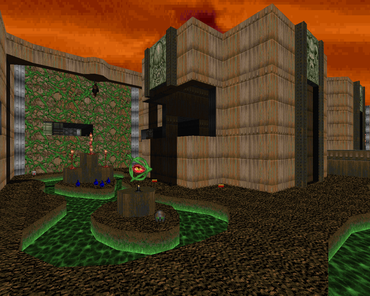
Even after all the years since Doom 1 was released, most episode replacements tend towards pleasant nostalgic homage; few of them have ambitions of going in their own direction and being something more. And it’s true that the maps in Shotgun Symphony (especially the earlier ones) have a certain Knee-Deep in the Dead character to them at first glance: simple, clean views across the architecture, contrast between indoor and outdoor areas. But Shotgun Symphony takes that character and blows it up across massive sandbox-style maps, expressing the classic E1 interconnectivity and buttery gameplay on a huge scale that turns it into something even more emergent and lovely. The combat plays out like an enormous brawl, allowing you to maintain big drawn-out firefights over complex, extensive architectural spaces while still keeping the sense of wandering layouts populated by wandering monsters, a la Romero. Meanwhile, the whole journey is punctuated and rounded out by occasional big arena fights, distinctive landmark-like hub rooms, and huge secret sidequests reminiscent of NEIS.
As a result, the maps just keep building upon themselves, creating a thick sense of place despite the relative simplicity of any given area—an impression that’s particularly strong in the last half of the episode where the maps sprawl out into the techbase equivalent of the Mines of Moria. This sense of deep connectedness spans between levels as well; familiar areas from earlier maps crop up again in later ones as you revisit them from different angles, extending the sandboxy character across the entire episode.
Steve managed to handle Shotgun Symphony’s long development cycle in the best way possible. Instead of having a few maps that look like they came from each decade, this episode blends the best of all worlds consistently across all of its maps: the clean classic ‘90s aesthetic, the distinctive 2000s detailing, and the scope and fierce combat style of the 2010s. It’s a brilliant piece of work, no matter which era you love best.


