Jump to content
  • NOTE: There is a known issue with the most recent entries having screwed-up information and links. Some databases are out of sync and we haven't been able to fix it yet.

Doom the Way id Did

   (179 reviews)

Guest

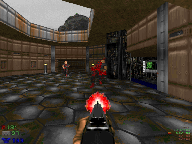
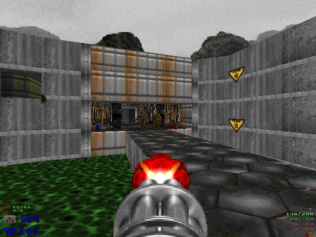
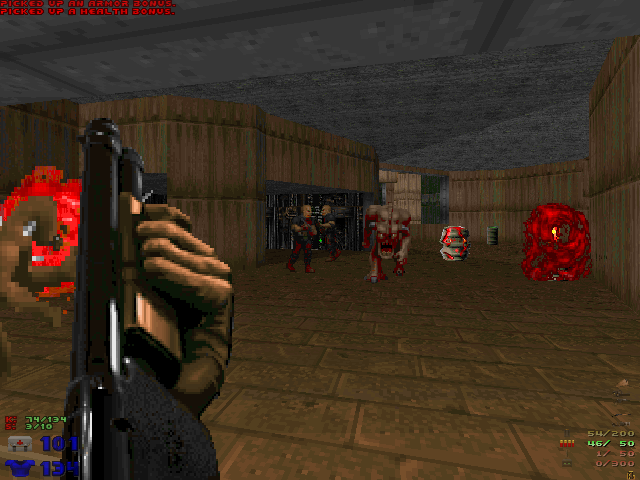
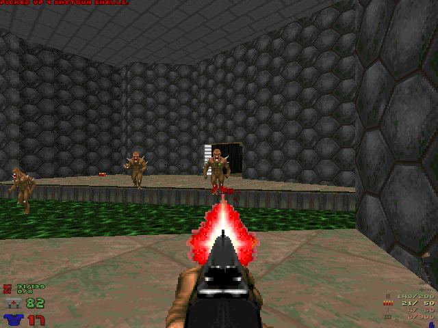
10 Screenshots

About This File

"At some point in time I got the idea that it would be really fun if John Romero dusted off the ol' doom editor and made another map for Doom episode 1 for old time's sake. He once replied to an email saying 'maybe I will!' but never did get around to it as far as I know.

This project asks the contributors to carefully study the original maps and try to make them as John Romero and Sandy Petersen did.

The guiding principle in the project is to pretend that id Software initially intended to release Doom as a three episode, 30 level game, but somehow lost three levels; one from each episode.

The mappers for the project are trying to create those lost tenth levels, except we are extending this concept to be a full 3 episode replacement.

Our goal is to make the 'lost' maps as authentically as possible to be convincingly mistaken for original levels from the game, to recreate Doom the Way id Did."

-Hellbent

User Feedback

Join the conversation

You can post now and register later. If you have an account, sign in now to post with your account.

Guest

Kyka


I like Ultimate Doom megawads. And this is an Ultimate Doom megawad. 5 Stars.


It is almost perfect in every regard. Highly recommended for anyone who wants a genuine Classic Dooming experience.

Share this review


Link to review
Knor964


One of my favorite mega wads it was like playing Doom for the first time again it almost brought a tear to my eye.


10/10 :D

Share this review


Link to review
GlebyGlobster


awesome. i enjoyed almost every bit of this wad, great job to all those involved!

Share this review


Link to review
spd7693


The reason I played it basically was to improve my mapping. I do think I drew a few lessons from there. As gameplay it didn't impress me much, especially Inferno. I was most disappointed by E3M3, which in the original game is my favorite map! Some levels were weird in terms of progression and I din't understand much of them. But like I said, the purpose was different and if I can take a lesson from this, then everything is great. 

Share this review


Link to review
KermyDM


I enjoyed a lot this megawad, as its name says the gameplay is like the original Doom, I felt I was playing some Romero levels here and that is a good sign. By the way, I think this is better than D2TWID.

Share this review


Link to review
QuaketallicA

· Edited by QuaketallicA


DTWID is a wad I played first a couple years back, and coming back to it now I'm remembering why I wasn't particularly fond of the experience.


Although certainly constructed by competent mappers well versed in the art of wadcraft, DTWID is simply boring. Too few enemies, resembling a vanilla Doom 1 experience on Hurt Me Plenty. (Even when playing Doom for the very first time, I remember HMP being not challenging enough even then, so I upped the difficulty to UV for Episodes 2 and 3 and never looked back). The level structure/architecture, while certainly appropriate and attractive to look at (for a vanilla-styled wad) ultimately fails, because it's so much of a "been there, done that" affair.


Let' examine E1M1, for instance, (though most if not all other maps in the wad has the same issues). You begin the map with the obligatory walk up the stairs to pick up an armor from a vantage where you can see an outside area. Near the end of the level, you kill Imps standing up on a vantage point. There's a secret with a shotgun and shells that is completely redundant since (on UV which again feels like HMP) you already get a shotgun from the shotgunner enemy earlier on.


What can we gleam from this information? Well, the mappers clearly prioritized an almost religious devotion to recreating any and every memorable detail about the original maps, irrespective of whether those choices were necessarily the best ones for their wad. No, that is not a dig against Romero, et. al. Doom 1 was quite literally the first of its kind, and they necessarily had to make it easier because nobody had played anything like that before. It made sense to be more welcoming (which is why Doom 2 and subsequent id releases were not as easy). However for a community of experienced gamers, let alone experienced Doomers, the combat is so trifling at times you may as well be walking through an empty level. It also speaks to a lack of creativity, perhaps an intentional one, but a lack nevertheless, on the mappers' part.


With a title as laden with hubris as "Doom, the way id Did," one would expect the same standard of creativity and architectural design style that Romero, Hall, et. al. brought to the table. You would expect a completely new, different experience, but one that feels believable like it could have been made by the 90s id guys in some alternate reality. That's not what the wad actually is. Instead, it's simply the exact same experience as the original wad, which is why other comments here qualify it as "generic" or "soulless." It's as though their vision of "the way id did" was literally recreating the specific landmarks, layouts, and even monster encounters of the vanilla maps, as opposed to creating something new and unique but feels like a spiritual successor to the original Doom.


TL;DR If you want to re-experience the original Doom...then just do that instead. Like most other modern remakes, this one ain't worth the time.

Share this review


Link to review
Argenteo


The maps are good, sometimes too good to fit to the whole idea. I enjoyed them but something is missing here.
Some maps are so long and complex. I agree with P41R47 except for e1m9.

Share this review


Link to review
TheMagicMushroomMan

· Edited by TheMagicMushroomMan


5.5/10


The problem with DTWID is that the same concept has been carried out by countless WADS already - they just didn't draw any direct comparison to the original DOOM. So what you get here is a set of competent-but-generic maps that follows the same beat-to-death techbase>hell progression of DOOM. Just like 10,000 other vanilla style megaWADs. In the end, that's all this is - a WAD that attempts to mimic (not always successfully, as there are some questionable maps here and there) OG DOOM. Without the awe that comes with experiencing the original game for the first time, you're left with a bunch of generic maps. The inspiration that ended up leading to the creation of this project causes the WAD itself to feel uninspiring. It lacks memorability and soul.

Share this review


Link to review
VoanHead


Upon the release of The Ultimate Midi Pack for Doom 1 that replaces all midi slots w/ original compositions, I thought to myself "Hell Yeah, now I have an excuse to play DTWiD!". Besides the shameless plug, I would recommend everyone to give that pack a listen and perhaps a spin w/ this wad b/c god damn does it go together like peanut butter and nutella.


Onto DTWiD: Well, the people behind this wad accomplished the goal of mimicking the style of John Romero, Sandy Petersen, and last but not least Tom Hall. Every level breathes like it was made by any of the three gentlemen, and god damn I had a blast w/ this one. While certainly not as hard as your Plutonia, Rowdy Rudy 1+2, Hell To Pay, or even Good Morning Phobos, it has its own moments where it doesn't pull its punches. However, one of my main gripes w/ this wad is that there's a lot of secrets to find if you're a completionist like I am, as some of them are a bit tricky to hunt down. The maps are way bigger than the OG John, Sandy, and Tom Hall levels, and while it's great to mesh some good fights here and there, it at times felt like a slog to go through b/c of the size of some of these maps. E1 was the weakest in terms of fights here, as expected that you won't be fighting anything tougher than hitscan, imps, and pinkies. While the design was great, I admittedly got lost a few times trying to get my bearings and know just where the hell I need to go. E2 was a bigger improvement upon E1, and had a few moments where it was spooky, like things are really beginning to hit the fan. E3 (which unironically in the OG UD was my least fav episode that I couldn't even bring myself to finish) was probably the best episode of the bunch, everything was oppressive and coming for you, luckily there was an abundance of ammo to help you out in messy situations, more traps and better set ups than what E2 had and a way better episode than E1. The secret levels of all 3 episodes are the highlight of the wad.


While I wouldn't say that this wad is a "must play" b/c over time I started to get a bit exhausted on the size of some of the levels and figuring out where I need to go, and especially since I binged E1, E2, and E3 3 days each respectively, I had my moments where I was like "Please God let this be over". Overall, I would say this is more of a wad that if you really wanna check out, go for it, or a good recommendation for people who are just beginning their journey of playing community wads and want something ez to play.

Share this review


Link to review
Teo Slayer


I just love this MegaWAD

Share this review


Link to review
xdude_gamer


It's very fresh and new. But, in the long run, becomes a bit bland after the first few plays. I have doubt that there is some excellent levels in this, and the boss battles are very cool, but it does not have much replay value. 4/5.

Share this review


Link to review
P41R47


Doom the Way Id Did birth from the idea of making maps that could replace the original campaing
and made mostly with the same aesthetic and limitations of maps made on 1993.
But not only that, the idea is also to emulate the designing styles of the different authors
of the maps of the original Doom: Romero, Petersen, and Hall.
This made the authors of this megawad analyse the quircks and designing ideas behind the original creators.
For certain, after completing this mapset not only one, but like more than 10 times already, i feel that
this mapset is overrated.
Yes, some maps are really good, especially on episode 2 and some on episode 3.
But the first episode not quietly match up to the original shareware episode.


That said, here is a review map per map of all episodes along UDTWID, as it was later expanded
to contain also all new Episode 4 maps.

Every map has it name, it author, the author style to mimic, and an individual rating for the map.


Episode 1:


-E1M1: Communications Bridge by Sarah Mancuso (esselfortium)(Romero) 2.5/5
For certain, it start differentiating itself from the regular way Id Did their job.
Esselfortium opening map is vastly more complex than the original Hangar by Romero.
It is still a short map, but it chain of secrets is far more complex.
Also, not great opening sight to set the mood, just a green wall with windows.
The music used on the DTWID Music pack isn't a great opener, but its ok.
A little repetitive, even before it start looping.


-E1M2: Military Bunker by Nick Laurent (hobomaster22)(Romero) 3.5/5
Again, a far more complex map than the expected for a second map on the first episode.
This time, a little bit longer than the map on the same place of the original.
The layout is intricante and non linear for the most part.
Still, this one is fun. So Hobomaster did a good job here.
The music is quite up to the atmosphere of the map, fitting well with it pacing.


-E1M3: Fuel Synthesis by Sarah Mancuso (Romero) 1.5/5
This is where things started to stray from the usual.
This map is really big for a third map, almost too much.
IT start to drag a lot when the Id formula by Romero just make it long enough to beat it
on one sitting.
Great map by Essel, no doubt. But too long.
Also, for some reason, its fairly easy to find the secret exit before the normal one.
The music is quite spooky and good. But the map is soo long that is makes the action seem
slower than what it is.


-E1M9: Excavation Site by Stuart Rynn (Stewboy)(Romero) 2/5
Another really long and slogish map with a lot of interconnected areas.
Stewboy make a linear map, but it interconnectivity detriment it pacing.
There are some really good desings here, but again, it is a bit too long for Ep.1
The music here is a stright rip of Zero by The Smashing Pumpkins.
As the map is longer than it should, it start to loop heavily on the back for a boring action.


-E1M4: Treatment Plant by Jason Root (Hellbent)(Romero) 4/5
Really good medium to large map that opens up a lot and has a really good nonlinear nature.
This is far more complex than the map on the same sloth, but somehow, it catches the same
ambience and atmosphere for a good action packed round.
So Hellbent did an amazing job here with great secrets.
The music is simple and repetitive, but it works.


-E1M5: Engineering Bay by Jacob Zuchowski (ellmo)(Romero) 4/5
Another great medium to large map. But this one is a bit more linera with a lot of
interconnected areas. The areas are greatly designed and the secret are quite good.
The music here is slow and atmospheric going perfectly with the lenght of the map.


-E1M6: Reactor Complex by Nick Laurent (Romero) 3/5
Pretty long map, but fortunatelly, it doesn't drag too much.
Is a linear map with side secret areas. It goes well in this spot as the orignal map6 was
also a little longer than the previous.
Hobomaster did another great map quite fitting with Episode 1 aesthetic.
The music is a stright rip of Sex Type Thing by Stone Temple Pilots.


-E1M7: Logic Core by Trevor Primmett (iori)(Romero) 2/5
Long, kinda non linear interconnected map.
It goes well for the slot number as map7 on the original was also pretty long.
Problem here is the interconnectivity, making easy to loose track of where you are.
Sometimes a strightforward approach is better, but anyway.
The aesthetic is good here with some areas reminicent of the original maps in general.
The music track is a march style slow one, pretty menacing and kinda spooky.
It mesh so so with the map.


-E1M8: Transport Facility by Jacob Zuchowski (Petersen) 3.5/5
The episode ending is quite similar to the original, but with a little more ramp up.
Lonelines and dread is sense during all the map until the final area. And thats really good.
The secrets are good, but one is kinda stupid as you need to beat the bosses to access it.
The musis isn't as dreadful and the original, but its also quite good and fitting.


Episode 2:


-E2M1: Receiving Station by Xaser Acheron (Petersen) 4/5
It set the tone for corrupted tech base quite well. Far more than the original map.
The lenght is right for the slot, and the secrets are good, making the little backtracking
worth.
Undoubtly, Xaser knows what he did with this map as its a perfect introduction to Ep.2
The music is a stright rip of Big Guns by Ac/DC. Repetitive as fuck and not meshing with the
map at all.


-E2M2: Filtration Compound by Sarah Mancuso and Xaser Acheron (Petersen)(Romero) 4/5
Now this is how a good colaboration is made.
Essel and Xaser deliver a really atmospheric and quite complex and interconnected map.
It deviates from the warehouse setting of the original, but it deviates for good.
The corrupted techbase theme is taken to the max here.
The music is repetitive slow but quite atmospheric and fitting for this map.


-E2M3: Rec Facility by Captain Toenail (Hall)(Petersen) 5/5
This map is a really good fun. Again the usage of corrupted tech base is top notch.
The length is right and the pacing is just amazing.
Capatain Toenail delivered a great map for sure, right there as good if not slighty better
than the original slot map.
As like the original game, the music is the intermission music. Since the map is on the action
side with a subtle exploration, it fits quite well, even if it becomes a little repetitive.


-E2M4: Mental Ward by Jacob Zuchowski (Hall)(Petersen) 5/5
Amazing atmosphere from the get go. This is kinda in line with the darkness that dominates
Deimos Anomaly, too. But here is far earier and haunting. The lenght is surprisinly medium to
short, but there is no bad moment on it. Excellent map. Far better than the original.
The music piece is quite earie and atmospheric, too. Meshing perfectly with the map.


-E2M5: Deimos Command by Mike Alfredson (Use3D)(Petersen) 2.5/5
Even when the atmosphere and the layout is good, the pacing of thi map is not good.
There are too much workaround to get to the later areas, something that could be easily
fixed by putting switch that activated a set of stair or a lift on the courtyard behind the
lue door.
That, and making one secret inaccessible if you move onto the room after the yellow bars, it
make the liking of this mapset not good.
Its kinda a let down from the great maps that were before this one.
The original map for this slot was also really convulted, and long. On the good side to this
map, is that it is fairly more coehesive and easy to explore, even without checking the automap.
The music track is an ominous spooky march, previously seen on E1M7 i think. Its good for this
map, certainly.


-E2M9: Nebulous Origins by Trevor Primmett (Petersen) 4/5
Now, this map, is what map e2m5 should had been. Complex and long with a good pace, neat sights
and interesting areas. It even has a secret exit back from the starting point.
how this one was relegated to E2M9, a map with a name that hinted some kind of bizarre setting,
just to deploy the usual corrupted tech, is beyond my understanding.
Anyway, this was supossed to be faithful to the original game, so making a really abstract and
bizarre map would had detracted for the faithfulness. In this case as it was a secret map,
and for a map that had a really abstract map on it original slot, i wouldn't give a fuck to
the faithfulness.
As i said, great map.
The music track is kinda good for the ambience, but a spookier one would have been better
i think.


-E2M6: Foundry by Gus Knezevich (Alfonzo)(Petersen) 3.5/5
This map has a perfect atmosphere and pacing...but really a lot of the map can be accidentally
skiped, so that kinda is a let down, as most of the side areas, and even a key are optional.
So i'm kinda divided on what this map offers. The atmosphere is top notch and the explorative
aspect is cool, but at the same time, i feel its not implemented properly onto the pacing of
the map itself.
Taking that in consideration, the map is kinda short. Ok, the original map on this slot is not
really good, even kinda tiresome on how long it could be, but the progress is dsigned to almost
all areas being visited before having all the needed keys for the exit.
One good way to solve this could be ad a colored key door with a switch behind that activates
the stairs to the exit, that way, one need to explore more before completing it.
The music track is a slow and atmospheric quite good for the map.


-E2M7: Ore Processing by Brendt Pantley (Megalyth)(Romero) 2/5
Great atmosphere, but the map is really complex, interconnected and kinda all over the place
with it pacing, so progressing through it is really tiresome and could make the player feel
lost most of the time.
This map is kinda analogue as the original E2M6, where the pacing is not clear and the progress
is disjointed.
Its a good map, but it not up to the excellent map that was on the same slot on the original.
The music track is really good for the atmosphere, but as the map is a really mazey it becomes
annoying and boring really fast.


-E2M8: Vault by Michael Fraize (Marcaek) and Sarah Mancuso (Petersen) 4/5
strightforward boss map, better than the original, but annoying to loose track of where the
cyber is teleported from time to time.
The music track is not even near to how good was Nobody told me about Id.


Episode 3:


-E3M1: Abyssal Stronghold by Jacob Zuchowski (Petersen) 2/5
Kinda simplistic map. Theme wise, it works. Now, it lives up to the original?
Hard to say, its a good map, but the original has kinda an iconic introduction.
This one is just somewkind of portal inside a cave.
Things are more spacious and less corridor here, and thats good. But i feel that it needed a
little bit of atmosphere. Not much hellish, more than volcanic cave fortress.
The music track is not good, feels more up to a tech base map than something like hell.


-E3M2: City of Corpses by Walter Confalonieri (daimon) and Jacob Zuchowski (Petersen) 2/5
Not Interesting map with some nods to Mt.Erebus, its a big and linear map that tries to
simulate non-linearity. Not bad map at all. Kinda empty and with boring sights.
The music track is again more fitting for techbase and completely ruins the atmosphere.


-E3M3: Malebolge by Icytux (Petersen) 5/5
Awesome nonlinear map with great interconnectivity and great areas. Secrets are top notch, too.
First proper hell map on the set, and this one delivers as it should.
Being far different from the original map on this slot, this one is a great example of good
material here.
The music track, even if a little punchy works pretty fine for this map.


-E3M4: Torture Chambers by Captain Toenail and Jason Root (Petersen) 3.5/5
Quite short map, but good non less. The inspiration, aesthetically, is clearly
the original Limbo, and it is delivered quitly well. But one of the things that i didn't liked
much is that after collecting the keys, the path wasn't clear, still. That along with two
shooteable switches, that don't appear on the original game before TFC, made me reluctant about
this one.
Its a good map, thats for sure. But has a few pacing problems.
The music track is the same as on E1M8, earie, dready and quite fitting for the map.


-E3M5: Chapel of Scorn by Paul Corfiatis (Edits by Alfonso and Essel)(Petersen) 5/5
Excellent map for sure, a little bit longer than one thought, but excellent.
Paul really knows what he was doing here, the pacing is marvellous and the action is just right.
Secrets are cool, and the areas are really good looking. The map seems to take inspiration from
various maps, like E3M2, E3M5, and even map28 from Doom 2. Even though, there is also a clear
TNT influence on almost every map Paul make, kinda greatly meshing the abstract and the
semi-realistic.
The music track is the same as E1M7, the menacing march, it goes well with this map, but i'm
getting kinda tired of hearing it.


-E3M6: Depths by James Cresswell (Phobus)(Petersen) 3.5/5
Good map, really good. The secrets are well hidden, but the shootable switch detriments from
the original experience, making the search for the secret exit a little tedious as its not
what one would search on a map from the original game.
The abstract nature of the map along the semi reallistic areas give an awesom vibe for sure.
One of the best maps of the episode for sure.
The music track is again Sex Type Thing by Stone Temple Pilots, strangely, it doesn't go bad
with this one, but the map is soo good that probably any kind of music could go well with it.


-E3M9: Lake of Fire by Christopher Lutz (Petersen) 3.5/5
Pretty good map in the same vein of Mt.Erebus. This one should have been a main level, not a
secret one. Lutz, as always, deliverd a great map. A little bit more linear than the original,
but still with great pacing and explorative aspects.
The music track is again ZERO by The Smashing Pumpkins. And doesn't fit the map at all.


-E3M7: Inner Sanctum by Jacob Zuchowski (Petersen) 3.5/5
Really good puzzle map, in fact, it is quite short, but as it is kinda big, it seem much
larger than what it is in reality. Its a good mash-up of the sandbox open ended style of
Mt.Erebus, with the concept of limbo, as all is surrended in darkness to simulate emptyness.
Only thing that didn't mesh well with the map is it name, but well, it kinda and not.
The music track its quite atmospheric and fitting for sure.


-E3M8: Core by Eli Cohen (ProcessingControl)(Petersen) 5/5
A really good final boss map. Quite improvement over the original, but still giving it an
homenage with it form.
The map has it difficulty on properly aiming to the Mastermind.
The music track its quite good as a climatic one.


On the ending, the Bunny theme is quite good, too.

-----------------------------------------------------------------------------------------

From here i will be reviewing the Ultimate Domm The Way Id Did, Thy Flesh Consumed Episode
replacement.
From the get go, the team took really long time to complete it, and it is only 9 maps long.
And thats is something to take unto the equation.
Seems like all those years, the team making the maps forget about the idea of maps being made
on 1993/1995 as the maps here are far more complex than anything saw on the previous episodes.
Not only that, but also some maps are not, even if they supposelly did, resemble anything
that could had come from the head of the original authors of this episode:
Romero, McGee, Green, Willits and Anderson.
The designing cues may be there, but the aesthetic and limitations of the time, are not.
So UDTWID is somewhat controversial as it doesn't fulfill at all what it should.
But anyway, here is the review map per map.


Episode 4:


-E4M1: Into The Grave by Walker Wright (Pavera)(Romero) 4/5
Right on difficulty for the hardest episode. The map is nice for sure, grasping the TFC
aesthetic quite well. Its pretty linear, and the secrets are easy, but is ok.
Its notoriously more difficult than any of the previos maps on DTWID.
The music track is the same as E1M8, similar to the original and fitting for the atmosphere,
too


-E4M2: Vile Affections by Matt Cibulas (RottKing)(McGee) 3/5
Not even near the difficulty of the map on the same slot as this one. Even though, the map
is quite good and entertaining to play, with good monster placement and tight encounters.
The aesthetic is more in line with map E4M3, but its ok.
The secrets are pretty hidden, and probably not even thought as secrets on first sight.
Maybe a more notorious approach would have helped more.
Its quite interesting to note that maybe there are some kind of hardcoding ramp up in difficulty,
somehow, as the shotguners in this episode are starting to be really hard hitters, unlike the
previous episodes that they were kinda cannon fodder.
The music track its not as cool as Donna to the Rescue, and its kinda repetitive.


-E4M9: Terror by Mike Alfredson (Use3D)(Willits) 2.5/5
Really good map, good pacing and interesting layout. Its not techbasey as the original map,
but still match with the aesthetic of the TFC. Albeit that, its easy to get lost in here,
somehow. The secret are so so, some are easy to find and some need great explorative skills or
just luck. But one time only secrets are a big no no.
The monster placement is good and its moderatelly difficult. Just like the original.
The music track is ZERO by The Smashing Pumpkins. It fits here, strangely, but is repetitive
as hell.


-E4M3: Earth, Blood and Fire by Chris Bourke (purist)(McGee) 3/5
Nice map, but the aesthetic doesn't feel right. Too much gray for the TFC.
Aside from that, its a really good map that plays well and its really entertaining.
The secrets are easy, except for the running one that may take more tries than one would like.
The sight is good and i like the idea of a rising a bridge to access the other areas, even when
most are acceded bua teleporters.
The music track is surprisingly fitting for this map.


-E4M4: Unclean Spirits by Michael Fraize (Marcaek)(Green) 1/5
Great achievement on vanilla mapping, gorgeous, top notch aesthetic grasping fully TFC.
Problem? Balls hard, even playing continuous and on HMP. This maps needs a lot of tries to be
completed.
And you know what is the biggest offender? Well, yo don't need to go to the side areas at all.
Yes, if you carefully made your way onto first area, and collected the blue key,
you completed the map.
Not even the side areas are in need to be explored, and the worst of all is that there is not
enough health to completelly explore the map. If the side areas had good rewards that could be
good, but just a few rockets, a berserk pack or a soulsphere is not reward enough for all the
monsters you will have to kill to reach them. And the ammo loose on them.
Seriously, how do you guys think this was on release state? This need a lot of balancing as i
seriously thinking that maybe there is not even enough ammo to complete it on pistol start.
Or even enough rad suits for explore it as it deserves.
Or you are a dooming god or you spend lots of time trying to conquer it for a reward not
that gratifying.
And from the start, DTWID and it expansion, UDTWID aimed for a conservative design,
trying to replicate or made maps on the style of the authors of the original game 
and a difficulty similar or a bit above the original game.
This is nowhere something seen on the original game at all. Designing wise and difficulty wise.
Those designs are not even near to what Tim Willits or John Anderson did on his master levels 
or released PWADS. Not A.McGee, not even Romero has this level of designing. And certainly 
not Shaw Green.
They did something far more in line with the original game aesthetic and design.
So this is completely bullshit about what UDTWID should be.
Maybe it was made a joke? As the original E4M4 by McGee wa really simple and easy, so you
guys went for something far more complex and ellaborate and balls hard?
Well, this one was not fun at all, and not what is expected of a true UDTWID.
The music track surprisingly fits this map, giving it a mysterious atmosphere.


-E4M5: Doctrines of Devils by Gifty (Petersen) 4/5
Now this one is a true TFC experience. Gifty made an excellent map. It is supposelly on
Petersen style, but it feels like meshing T.Willits and J.Anderson influence greatly.
The simplier and clean design is faithful and makes for a really enjoyable experience.
The map has a hub area with three different routes to tackle. So the pacing is at your choice.
All of them are challenging and has greatly designed encounters.
The final room after the yellow door, is a bit unforgiving with all the spectres and barons
on almost complete darkness. But if you still have some BFG ammo, this is the place to use it.
So perfect design for sure.
The music track fits greatly on this map.


-E4M6: Molten Gods by Richard Frei (Tarnsman)(Romero) 5/5
Excellent map in the style of Romero. Tarnsman did a great job here. The map is really fun,
even when it is quite short. The layout and flow is excellent, allowing exploration and action
in a good mix. There is even a surprise Cyber that offers a good challenge.
The aesthetic is a bit woodey, too much wood for TFC, but mesh well with the map flow and
design. The secrets are rightly done and none of them seems to be hard to find.
The musci track, surprisingly, fits perfectly with this map.


-E4M7: Hand of the Heathen by Gus Knezevich (Alfonzo)(Anderson) 2.5/5
Really interesting map, but has some flags. The layout is mostly like what Anderson did, 
orthogonal rooms with some interesting texturing. The pace is a little convulted as there are
sections in need of a rad suit to be traversed, and if one loose something or miss as switch, 
it becomes tiresome. Maps that relies a lot on sector damage need a safe return or way to
access the concealed area in case of need.
Aside from that, the map is really hard on hitscanner action and Caco mobs. Not bad, but
certainly something no note. The map is short per ce, but the use of the rad suit and the
sponge enemies make for a slower action. The texturing may have been better, as Anderson make
use of TFC aesthetic on an interesting way. The secret are not that hard to figure, and one is
key dependant on a heavy damaging sector zone, so thats kinda annoying.
Then there is a surprise Cyberdemon after the blue door that could literaly kill you on the
surprise. The map gets flooded of demons, specters and lost souls that difficult the fight
with the cow a little.
After that, just a little more to access the final room with a neat self referencing bridge
with a dead marine body on it. Something that didn't appeared at all on Doom or TFC, but well,
nice touch.
Not bad map, but could be better i think.
The music track is quite fitting for sure.


-E4M8: An End to Darkness by Xaser (Anderson) 3.5/5
This map is a tribute by Xaser, to the late John Anderson. The starting area of the map
resembles the only know image of what is supposed to be the last map on his Inferno serie,
''Waters of Lethe''.
Aside from that, the map doesn't resemble something Dr.Sleep would make. Its far more complex
and kinda puzzley. In fact, it is almost a complete puzzle map that turns slaughtery at the
end.
Great map for sure, but doesn't mesh at all with the DTWID aesthetic, as this is too complex
for something that could have come from 1993/1995.
This fully grasp the TFC aesthetic, though.
The map itself is divided on two parts, east or west. You don't need to explore both to
complete the map, but only for completionist sake. The east area offers an interesting puzzle
and the west area offers a more action packed approach.
Both sides lead to the unique complain of the map, that is fighing a cyber on a tight corridor.
Not only you are on a tight corridor, you also are under hitscanner fire and imp love.
The proper way to face this part is founding the secret invensivility, but its kinda too well
hidden, and this lead to the secrets. Most are cool and rewards exploration and attention to
details.
The pace is good and mostly you are all the time going from loud-quite-loud during all the map.
There is a secret not reacheable by any means, and are just two textures in memory of Dr. Sleep.
Great map, again. But departs too much from what UDTWID should be.


After all, DTWID + UDTWID make for a great mapset. Far more loved than it should as it is
vastly inferior to Wonderful Doom, or far less ambitious than 2002: A Doom Odyssey, for example.

The authors couldn't stoped themselves of including some of their own quircks and designing choices. And thats not bad, as it adds some new fresh air to the style. But could have been done better as shown on the examples mentioned above.


Mixing the boldness with the faithfullness is rather hard, thats for sure.

And this was not an easy task.

They succeded?

For some yes, for me, not completely.


So after playing it for long time, i can say that the real complete UDTWID is clearly Wonderful Doom made by Wraith777.

Share this review


Link to review
Percy T


9.5/10. My Favourite Ultimate Doom Megawad for sure. Awesome levels, secrets and great monster placement. 


Heres my video review-


Share this review


Link to review
Endless


A classic for a classic!

Share this review


Link to review
Walter confetti


Really great megawad, with lots of references to the original ID maps (especially in episode 3) and many amazing layouts and ideas. Only letdown in the map is E2M9 (that is purposely bad because... E2M9 is bad?) and E3M6 is way too techbase-ish to be a proper hell map for my tastes, even if it could be some sort of "pandemonium" style map in the main concept, I guess. But overall it was a good experience, pretty neat stuff.

Share this review


Link to review
SilverMiner

· Edited by SilverMiner


As far as I know, no one of Doom Registered level designers ever created control sectors outside of the playing area lol.

E.g. the stairs that lower in starting area of E2M2 DO use control sectors so it's barely incorrect to say: "Yeah, we had done the Doom the way Id did"


No, guys, no. But overall the wad is cool. Except inescapable pit in E1M6

Share this review


Link to review
Rathori


EP1: Easier than original EP1, pretty much no tight encounters. Kinda feels like a DOOM episode, also feels somewhat wrong.
EP2: Pretty annoying level design: I kept getting lost in two or three levels. Died twice during the episode, once during the final fight. Also, lots of pointless pickups in the final boss fight.
EP3: Meh.


Doesn't feel like it managed to capture the essence of the original, sorry.

Share this review


Link to review
PureSlime


Very well-made. It almost seamlessly mimics the style of the first three original episodes, but tweaks the formula to streamline it in certain places and extrapolate upon it in others. A cool look into a sort of "alternate reality" version of Doom. It feels like it spilled over from another timeline where everything was the same, but still a little different.

Share this review


Link to review
Shiro Nomatsu


Very good 3 full episodes, id quality made. Enjoyed it greatly! 5/5.

Share this review


Link to review
DeadAstronaut


For players who enjoyed the original Doom, this wad set would appeal to them more than anything. The design is dedicated around the original game and in the styles of John Romero and Sandy Petersen. If there is one thing this wad truly does accomplish more so than anything, it is that the maps could pass for official id releases. For players who are new to trying custom wads, this is a decent one to begin with. 


There are a number of maps that truly feel like you're playing a sequel to the original Doom. E1 follows the tech base style of Romero's level design from the original game with faithful renditions. The maps are mixed up, so they don't come off as copies to the original game's levels. Reactor Core feels like a legitimate sequel to Computer Station from the original game. Each level contains tons of secrets that are well hidden and some have hidden keys leading to doors, much like the original E1 had. The boss map with the barons is a faithful rendition that turns up the challenge a bit for expert players of the original game. 


I personally found E2 to be more interesting than the Romero style maps. The textures offer a blend of tech base and the hellish look but it's more fluid in this wad as the levels progress. As the player progresses, the levels begin to look more and more hell-like leading up to the boss map with the cyberdemon The intermission screen fades into darkness the closer you get to the last level. The E2 levels do not so much feel like sequels and faithful renditions of E2 from the original game, but more in a way of carrying that torch to design levels that are similar. There's a couple moments where the influence can be felt back to the original game, but not every level will remind the player of a specific level. The cyberdemon fight itself is made more challenging with the use of teleporters. E2's secret level is the best in this wad offering fast paced combat. 


E3 is where things begin to really change compared to the original game. The hell levels have a lot more going on to them and overall, feel much bigger than that of the original game. Chapel of Scorn is the one map in the whole game that sums up Sandy Petersen's level design style more than anything. It has an outside area resembling Sough Of Despair while the inside is similar to Unholy Cathedral (and contains a new secret puzzle that is something he would've done in the original game). Towards the end, Depths could be considered a weak level compared to the original game's level in it's slot (Mt. Erebus) but by this point, that's more of a nitpick than a criticism (my only real complaint is that the Mt. Erebus style level is a secret and not in the level order). The textures for E3 have never looked better than what you get here in this wad. Unlike the original game, the Spidermastermind boss fight is a legitimate challenge here since you can't just run up and BFG blast her. The boss stage involves crushing ceilings and a moving platform making for what feels like a grand boss battle. 


Overall, I would rank this map set a 5 out of 5. The love is felt back to the original game as the team involved for this wad pay tribute to id's style of level making. For Doom players first venturing away from official levels and trying community projects for the first time, this is most definitely a good place to begin with custom wads. 


Share this review


Link to review
CoyoteComrade


Original art in menus and level overviews is nice. The cyberdemon fight is more fair, and the maps are fun if you don't expect too much. Good as the original.

Share this review


Link to review
seed

· Edited by Agent6


Here goes yet another wad.


I don't have much to say about this wad to be completely honest. It follows the design of the original Doom quite closely, and so does the gameplay, therefore it does reach its goal of making episodes that could be easily mistaken for levels created by id itself. I don't have any maps to dislike or hate, and like in the original game, my favorite levels are mostly from E3 due to the surreal look and great use of colors. It also includes a custom background and start/end mission screens. Not mind blowing and cartoony looking but still nice enough, and they're also animated. Beside the cartoony look, there's no real complains to be made here.


It doesn't feature new music, which is something I expected to see in such a project, but oh well. The only reason it doesn't get 5 stars from me is the fact that, especially in E1 from what I managed to see, there's quite a number of misaligned textures which had become a bit irritating at some point when I started noticing them more and more, and did this unwillingly, which means they're quite obvious during normal play (without looking specifically for them). And there's no E4, but perhaps I'm just asking for too much here as this was probably beyond the scope of the project since neither Thy Flesh Consumed nor No Rest for the Living from Doom 2 were part of the original games at release but added at a later time.


All things considered, it's a great wad and well worth your time, but with some visual annoyances. Otherwise, no serious bugs or flaws.

Share this review


Link to review
The_SloVinator


Played on UV.


The Good

If you need more of a classic Dos DooM from 93, then look no further. This was done brilliantly, especially the Cyberdemon & Spider Mastermind battles.


The Bad

Nothing.


In summation

Don't miss on this one. Three episodes of goodness!


Share this review


Link to review
Summer Deep

· Edited by Summer Deep


The first episode of this was dire - I completed it, playing pretty much in autopilot mode, in around 2 hours on UV without even coming close to dying once. The levels seemed almost interchangeable in their sameness and maziness, and I'd have taken even less time but for getting lost searching for a couple of yellow keys, which turned out not to be needed to reach the exits anyway.


Episode Two was a good deal better with all levels at least serviceable and two or three being quite impressive.


The third episode maintained the improving trend and presented an excellent and enjoyable combat challenge, with some nice puzzles and secrets thrown into the mix.


2 stars out of five for Episode 1, 4++ for the rest of the game.


So around 3.5 overall.


Share this review


Link to review
Diabolución


Excellent megawad, it’s the first megawad I have ever completed, getting 100%/100%/100% on each level and discovering only two minor glitches on these levels: E1M7 has one floating item (item #123) and E3M4 has tutti-frutti (linedefs #977/#978/#979).


While it does remind me of the original levels due to the style and tropes, I don’t get the feeling of this being a copy of the original levels. I mean, it’s a good megawad to extend the original game in a conservative and faithful way.


However, I dislike the overuse of damaging floors and dark zones present on episodes 2 and 3, and this is the reason why I rate this 4 stars instead of 5.


Waiting for the expected episode 4…

Share this review


Link to review
  • File Reviews

    • By D3rpyD00dlez · Posted
      I genuinely enjoyed this mod with its level design and music. It was challenging and interesting and it kept me playing a while after beating it to try to find anything. though I would say it was slightly repetitive and overwhelming with enemies at some moments.
    • By LouigiVerona · Posted
      Writing a review for Darkening 2 is tough. It's a beloved megawad, and for good reason. As many other reviewers have said, it is historically a very important project.   It was an important megawad for me personally. I fell in love with the first level in particular. The music, the realistic architecture, so reminiscent of the video games of the 90s... It all left a lasting impression. And it was one of the most beautiful wads I've seen at the time.   But I rarely played anyt
    • By Ofisil · Posted
      A competently made map, for sure, but fun? It's way too long and repetitive, with same-y combat & ambush scenarios used again and again, and with way too much enemies, and not that much of a challenge, even for me who isn't exactly fond of "SUPER HARD WAD #9263!!!!11!. You can cut the whole thing in half, and then cut THAT half in half, and it would be a better map. Is it bad? No, just a little bit above average, mostly because it drags a bit too long.
    • By MrSkeltal · Posted
      Generally good map design, but the difficulty as is the case with pwads tends to be uneven even on HMP, especially when you mix them with what slaughtermaps tend to be (monster spam). Too many parts where, after pressing a switch, you'll spend some time killing enemies only to realise the map maker tried to get cute and spawned a bunch of hidden archviles somewhere to start reviving everyone while you were busy wasting ammo. This is especially unfun in parts with very little cover where you'll b
    • By Ranger Qwerty · Posted
      I like the part where I pay for the numerous murders I committed by getting beaten up by either a Mancubus or an Arachnotron, it changed my outlook on Monster Priority. Thank you "Problematic" Revenant #7, I have yet to find a way to repay him.
×
×
  • Create New...