-
Posts
34 -
Joined
-
Last visited
About resle
-
Rank
不知道了

Recent Profile Visitors
The recent visitors block is disabled and is not being shown to other users.
-
A simple "whoops I was wrong" would have sufficed, but ok let's go metaphysical: If two things look different, and they have different names, then, my friend - they indeed are different really really different things, I mean really different, not the same. Hope this helps, r.
-
Except it's not a Goomba, it's something called a "Strollin' Stu" (jesus I had to search and channel the long gone nerd in me)
-
But that's the thing: in spite of wild differences in atmosphere, tone, visual flare how you put it - Mario's design stays consistent. A goomba is a goomba is a goomba, a koopa stays a plain koopa, etc.
-
Doesn't look that drastic to me
-
So, Goombas in Mario 64 could have been modeled to look like zucchini rather than mushrooms, and that would make sense to you. Got it.
-
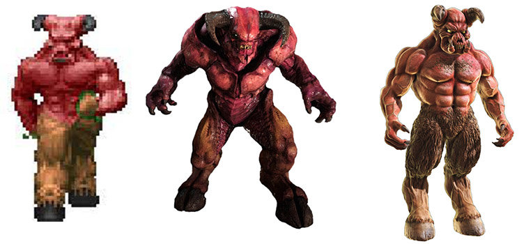
I just wish I lived to see in-game models like the one on the right, rather than the one in the middle. Modern tech used ✓, original design preserved ✓, and if you imagine it a little less color saturated, animated, towering over you - it would also fit a scary/horror theme.
-
I am sure this particular dead horse must be a mummified carcass by now, beaten repeatedly to a pulp. Ground to the finest of dusts. But I want to ask nonetheless: WHY, why did Doom games after Doom 2 - starting with Doom 64 - have to f**k with the original monster design? Something that was instantly SO iconic it's still revered 30 years later, inspiring countless fan art, attempts at upscaling, voxel upgrades etc. Take Mario's Goombas, or D&D's Beholder. Faithful to the original design through the decades, from pixel art all the way to last generation 3d engines, their respective IP owners being well aware of the power of recognizability. So I can't help but wonder what went through everyone's head when they decided to just go and trash such an invaluable asset. Lost souls turned to some creepy human-cyborg head, pain elementals with two mouths, brown squishy cacodemons, insect-like hell knights... Even Doom Eternal - that tried to harken back to the original designs - still has insectoid-ish Barons with... uhm... blades on their forearms? Not even spewing iconic green fireballs? The Gladiator, that looks like an almost perfect modern rendition of a baron or hellknight, feels like a tease to the fanbase. What do you think?
-
Origin of the Mancubus battlecry. Now, for something quite twisted: Back in 1994, I thought the Mancubus said "ANDY MALLOC", malloc as in c++'s malloc(size_t size) function. Going as far as theorizing it was an inside joke: someone at ID mocking a fellow developer named Andy for a botched malloc() call or something. As it used to happen in those pre-internet days, the thing spread quickly at school and became a little urban legend of sorts. Just a few months later, that summer in tabletop rpg store (sigh) I overheard some total strangers repeating that same thing like it was a well established fact.
-
Doom is actually a subtle allegory of class struggle, political tension and economic antagonism
-
To your point: being too bad a player to beat this the right way, I ended up developing this workaround - I get to the room while still under the effect of the secret invulnerability, activate the switch, run back to the point where you drop from, and with some luck and backpedaling the combined archvile zaps will make me jump back. And then I cowardly clean the room from that vantage point, hiding and peeking as needed.
-
E4 should not exist. E2M2 is one of the best maps ever.
-

What is the most memorable midi you've ever heard in a doom map?
resle replied to StarSpun5000's topic in Doom General
Tristan Clark, AORTA, from Sunder's "The Harlot's Garden" and Panophobia's "Hemophobia". I have been listening to it for 2 years now, on an almost daily basis. There's something about it that makes it impervious to saturation. -
Generally speaking, I think none of the cosmetic improvements, - be it higher resolution, smoother this, resampled that etc. conflict with the original game design, love them or hate them. (I don't mind high res and some translucency but that's as far as I go) Jumping, "swimming" and the likes are an absolute no. There are maps that can be finshed in a second, sections that can be skipped entirely, by the mean of a tiny little jump. Jumping was never part of the original design. And it was a choice, not an engine limitation: vertical movement, collisions and "climbing" were well built into the engine already so if they wanted to let the player jump, it would have been easy to do so. Now, about vertical look.. I don't think anyone at Id really designed maps around not being able to look up and down, or considered the absence of vertical looking a feature. Monsters can "look" up and down and target you accordingly after all. It was an engine constraint, and the only map that exploits that limitation as a game dynamic is at the veeeery end of the original run, with the *cough* universally loved icon of sin. So, grey area I'd say. I keep it on, makes play more varied, less repetitive.


